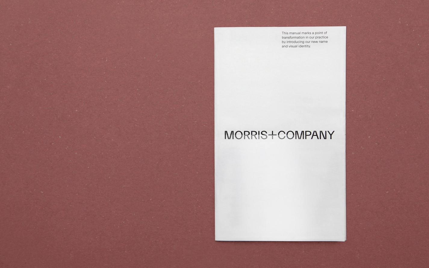
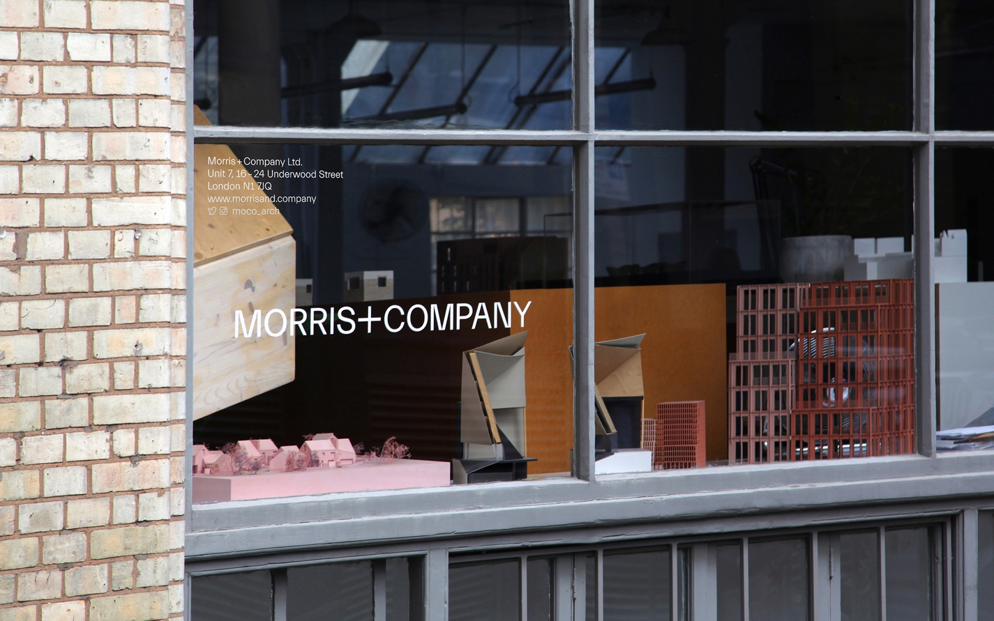
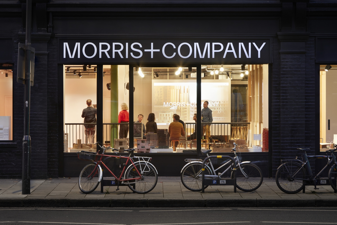
Morris+Company
Morris+Company is an evolution of the acclaimed Duggan Morris Architects. The renewed practice dovetails the individual strengths of founder Joe Morris with the talents of a wider company of designers, all committed to the adventure of making architecture collectively. Our brief was to distill and communicate the creative spirit of this reassembled office.
Read more
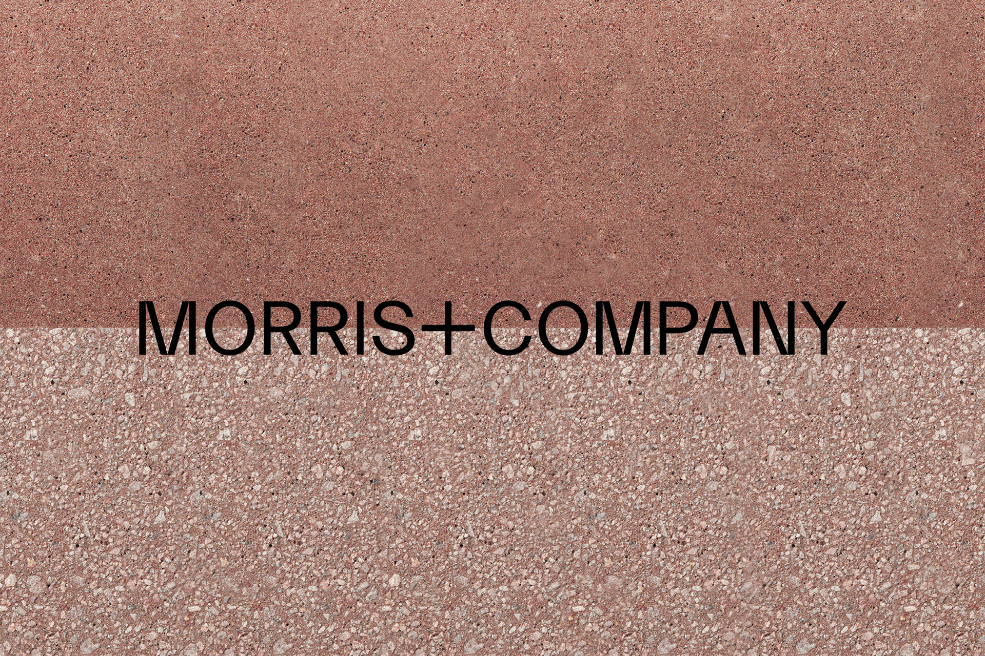
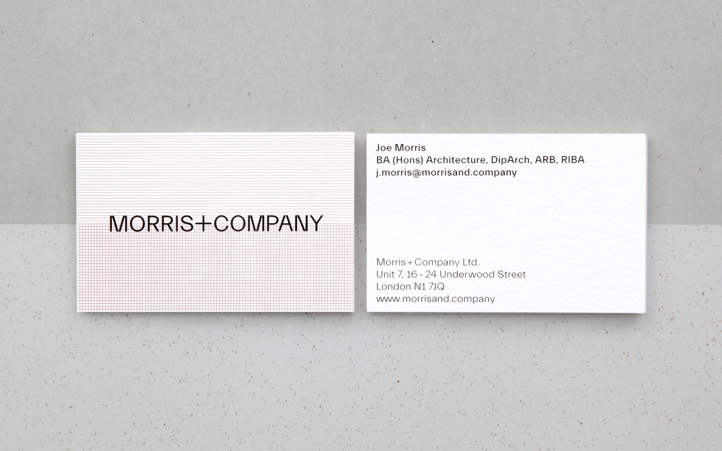
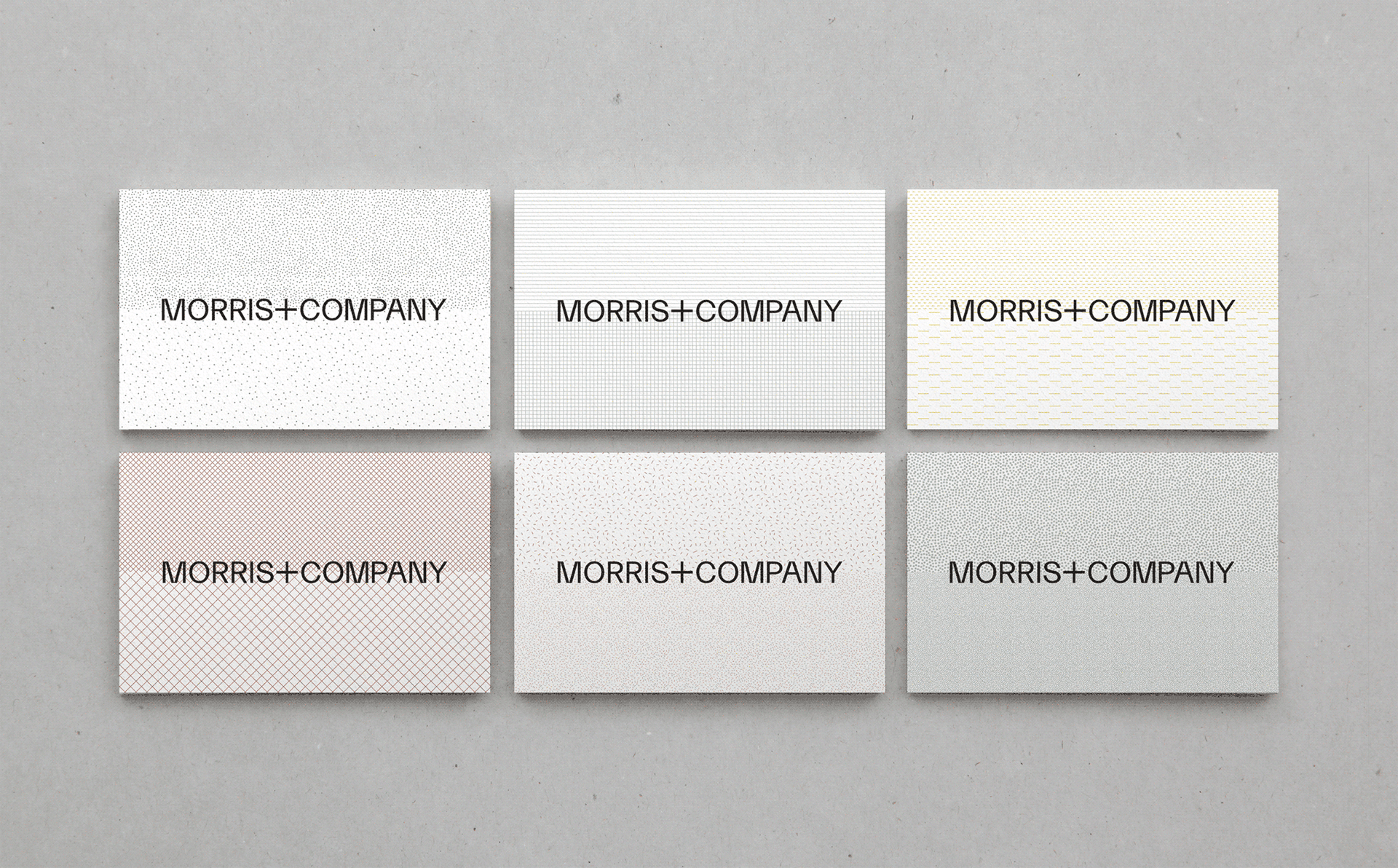
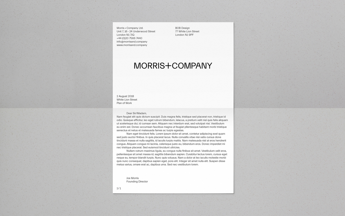
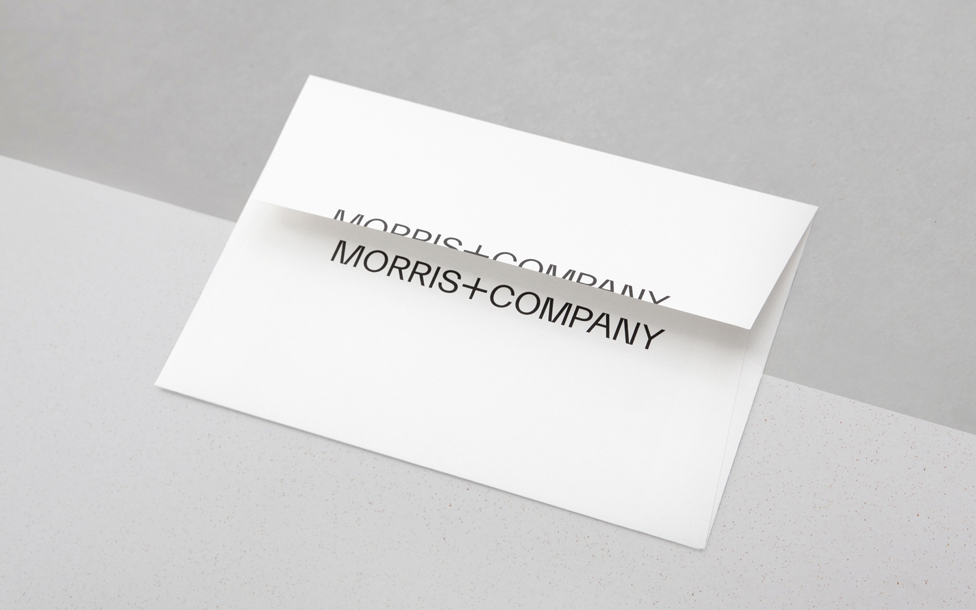
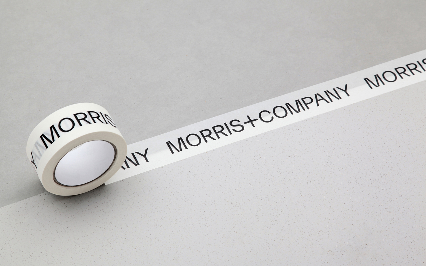
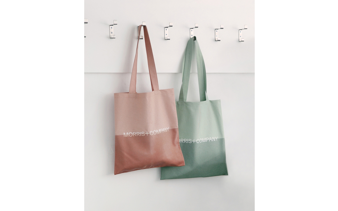
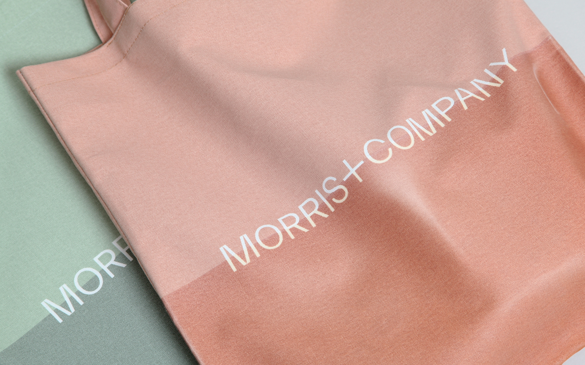
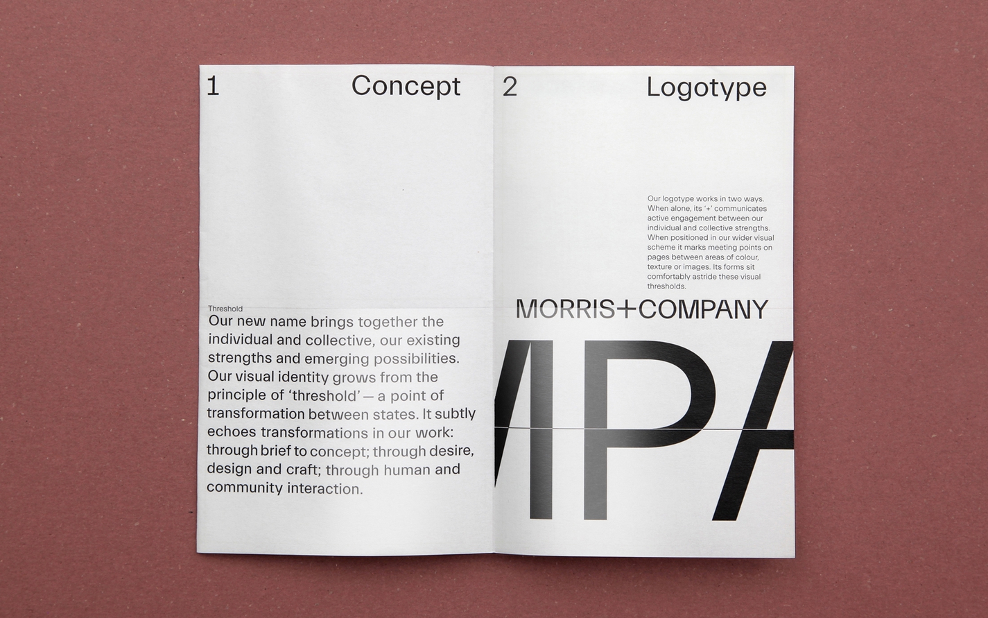
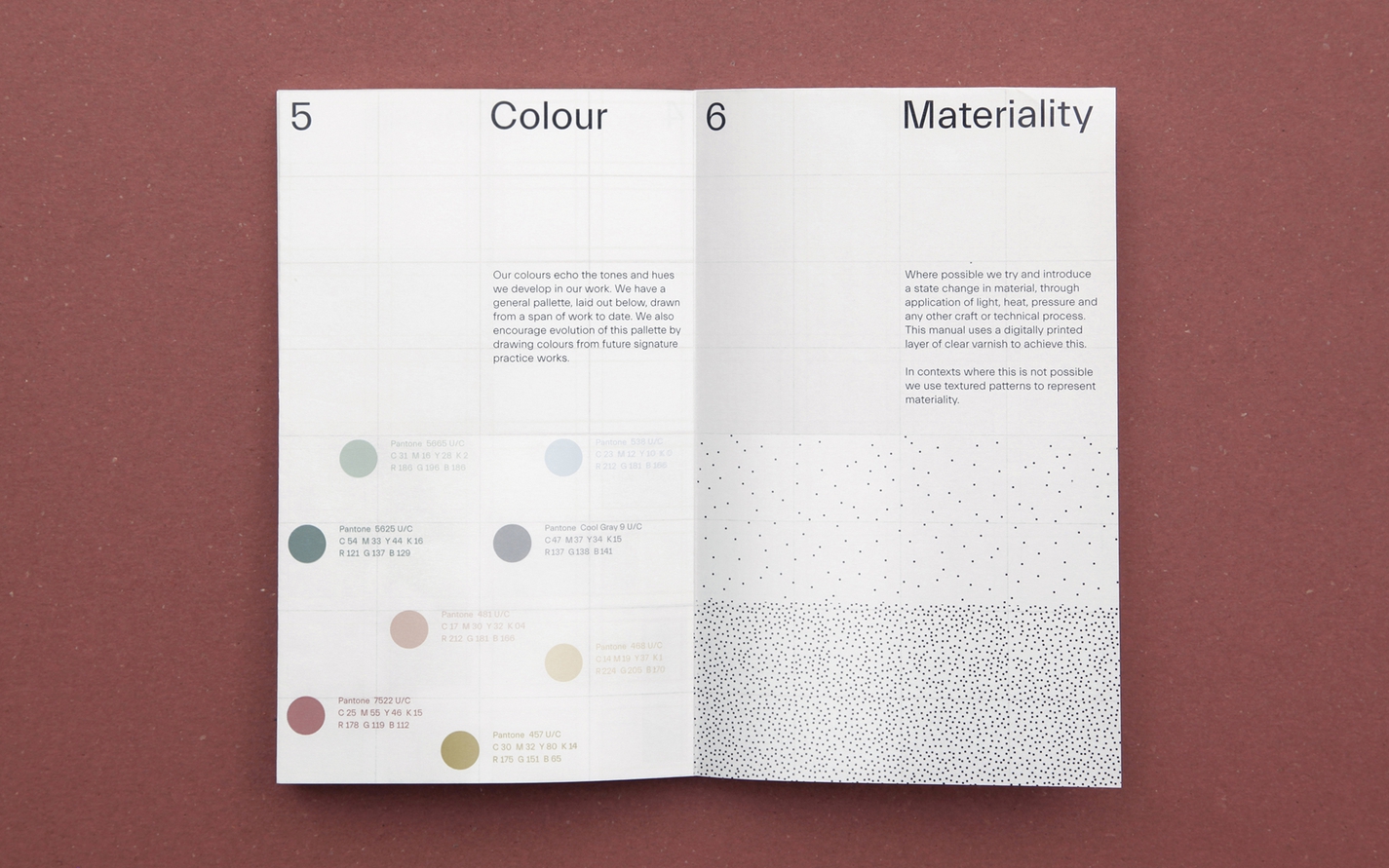
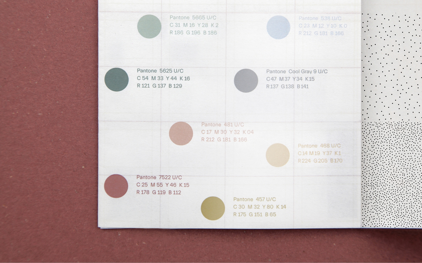
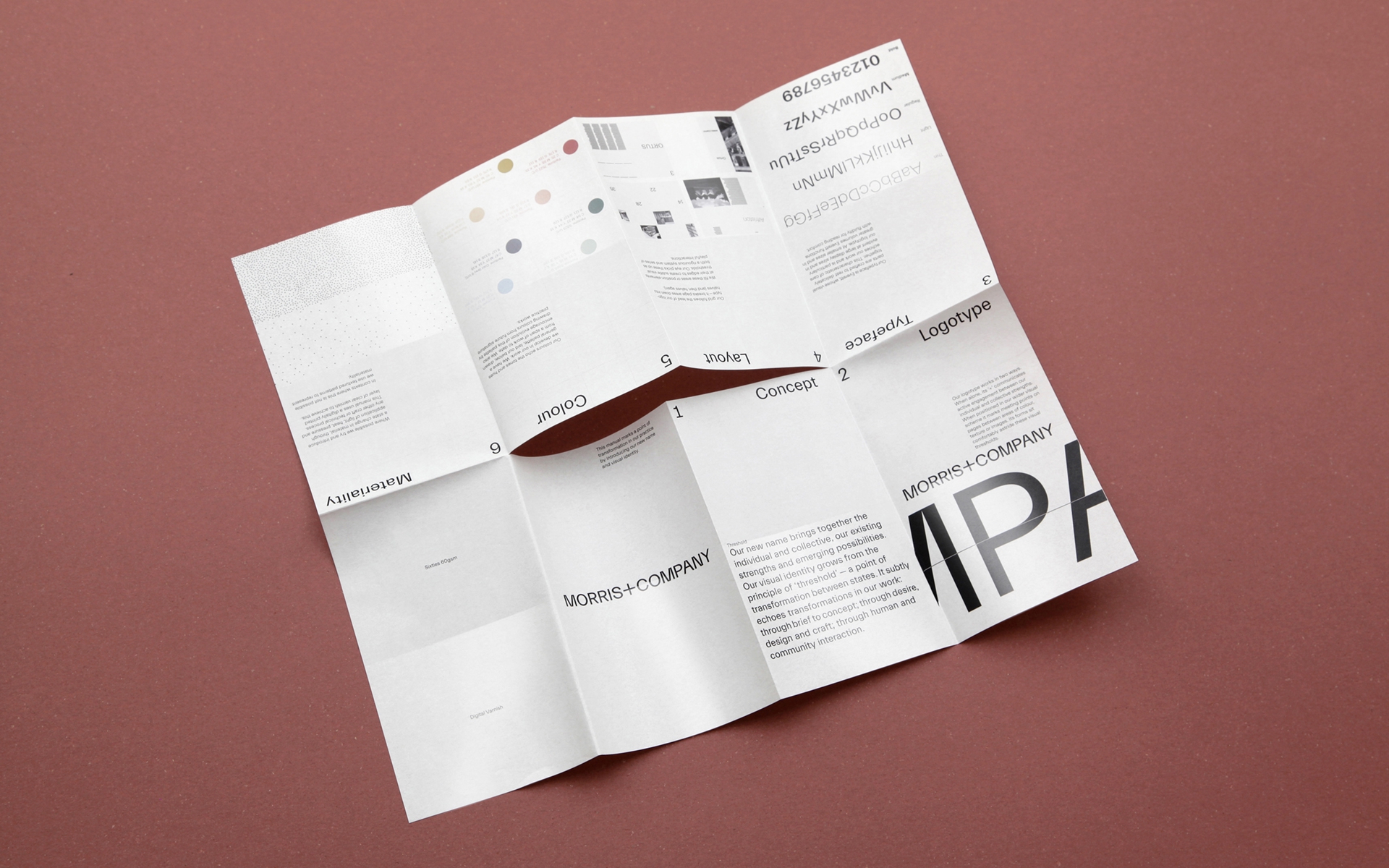
The ‘change of state’ is represented by a ‘+’, which sits central to the new name at the meeting point between the individual (Morris) and the collective (Company). The ‘+’ also triggers a framework for the visual identity, marking the meeting point of fields with differing colour, texture, material or imagery. Where changes in material or texture aren’t possible, patterns are used to represent materiality.
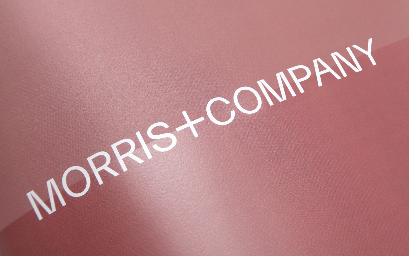
The logotype is tailored to sit aside these visual thresholds, and is formed from the Everett typeface. The elements of each letter in the face ‘rest delicately’ together, a characteristic of the practice’s highly crafted architecture.
We rolled these core elements out across a wide variety of applications, including a website. The structure of the site is again defined by the ‘+’, which marks the threshold between the two halves of the screen as well as acting as a navigation device. Factual, static information is placed on the left hand side of the screen, while the right hand side is fed with more ephemeral, subjective material to communicate the multi-voiced, iterative process of making and living in Morris+Company buildings.
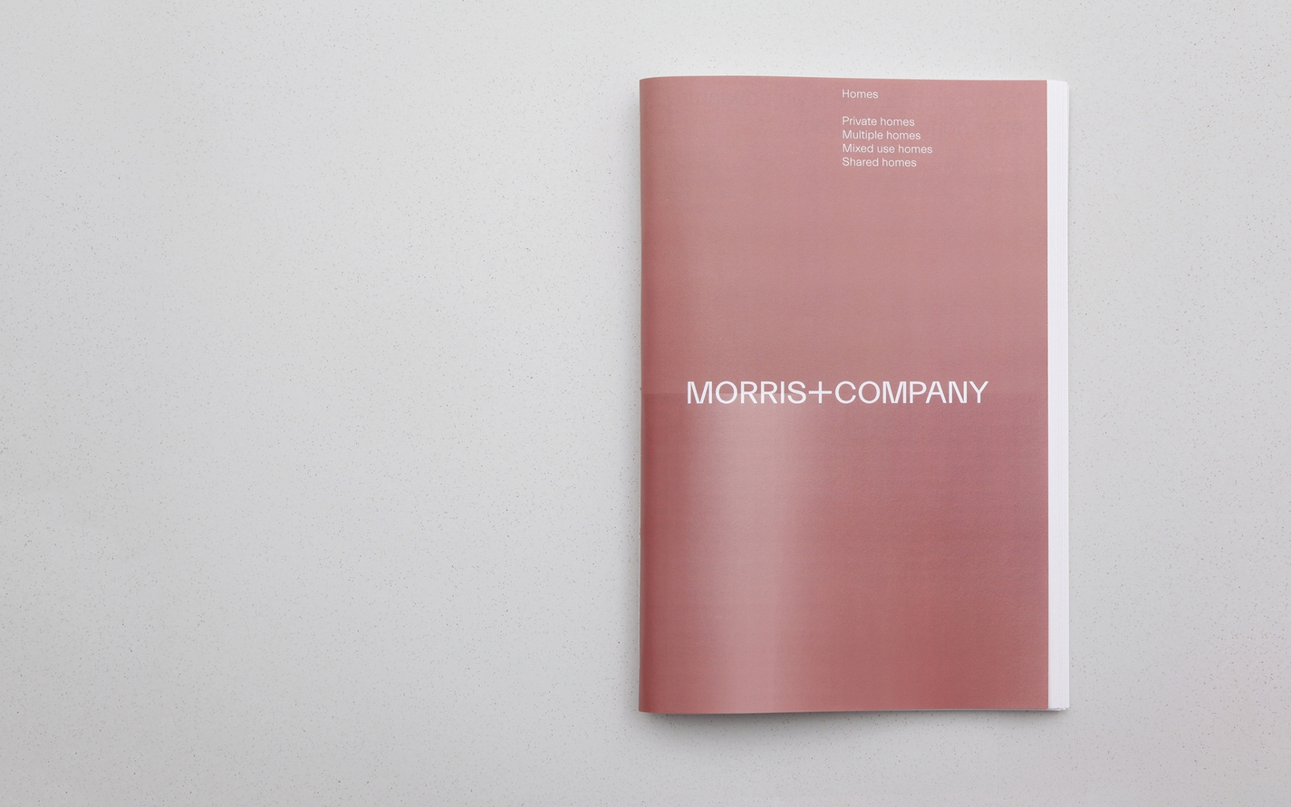
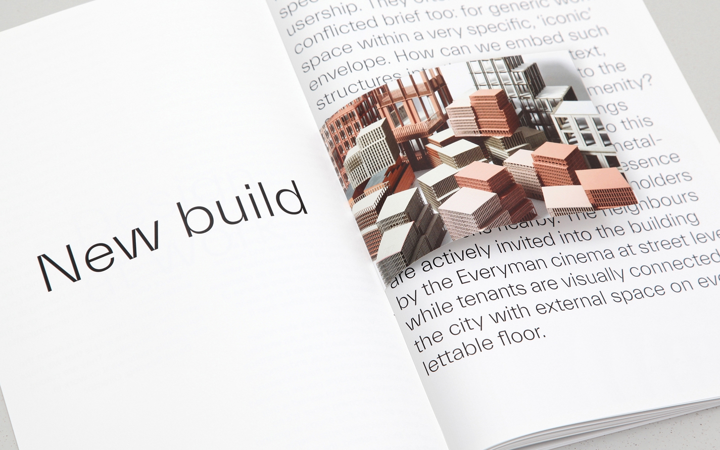
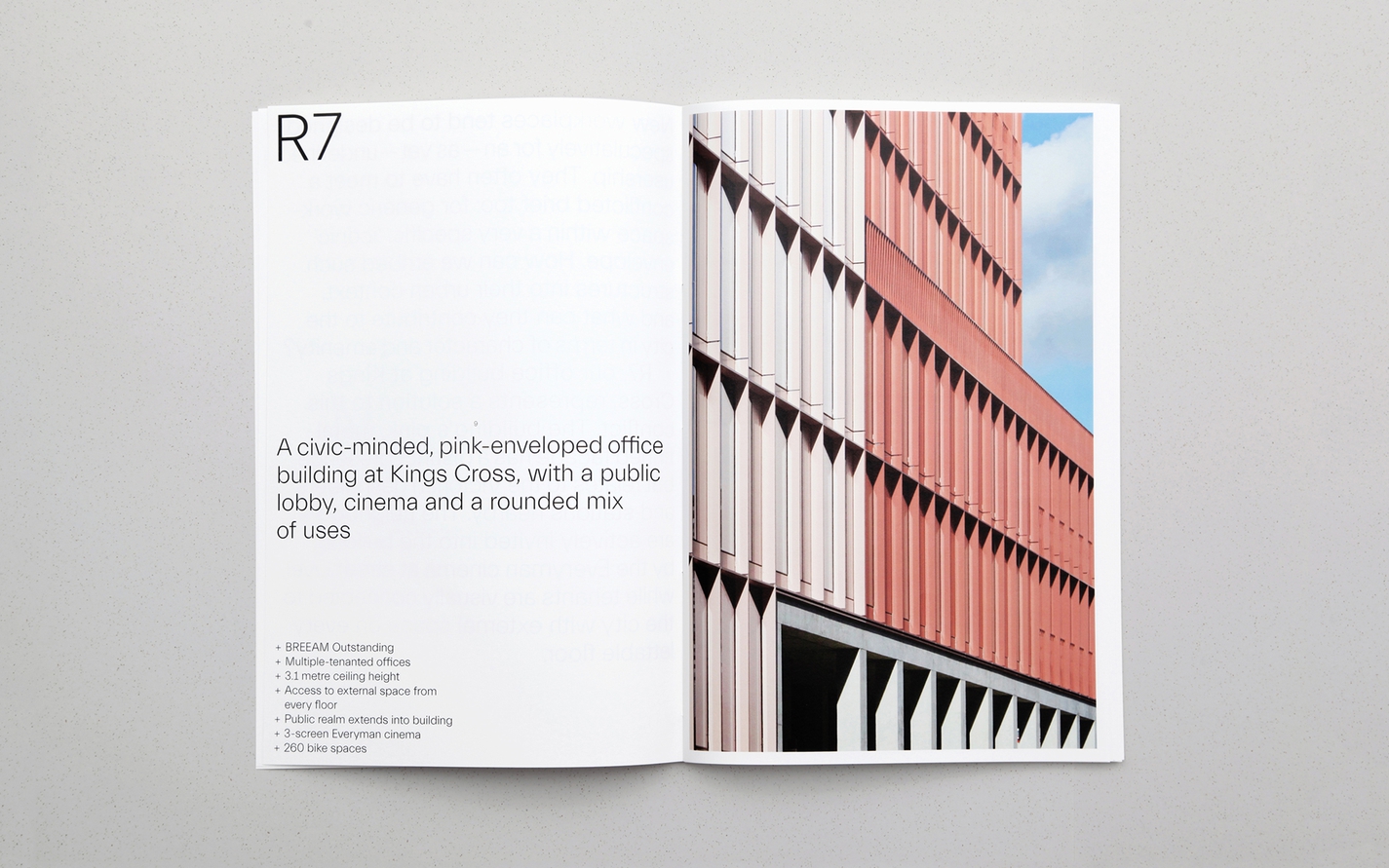
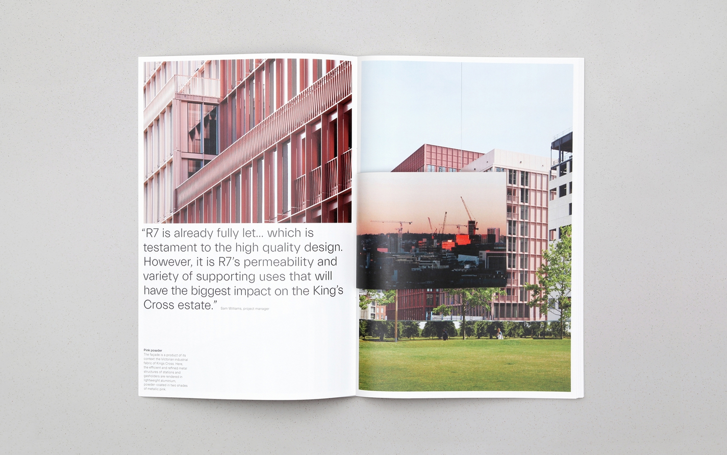
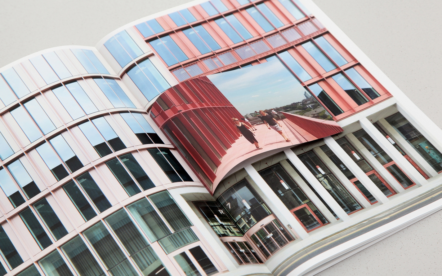
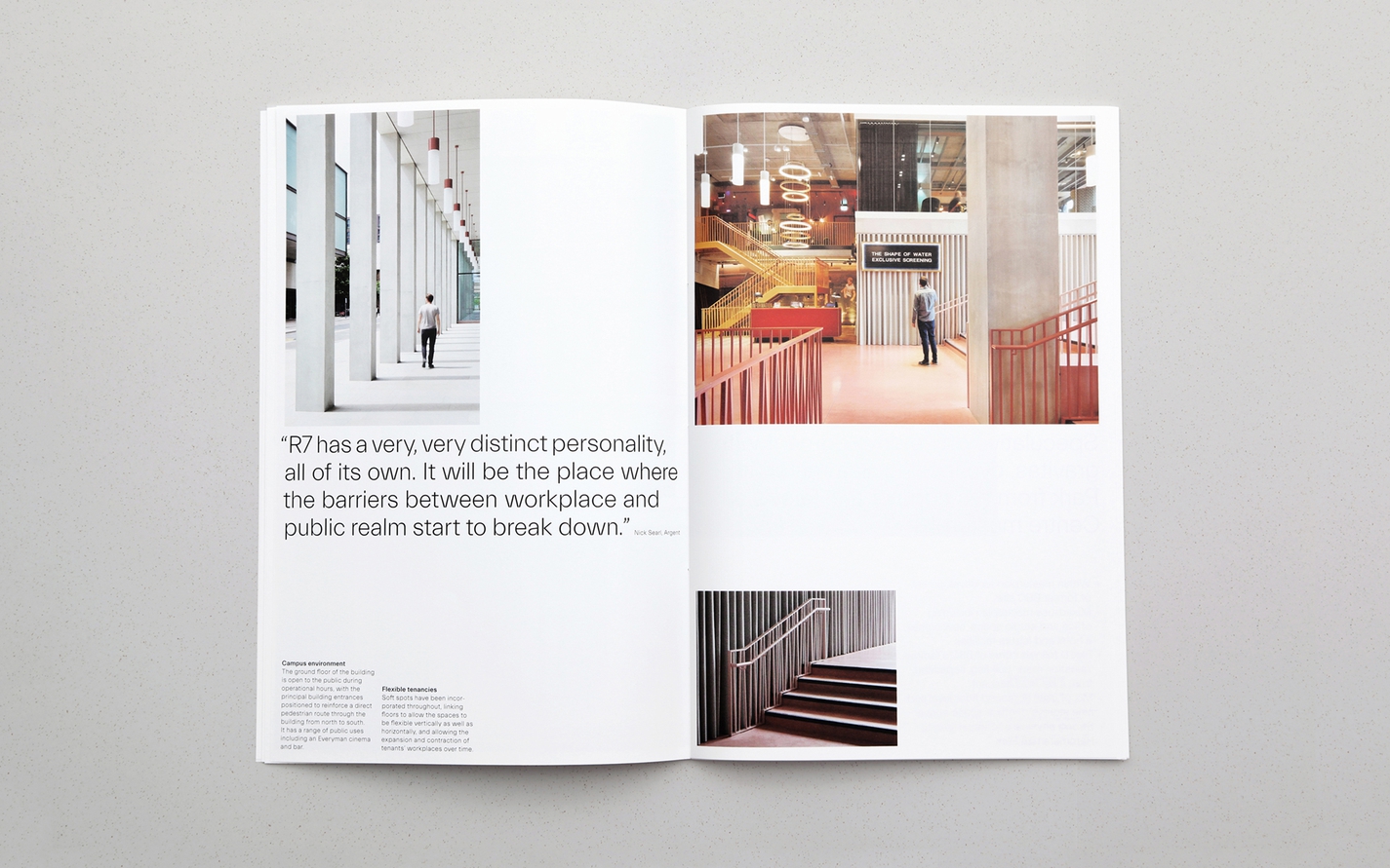
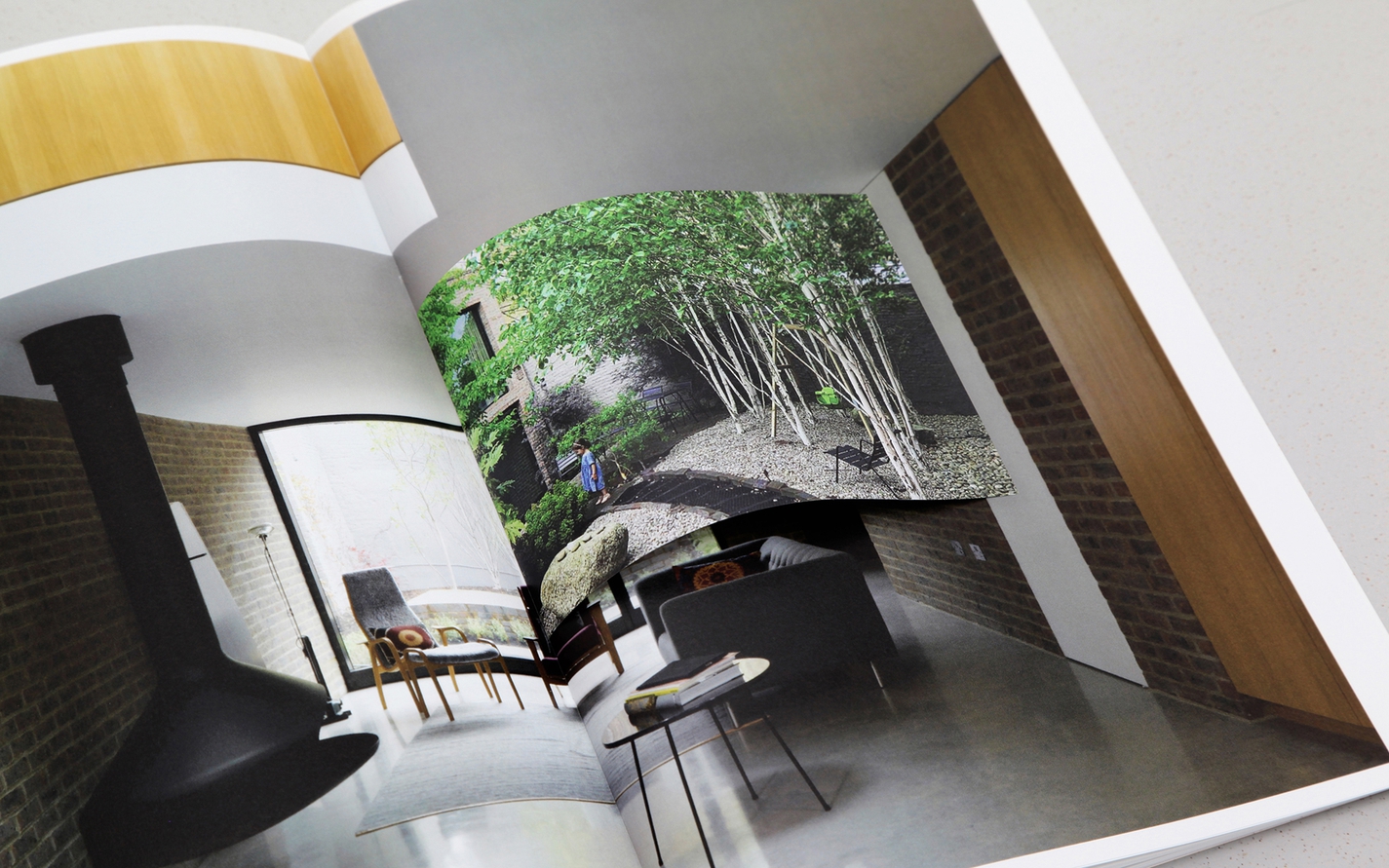
Hand-bound booklets on key areas of work follow a similar structure, the pages set out by a grid of thresholds, and ephemeral information added to the static in the form of postcard-sized inserts.
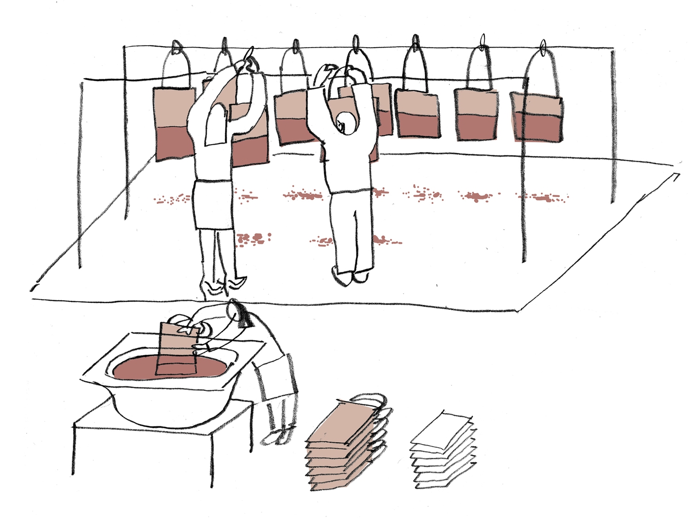
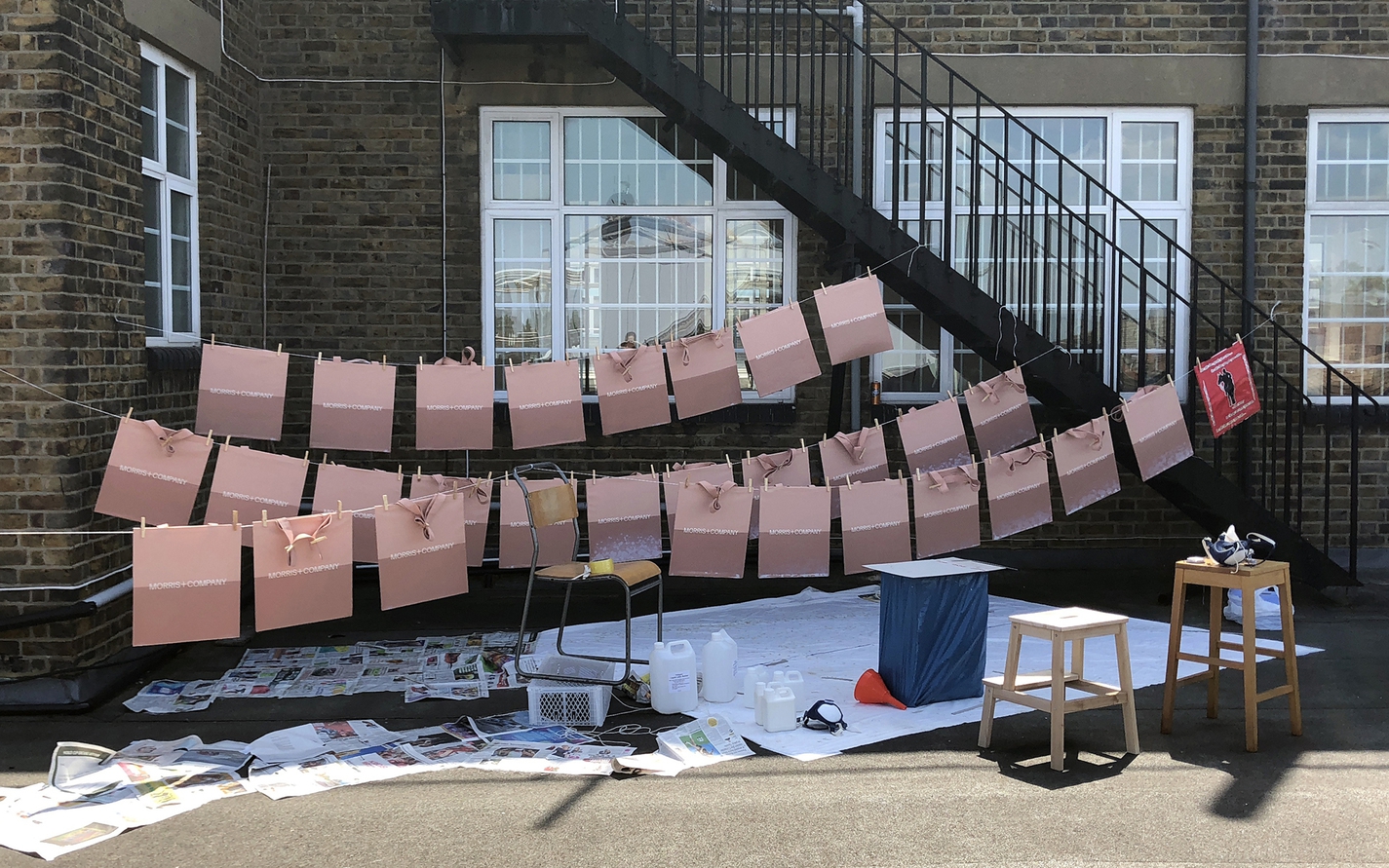
The ‘change of state’ concept holds the potential to be implemented in many different ways, and across many touchpoints. We have experimented with a variety of processes: dipping tote bags in latex to achieve a threshold between natural and waterproofed surfaces; sun-bleaching paper stock for invitations; and part-treating a metal street sign for the practice, allowing the rest to oxidise and age over time.
Words by Emma Keyte at Free:
Everett typeface by Nolan Paparelli
Website built by BONG
Identity
Digital
“The winning website is awash with colour, textures, patterns and emotion, sending out messages to do with sharing, research and innovation. Other architects can learn much from this site and this practice.”
Archiboo Web Awards 2019