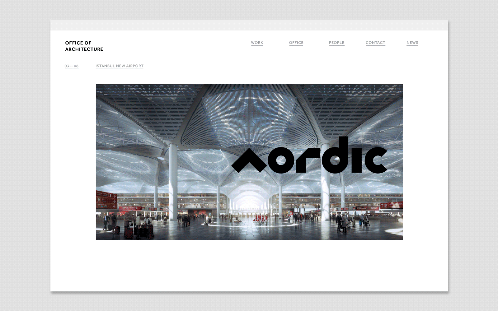
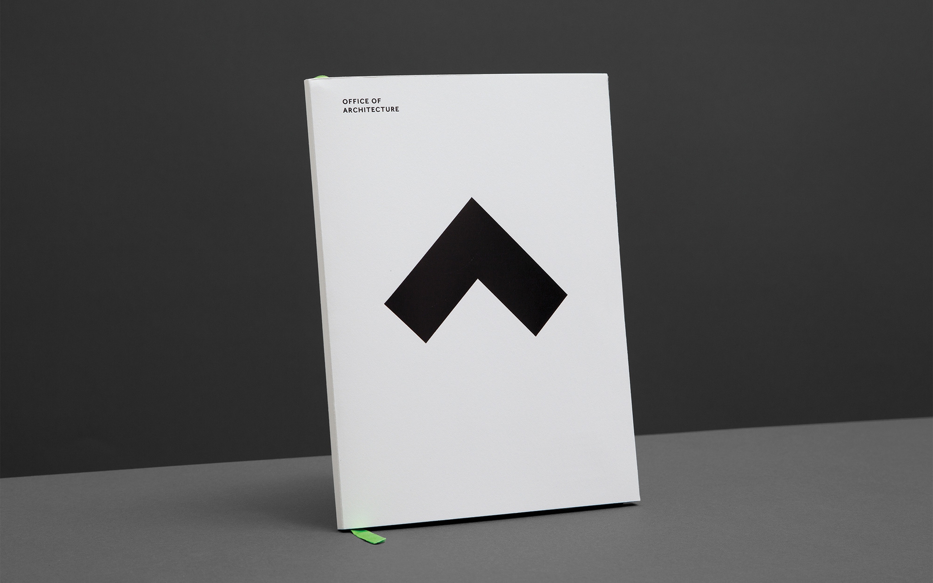
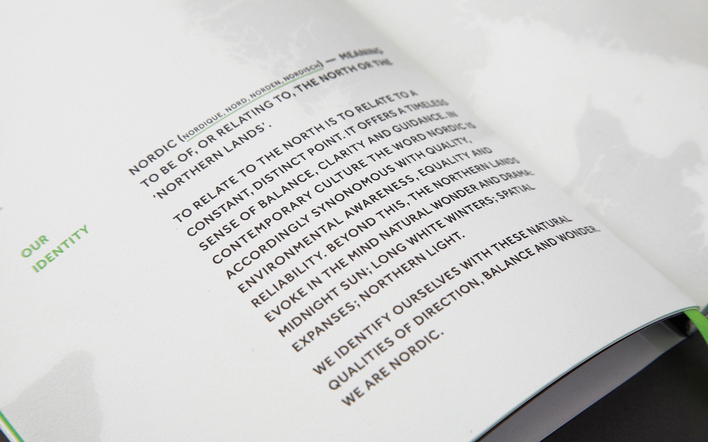
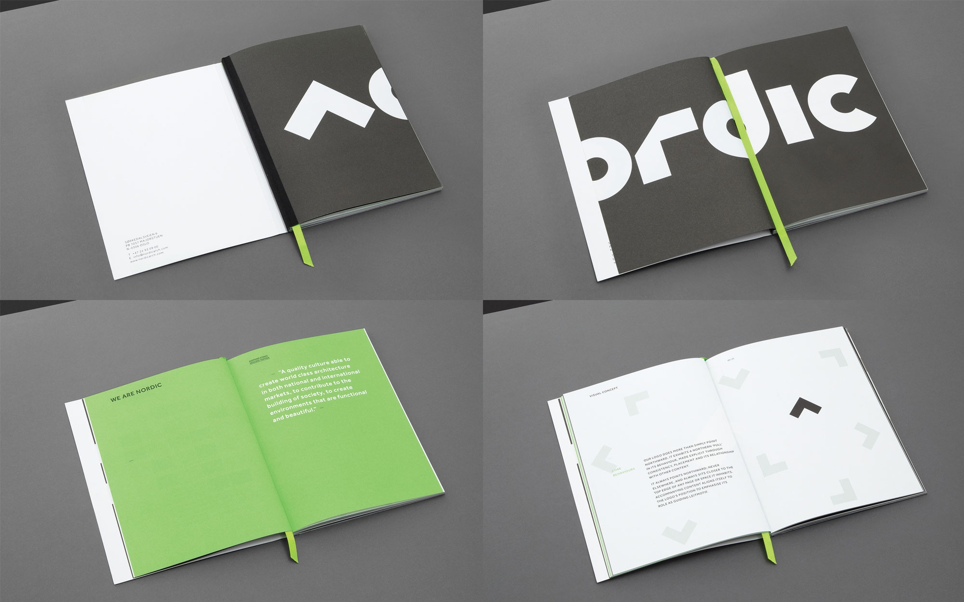
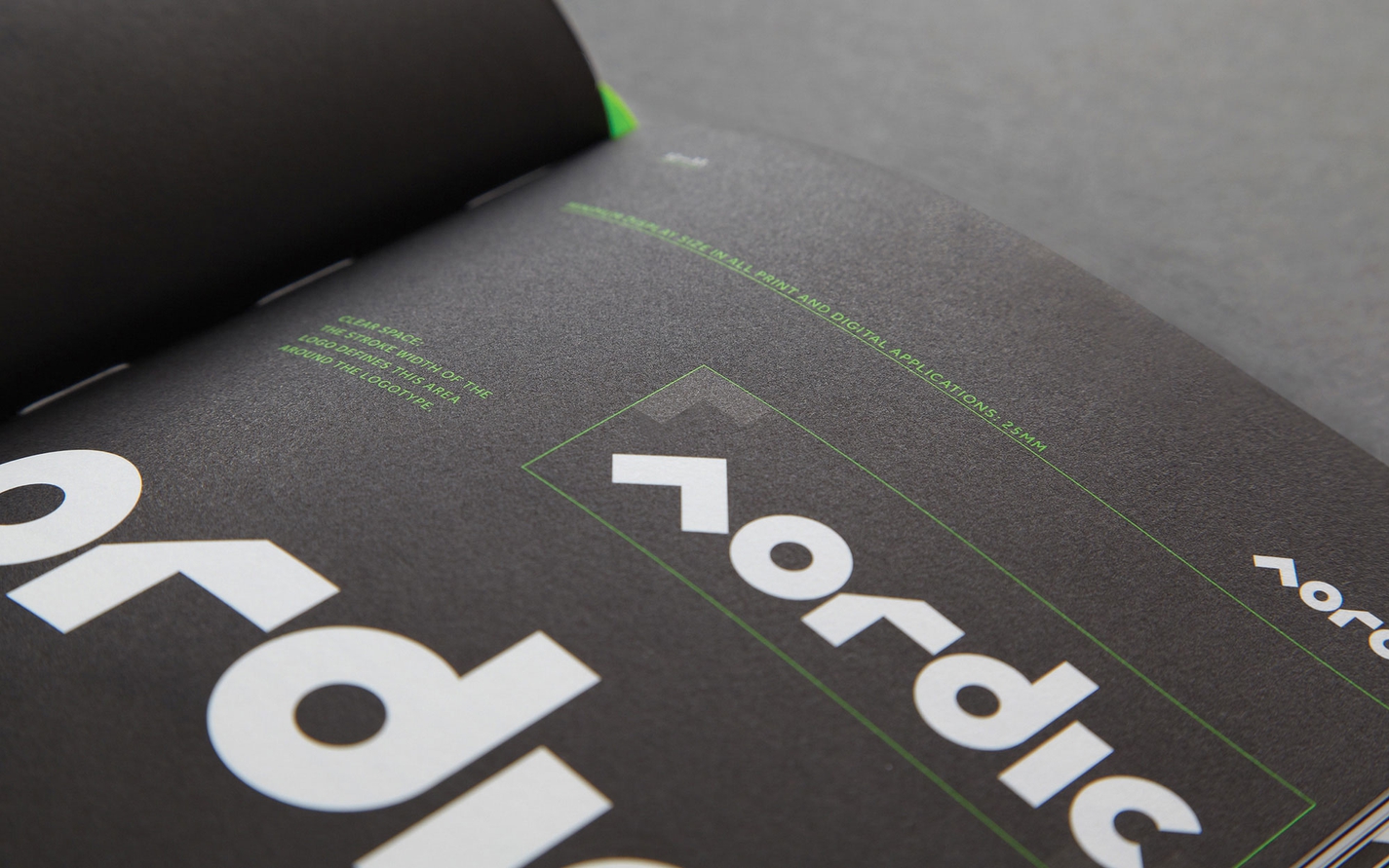
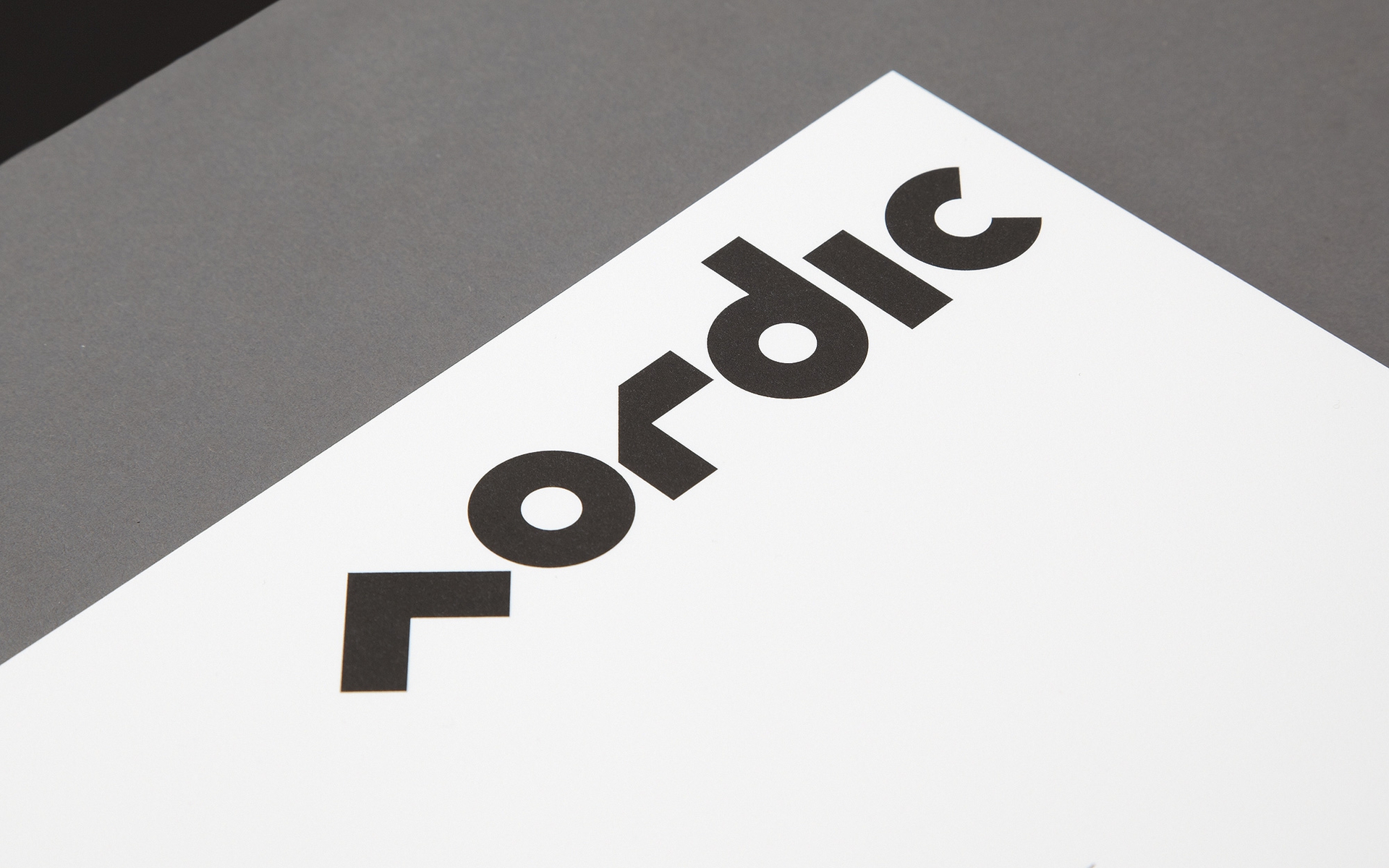
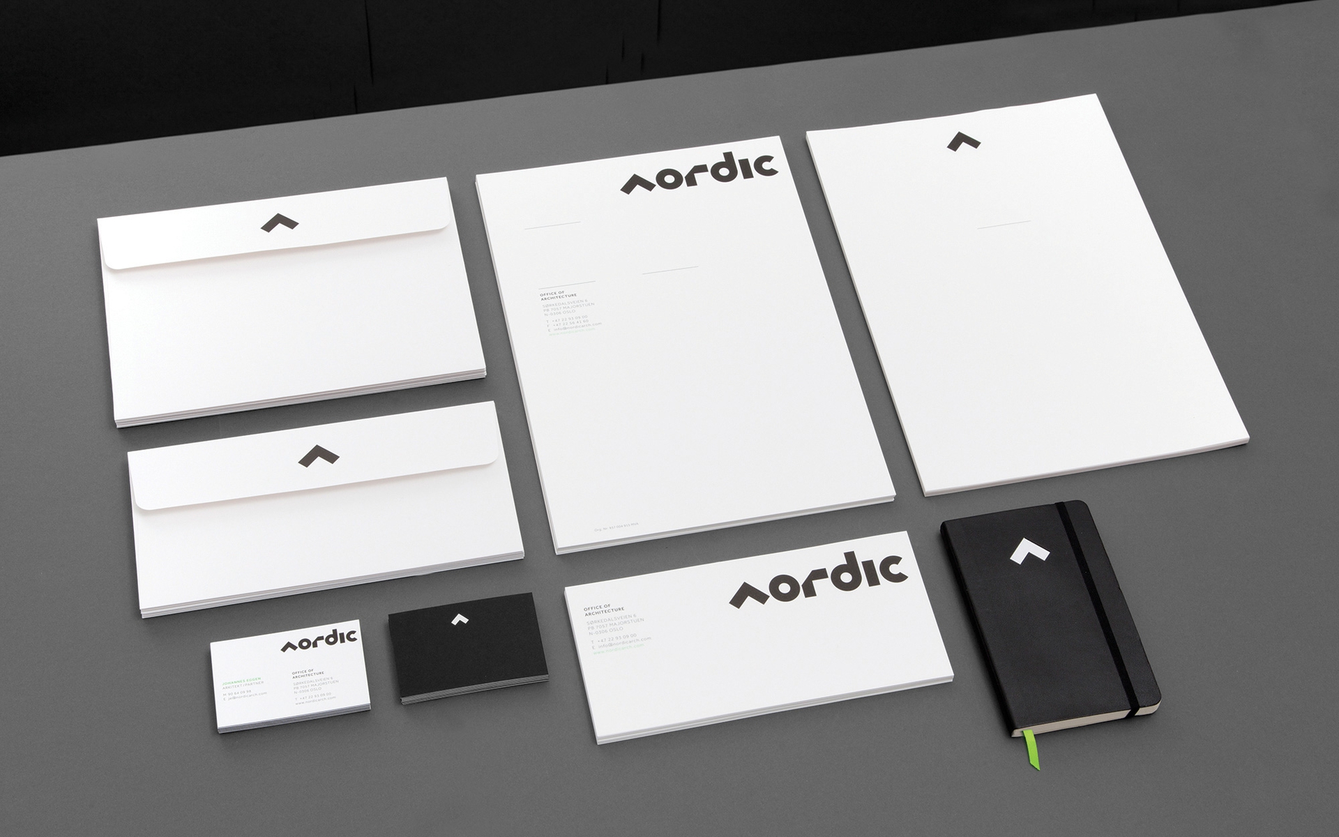
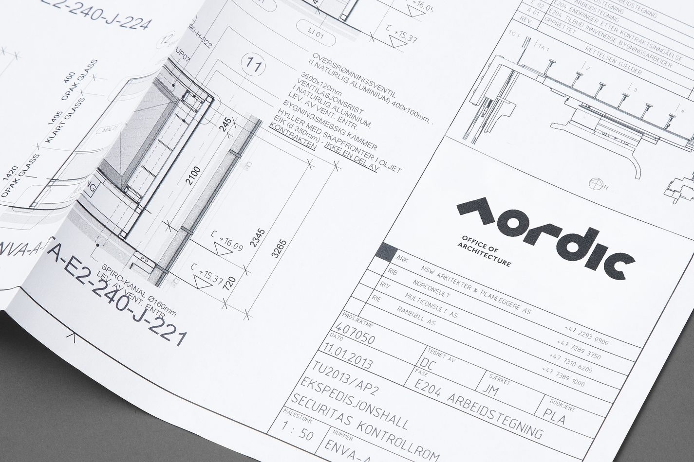
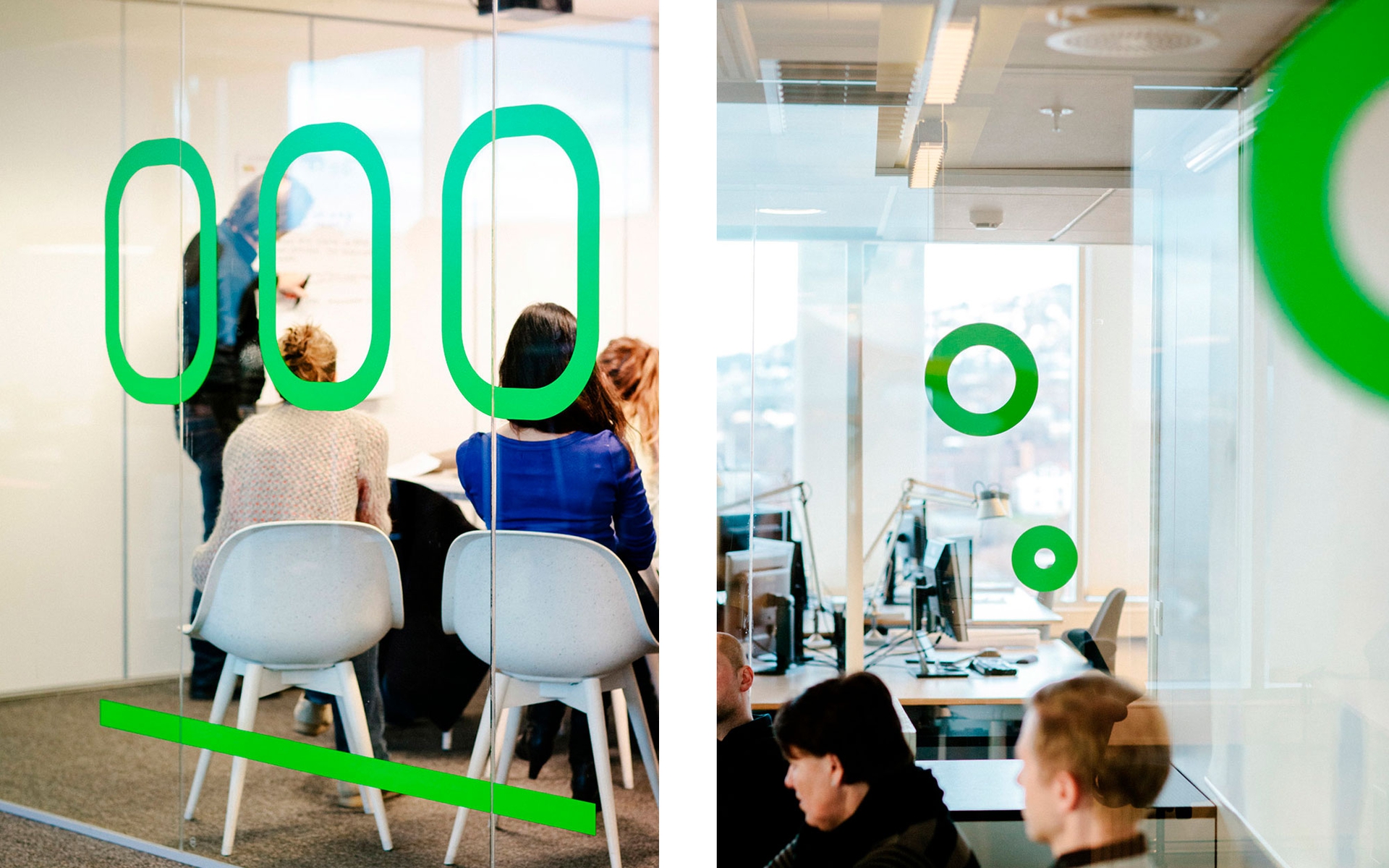
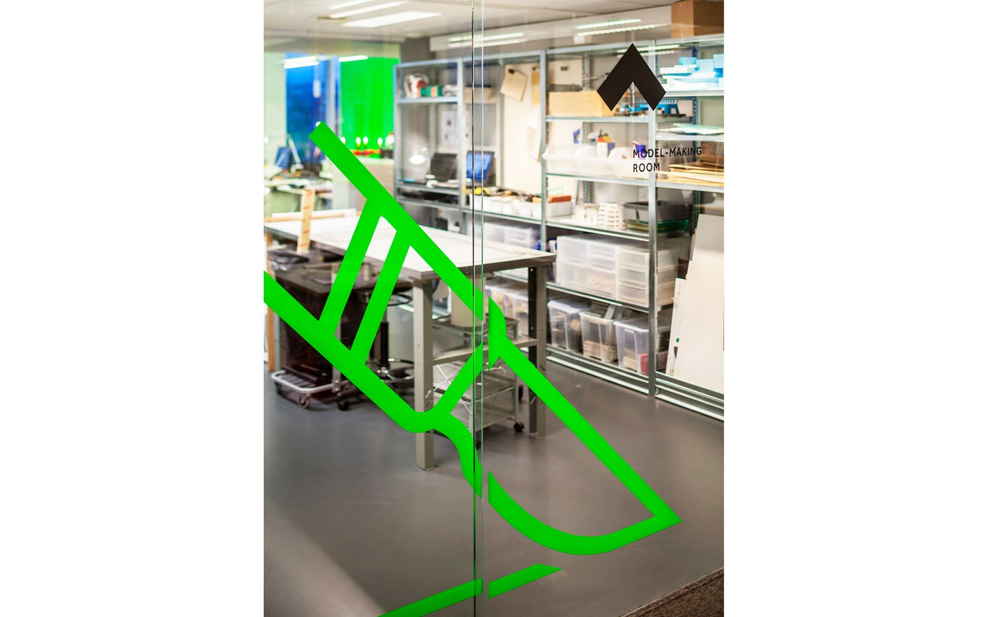
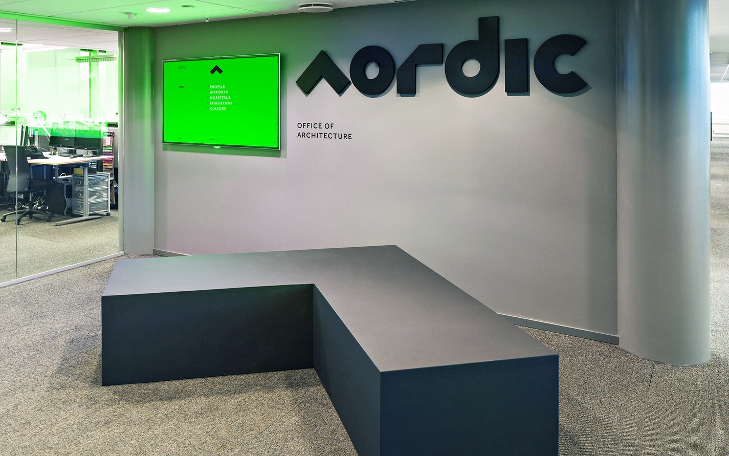
Nordic — Office of Architecture — Building a visual identity around the north arrow.
Nordic is an Oslo-based architectural practice — a recent evolution of long-established practice Narud Stokke Wiig Architects + Planners. We created a new visual identity to put a flag in the ground for this office as an industry leader in and of this region.
Read more
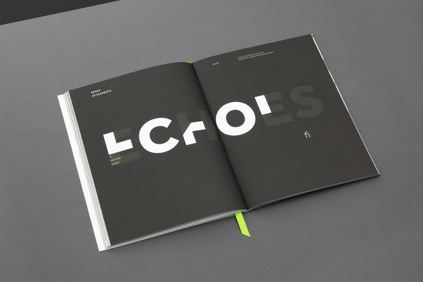
Identity
Digital