Sheppard Robson
First founded in 1938, Sheppard Robson is an ever-evolving collective of architects, interior designers and masterplanners.
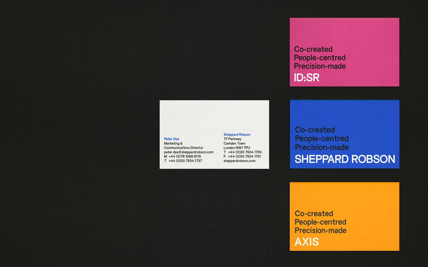
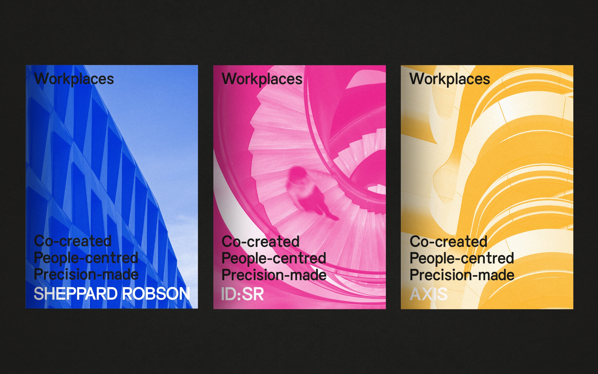
We created a new visual identity to emphasise this continued freshness and to draw together the main brand with sister brands ID:SR and Axis.
We created a new visual identity to emphasise this continued freshness and to draw together the main brand with sister brands ID:SR and Axis.
Read more
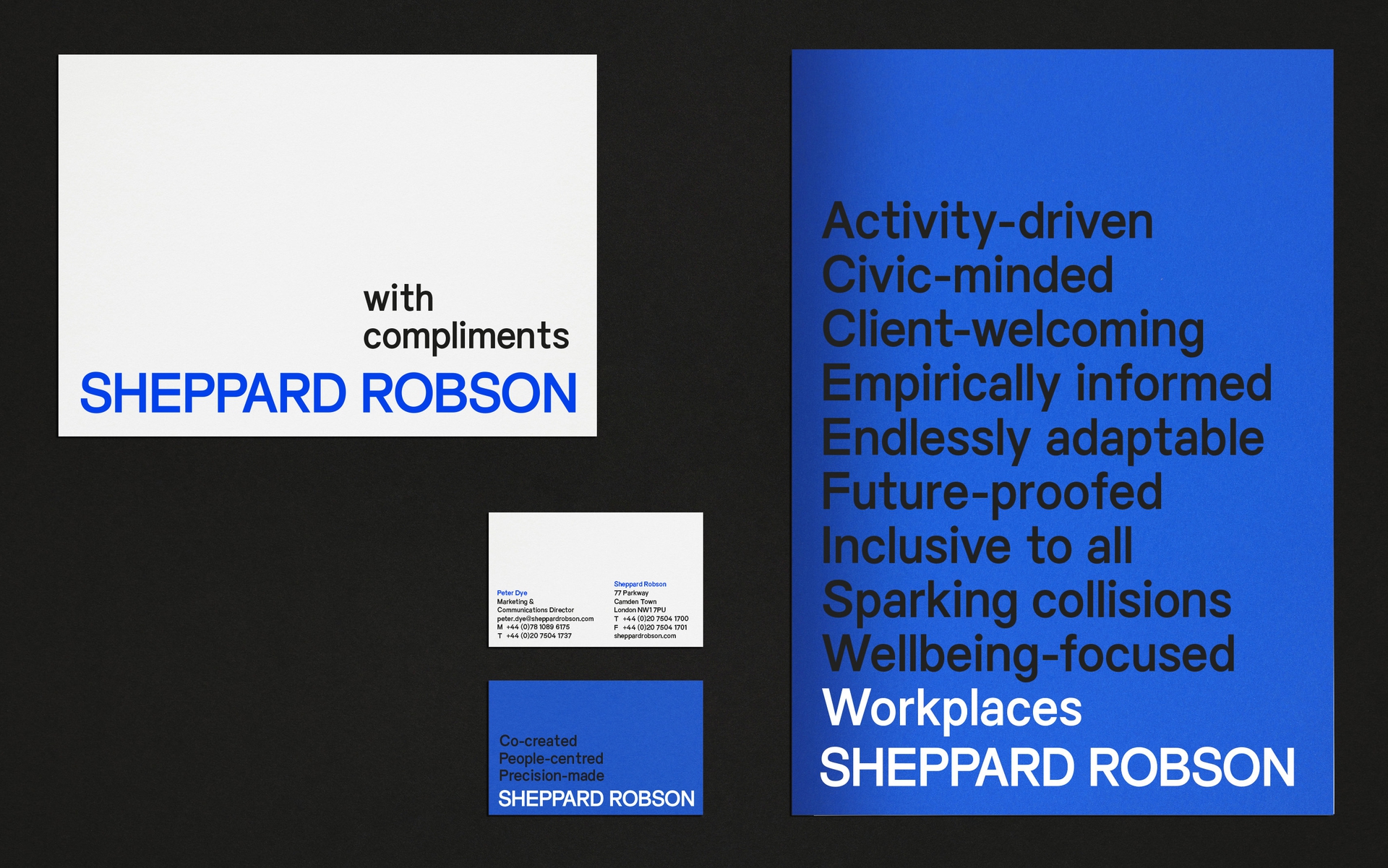
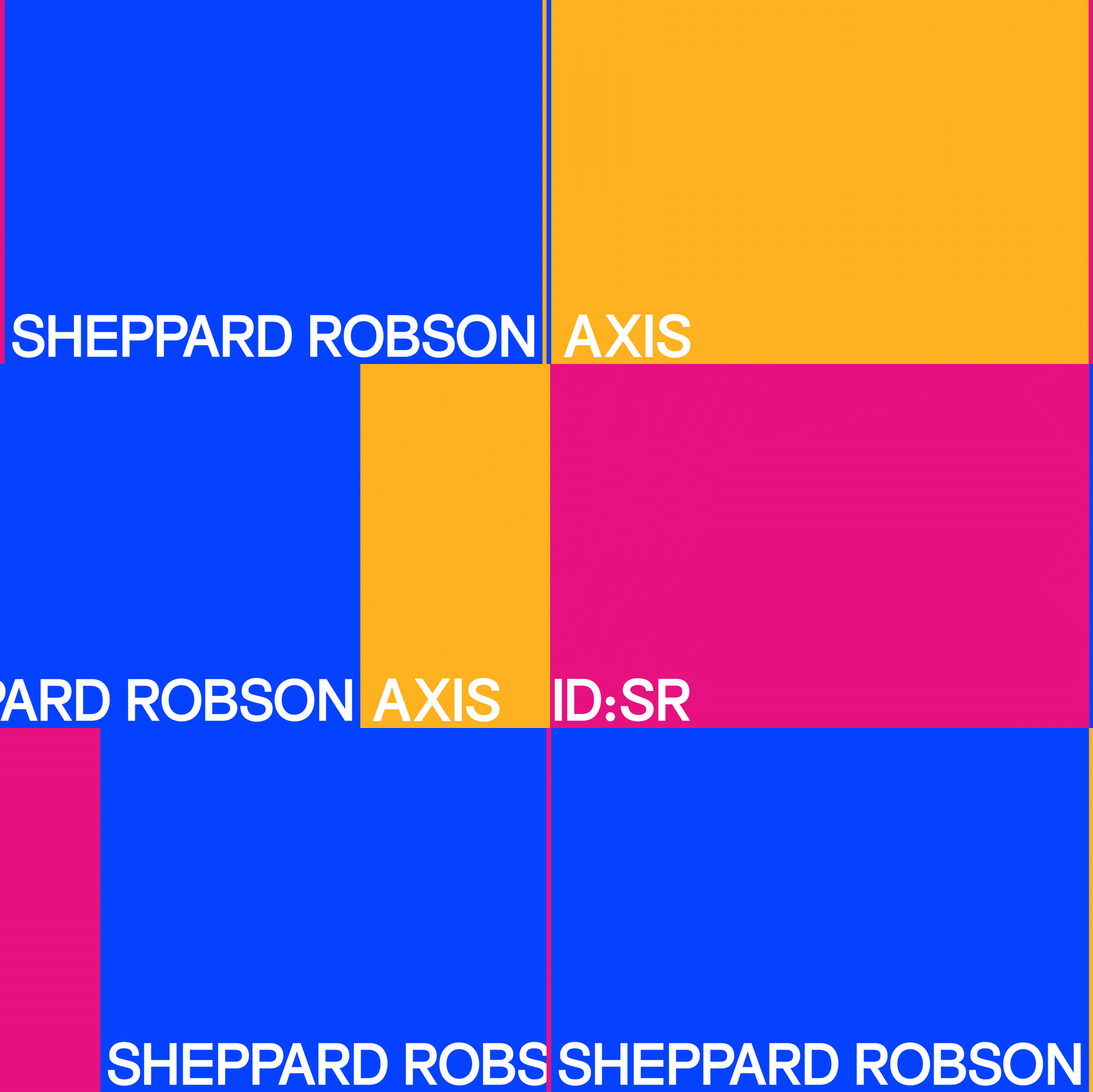
The logo acts as the visual platform for this growth, spanning the base of the spaces and layouts it inhabits. From this, all other elements spring upwards into life in vibrant vertical layers of imagery and text. These rich columns offer a snapshot of collective dialogues and interplays.
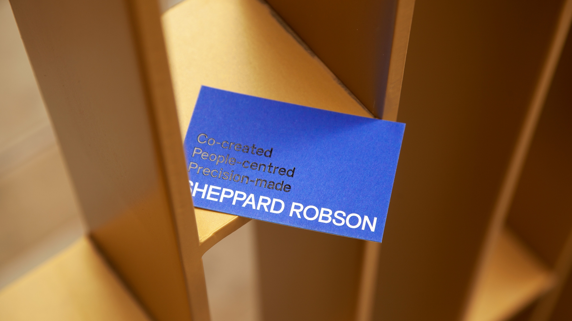
Everyday Sans carries strength and a sense of the vertical through its solid, tall, elegant type forms while an energetic colour palette adds further dynamism. The range of this palette helps us differentiate between the three brands, with a signature colour for each that signals their focus.
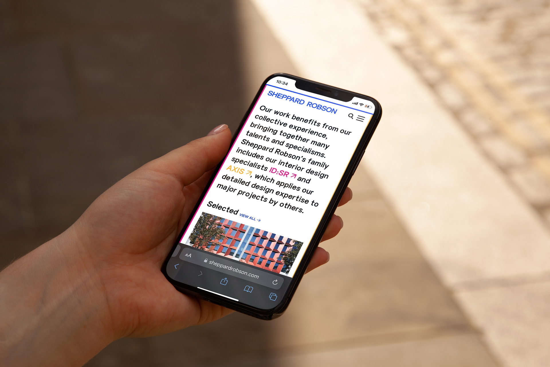
The website balances the brands by sitting their individual sites beside one another like terraced houses, separate yet similar, and signposted again by slivers of colour that appear at the edges of the screen.
Words by Emma Keyte at Free:
Website built by Archive
Identity
Digital
“The winner has been on a huge journey overhauling its brand while bringing disparate parts of the business together. The design is energetic and authoritative and its content gives a real sense of the team and the people behind it.”
Archiboo Awards 2022