Tate Hindle
Tate Hindle are architects and urbanists, design custodians of places where people can live, work and enjoy every shade of life in between.
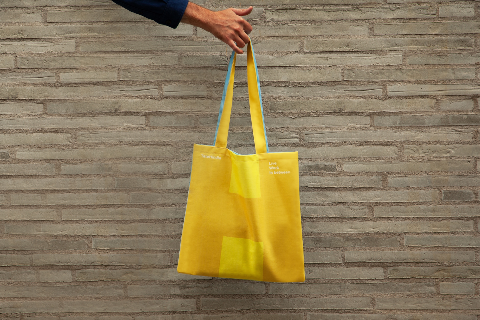
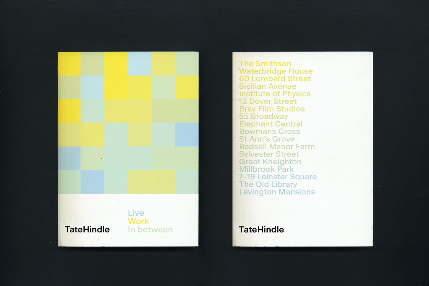
We created a refreshed visual identity and website for them, with a concept centred on shape, space and shade.
We created a refreshed visual identity and website for them, with a concept centred on shape, space and shade.
Read more
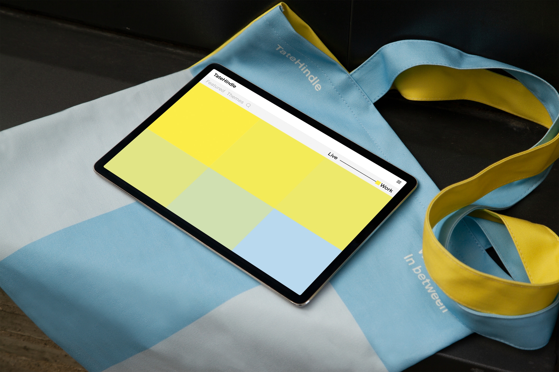
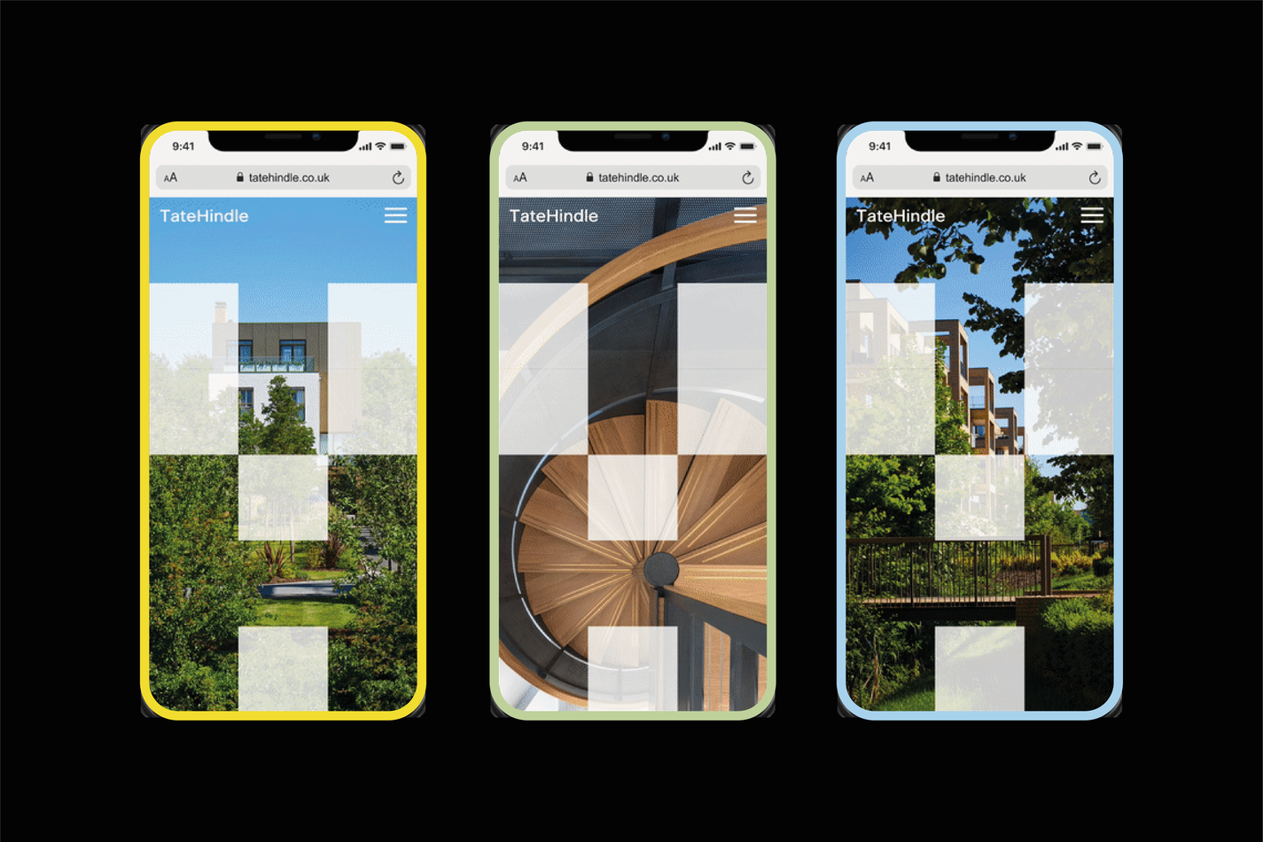
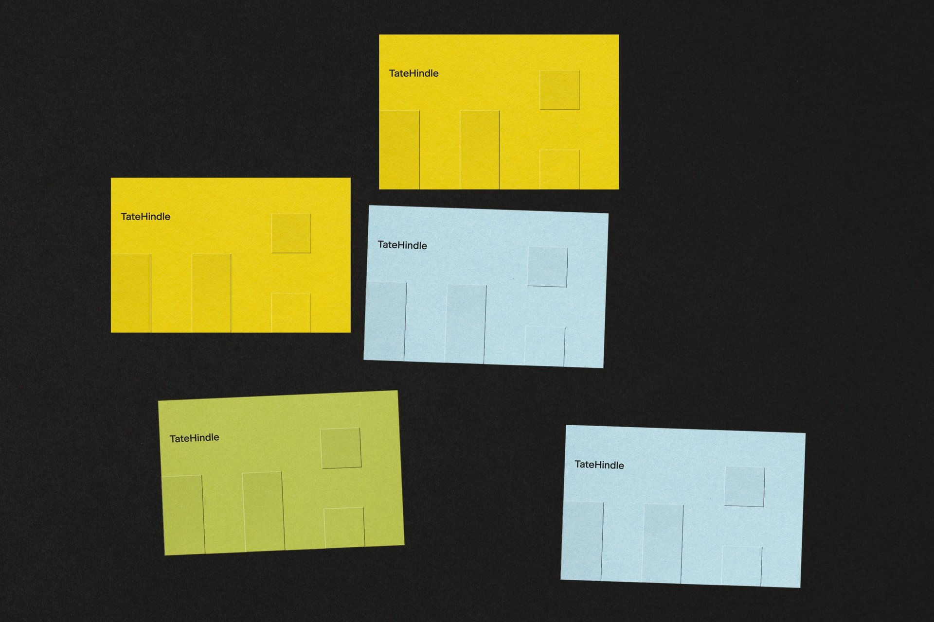
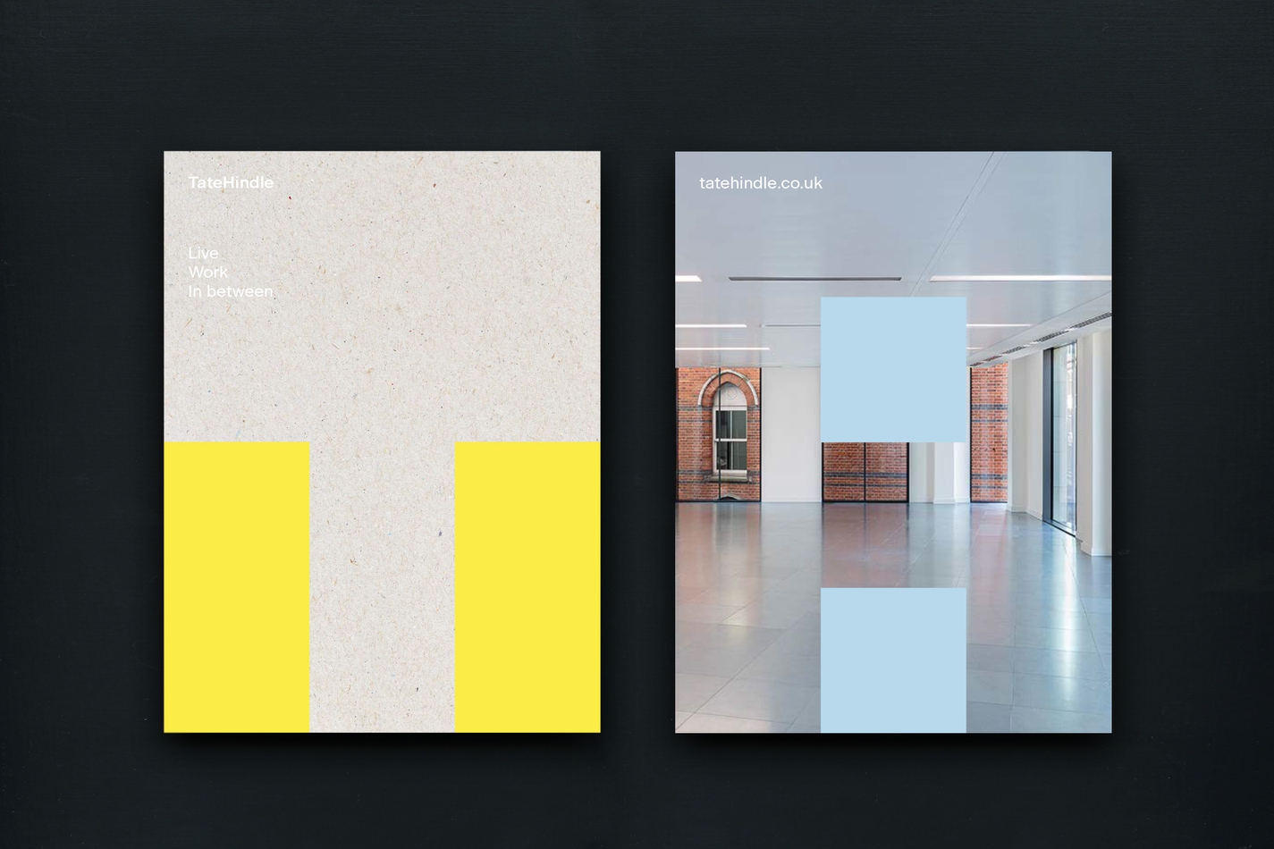
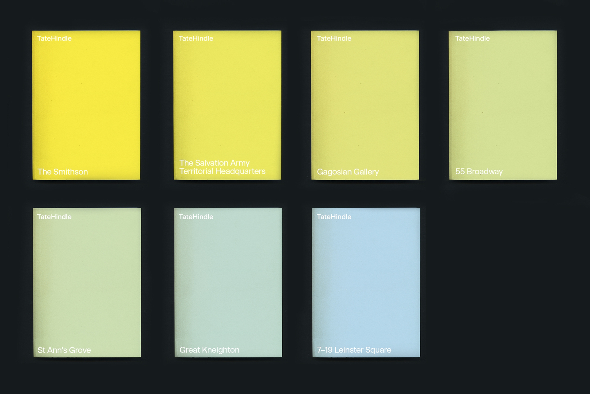
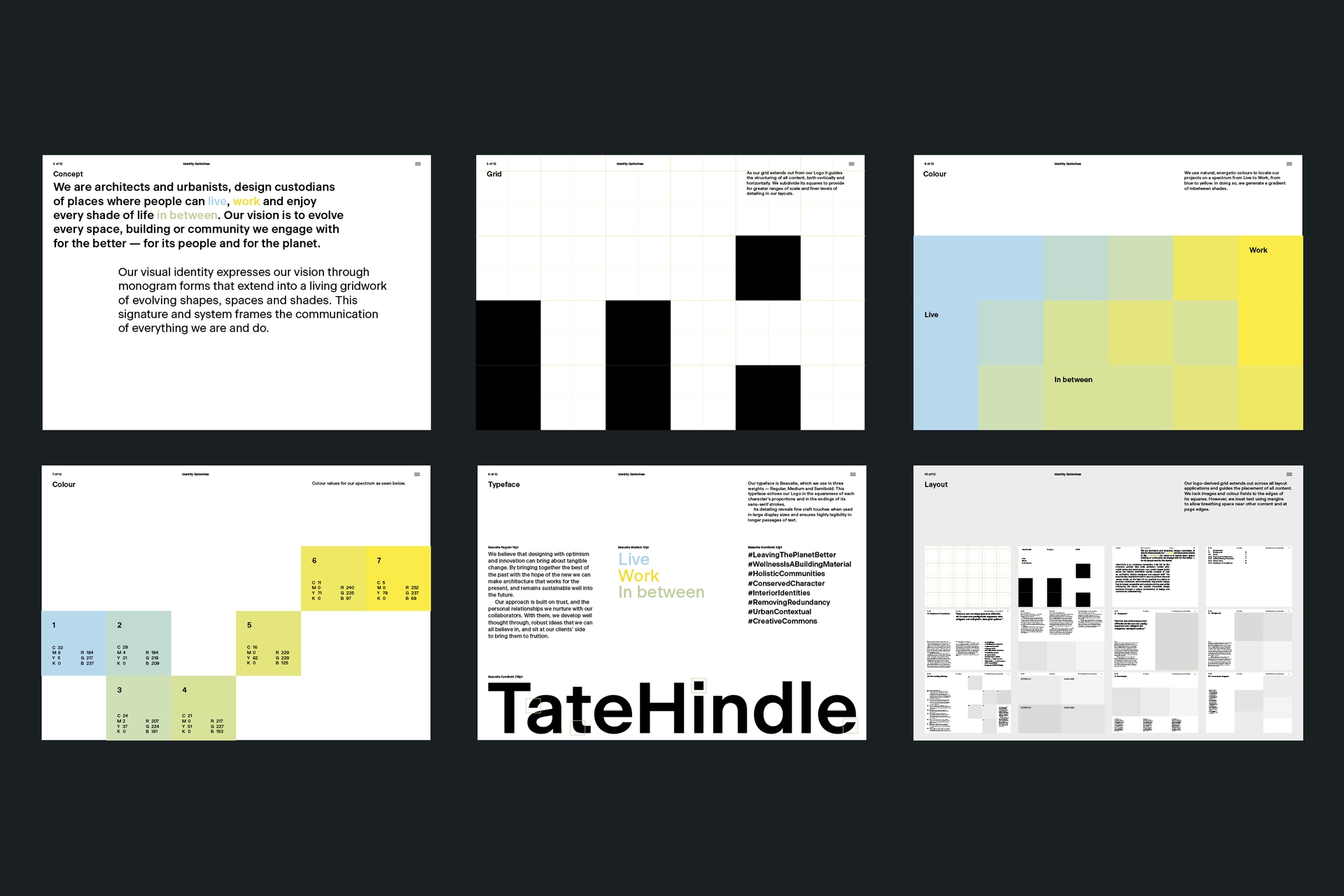
The website uses our grid to introduce the brand at large scale and then zoom to uncover and arrange finer levels of detail. This is supported by the square features and legibility of the typeface Beausite. It uses our colour gradient throughout to categorise works along a continuum rather than in siloed typologies and uses. This is supported by a series of core themes, developed through workshopping and searchable via hashtag across the site.
Words by: Emma Keyte
Website built by: Archive
Beausite by: Fatype
Identity

Digital