Cabaret
Cabaret at the Kit Kat Club
A new production that transforms the Playhouse into the Kit Kat Club and transports 1920s Berlin to 2020s London.
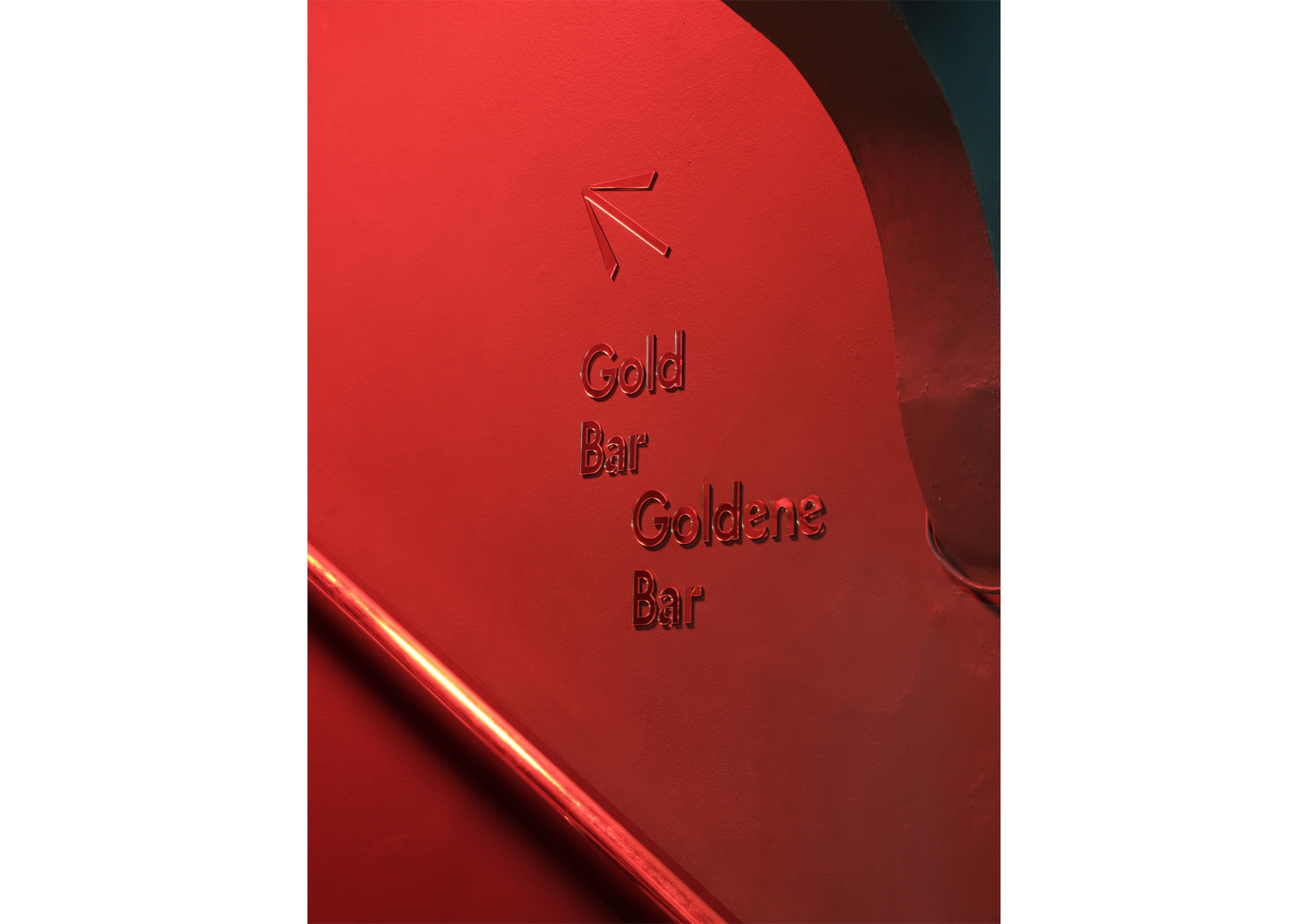
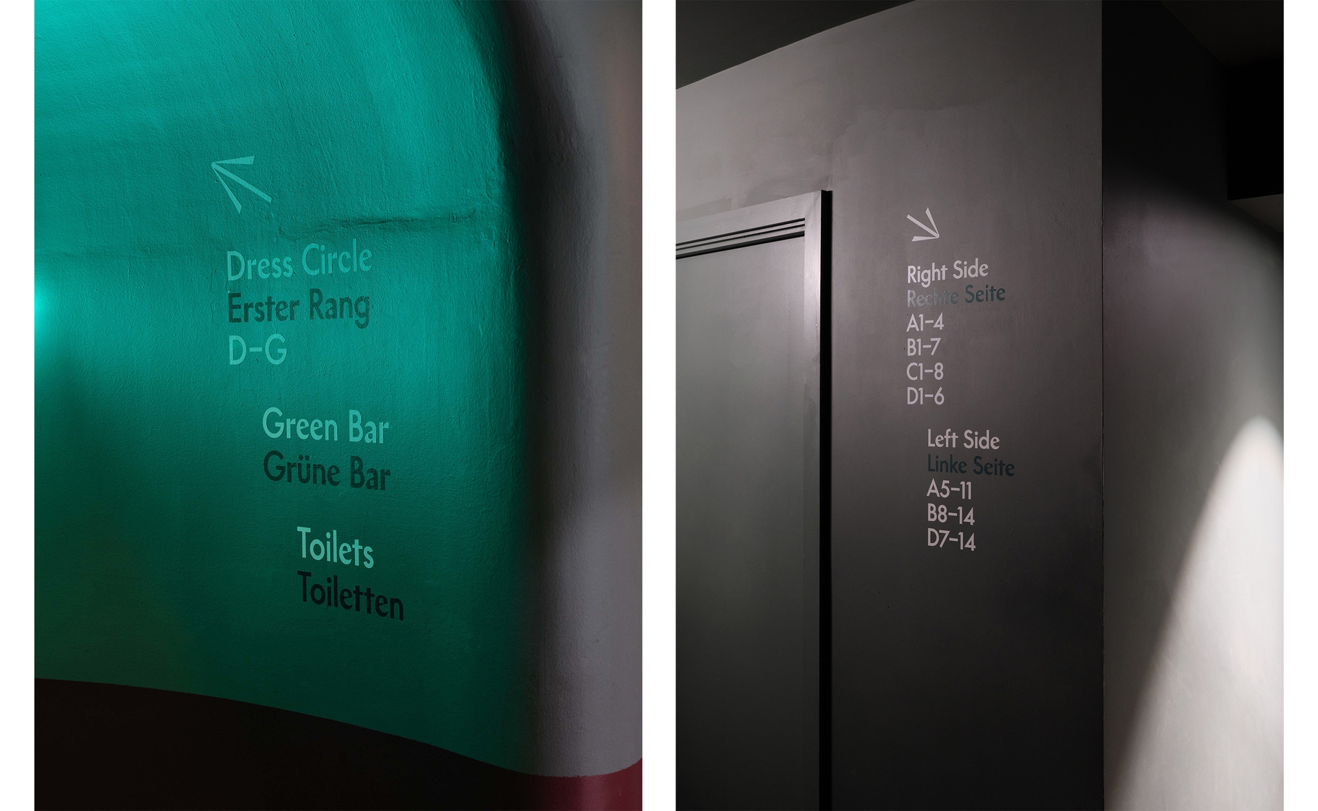
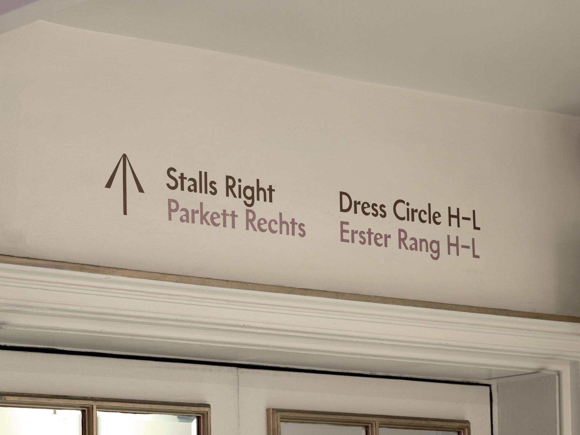
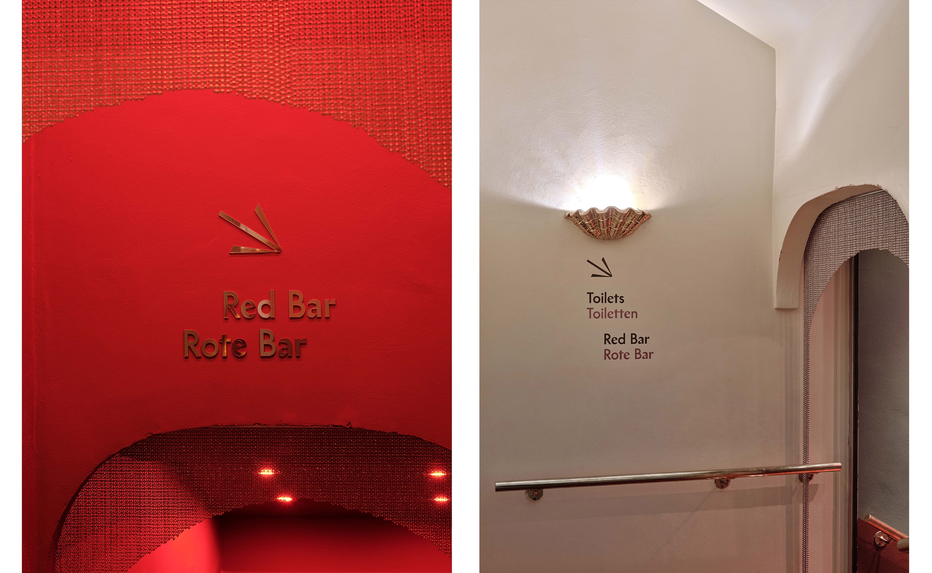
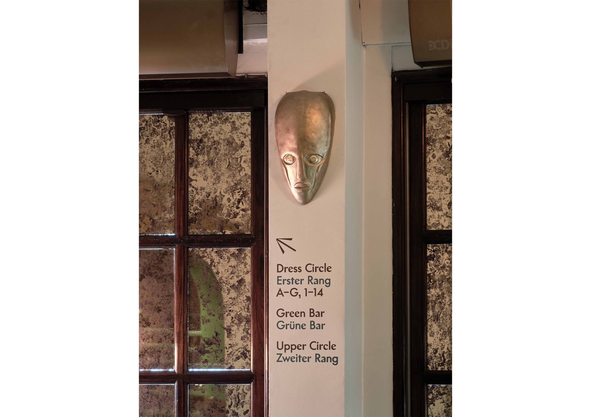
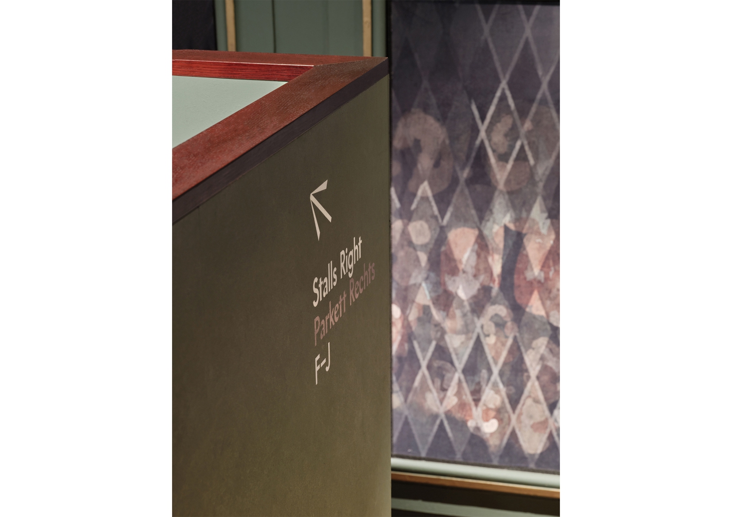
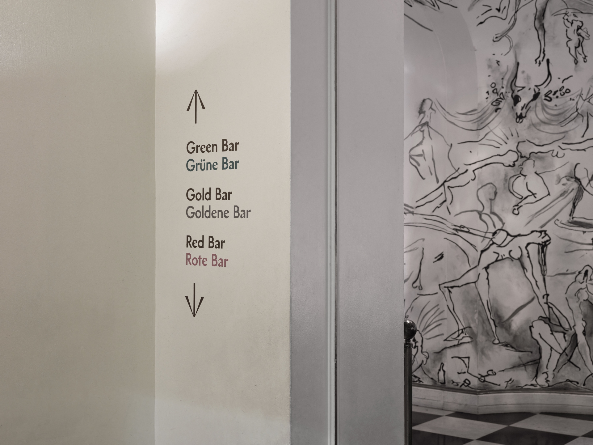
We created signage and wayfinding to help immerse and guide audiences.
Working closely with theatre designer Tom Scutt, we blended forms to evoke Cabaret’s themes of ambiguity.
We used coding to randomly combine Chap and Supreme, both contemporary re-imaginings of 1920’s typefaces.
Chap is a sharply angled sans serif while Supreme’s curves are inspired by Paul Renner’s Futura.
Subtle shifts between their strokes play out across all titling and is echoed in our hand-drawn pictograms.
A new production that transforms the Playhouse into the Kit Kat Club and transports 1920s Berlin to 2020s London.
We created signage and wayfinding to help immerse and guide audiences.
Working closely with theatre designer Tom Scutt, we blended forms to evoke Cabaret’s themes of ambiguity.
We used coding to randomly combine Chap and Supreme, both contemporary re-imaginings of 1920’s typefaces.
Chap is a sharply angled sans serif while Supreme’s curves are inspired by Paul Renner’s Futura.
Subtle shifts between their strokes play out across all titling and is echoed in our hand-drawn pictograms.
Read more
“I wanted it to be as exciting as it feels for me to go to a queer party in East London, now. It is about capturing an atmosphere that could be translated to
100 years ago, but more by skimming stones through time, with décor and costumes, so it isn’t relegated to something that happened in the past.
You want a sense of history, but you also want it to feel prescient.”
Tom Scutt
Theatre Design by Tom Scutt
Chap typeface by Schick Toikka
Supreme typeface by Lineto
Photography by Thomas Adank