SPPARC
SPPARC is a London based architecture studio with an eclectic oeuvre.
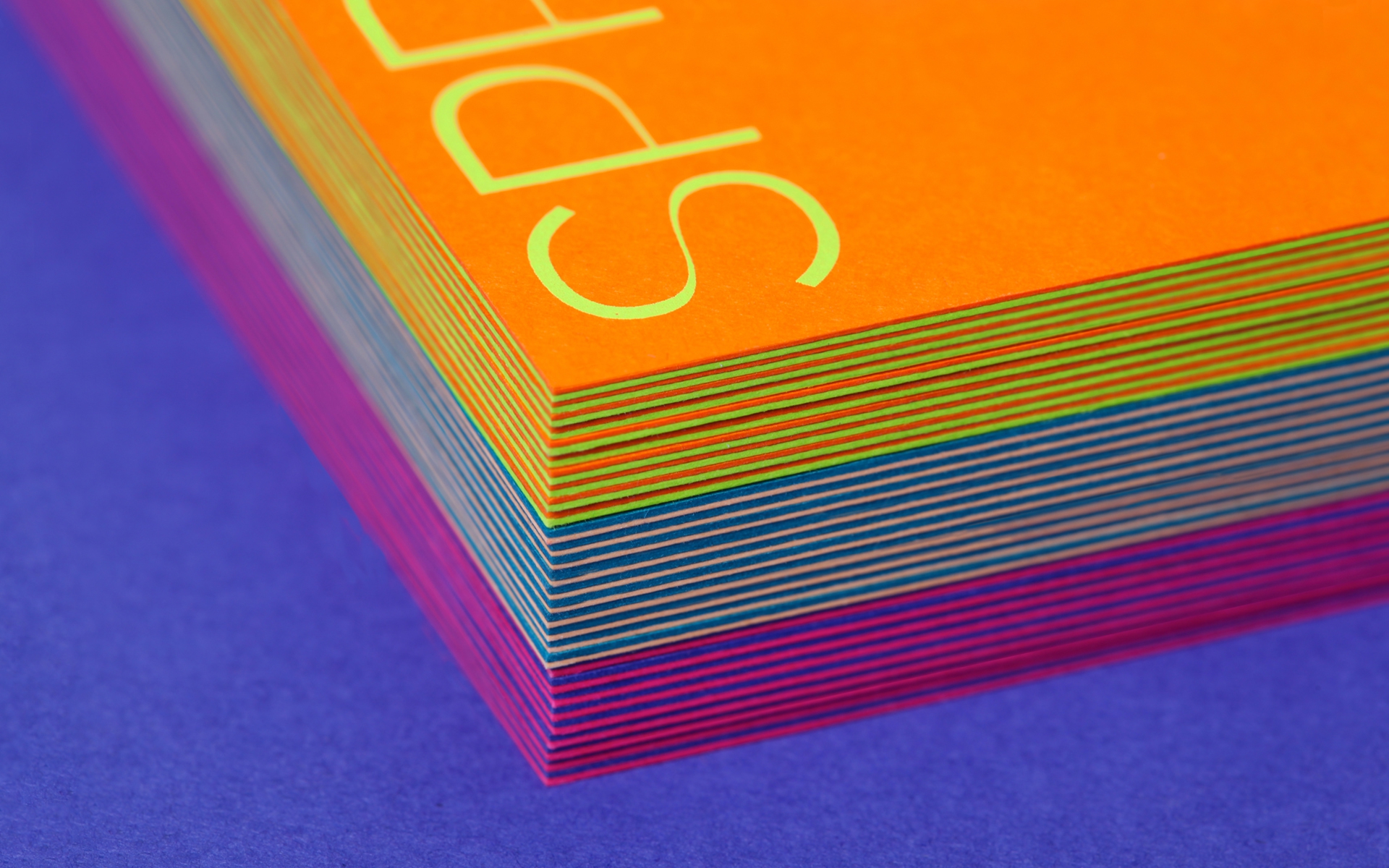
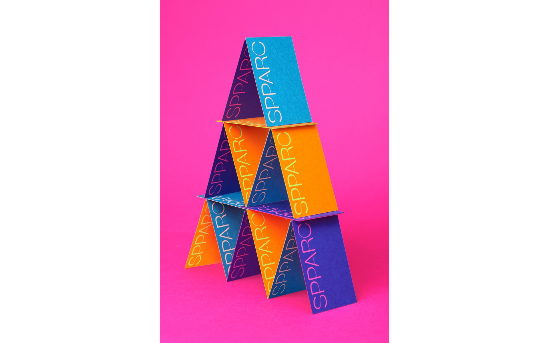
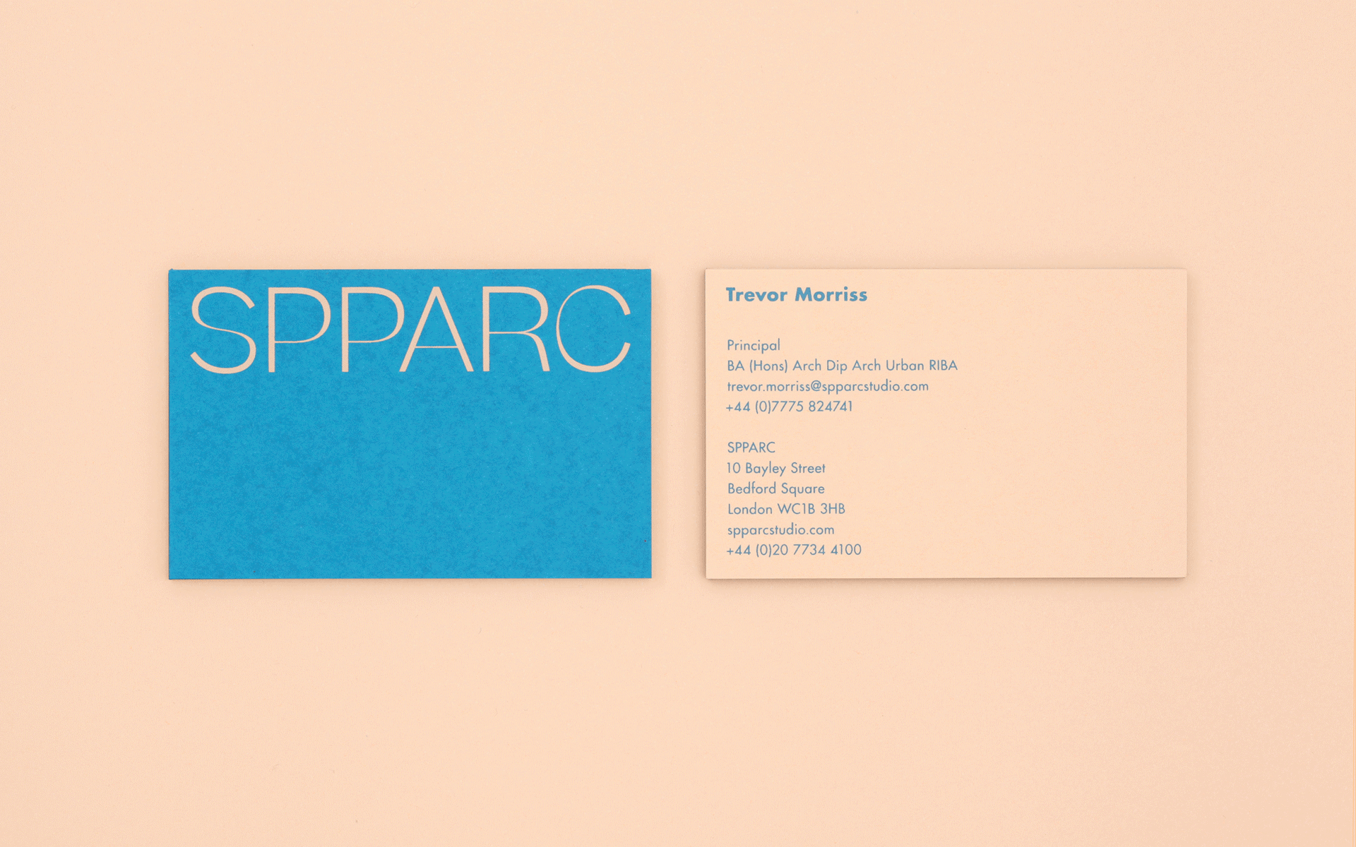
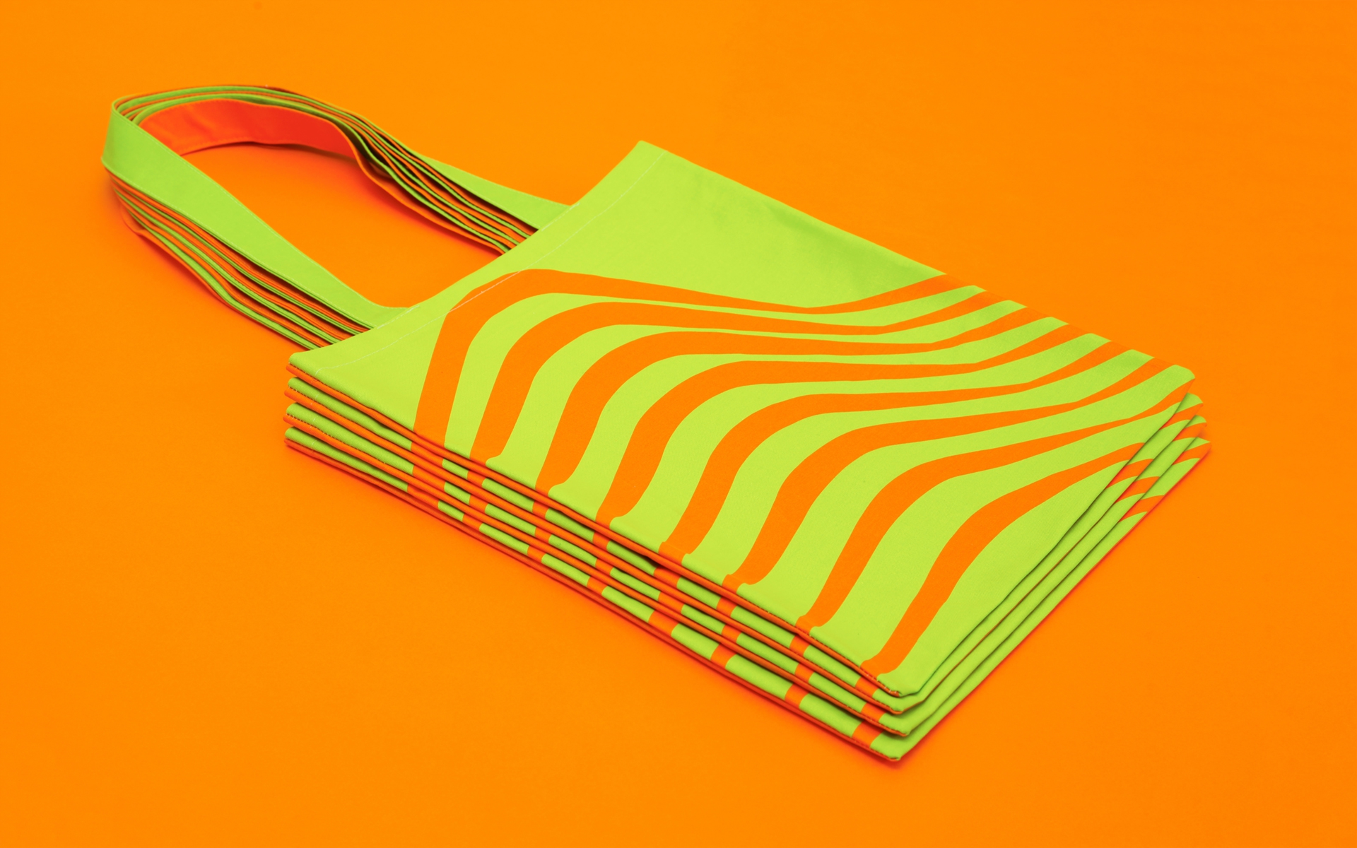
We created a new visual identity around the brand idea of ‘eclectic order’. The refreshed identity brings the practice's distinct architectural works together like a pop-art collage—an assemblage of iconic forms and distinct stories.
We created a new visual identity around the brand idea of ‘eclectic order’. The refreshed identity brings the practice's distinct architectural works together like a pop-art collage—an assemblage of iconic forms and distinct stories.
Read more
Editorially, we introduce each work as a story, capitalising on the engaging names and natures of the projects; Butterfly; Music Box; Candle Factory. We tell these stories in a storybook style, using a chapter structure. Storybook-style descriptions open up SPPARC’s approach to audiences beyond the architectural industry.
Beatrice typeface by Sharp Type
Website built by Neal Fletcher