Whittaker Parsons
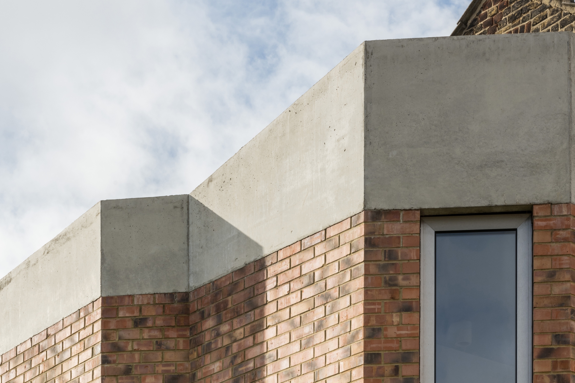
Whittaker Parsons are architects whose work ranges from pavilions to private homes, community centres to concept stores, all of them the product of a principled, resourceful approach.
Read more
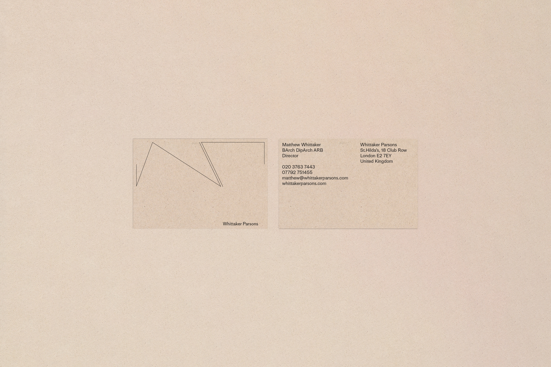
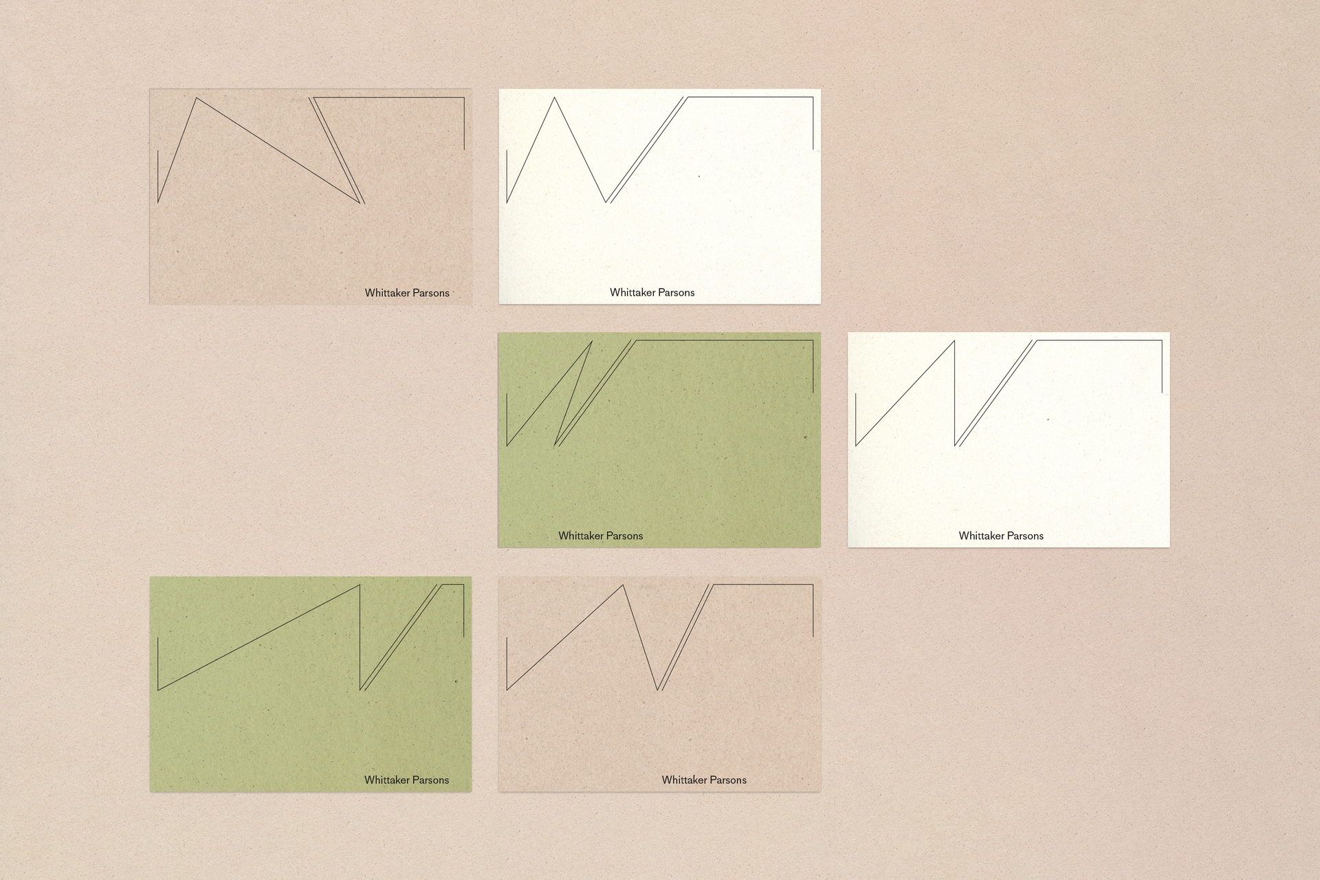
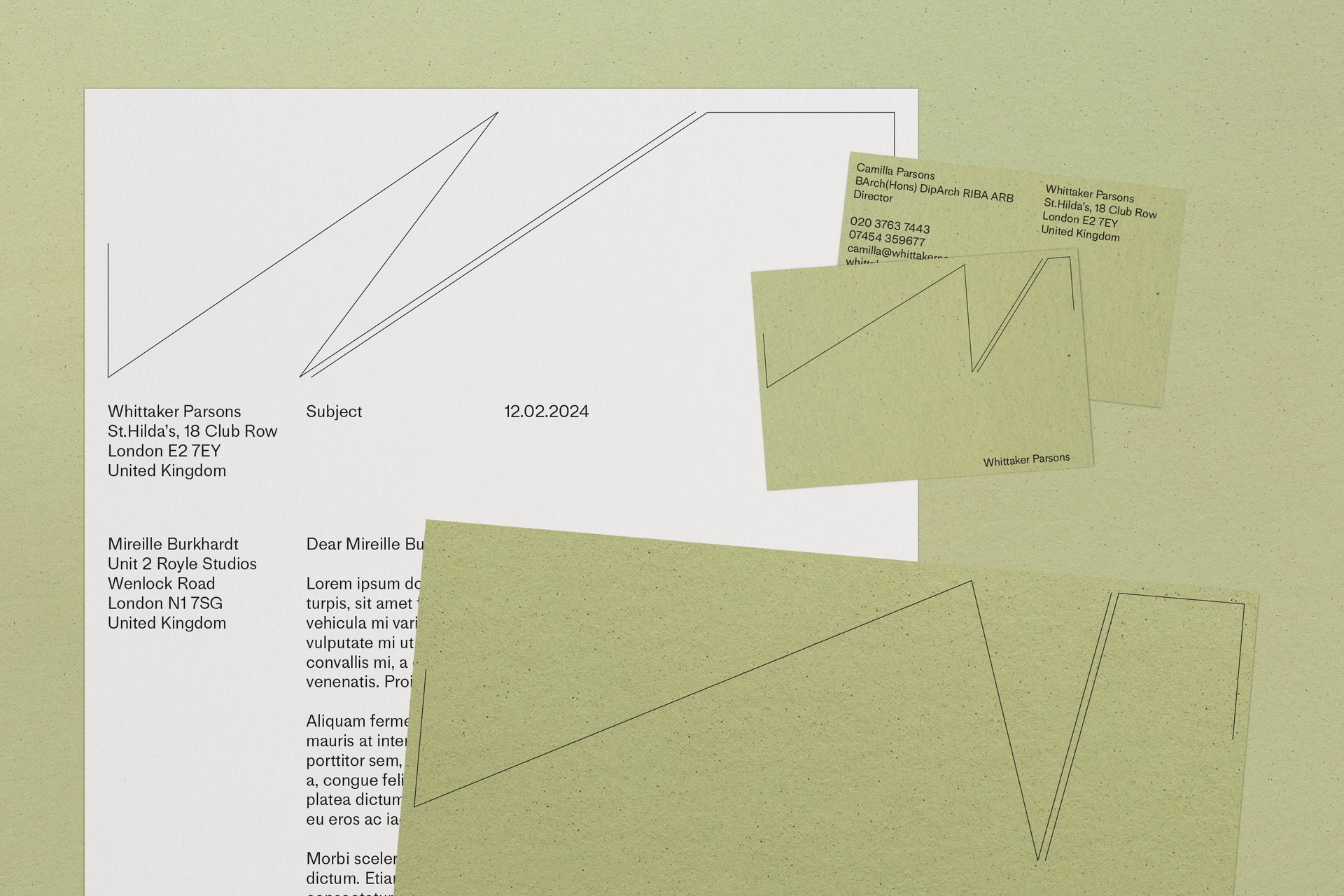
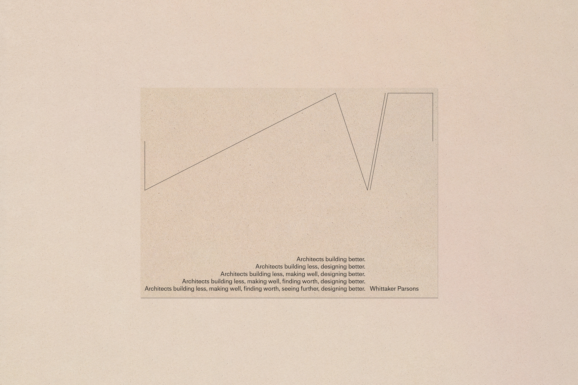
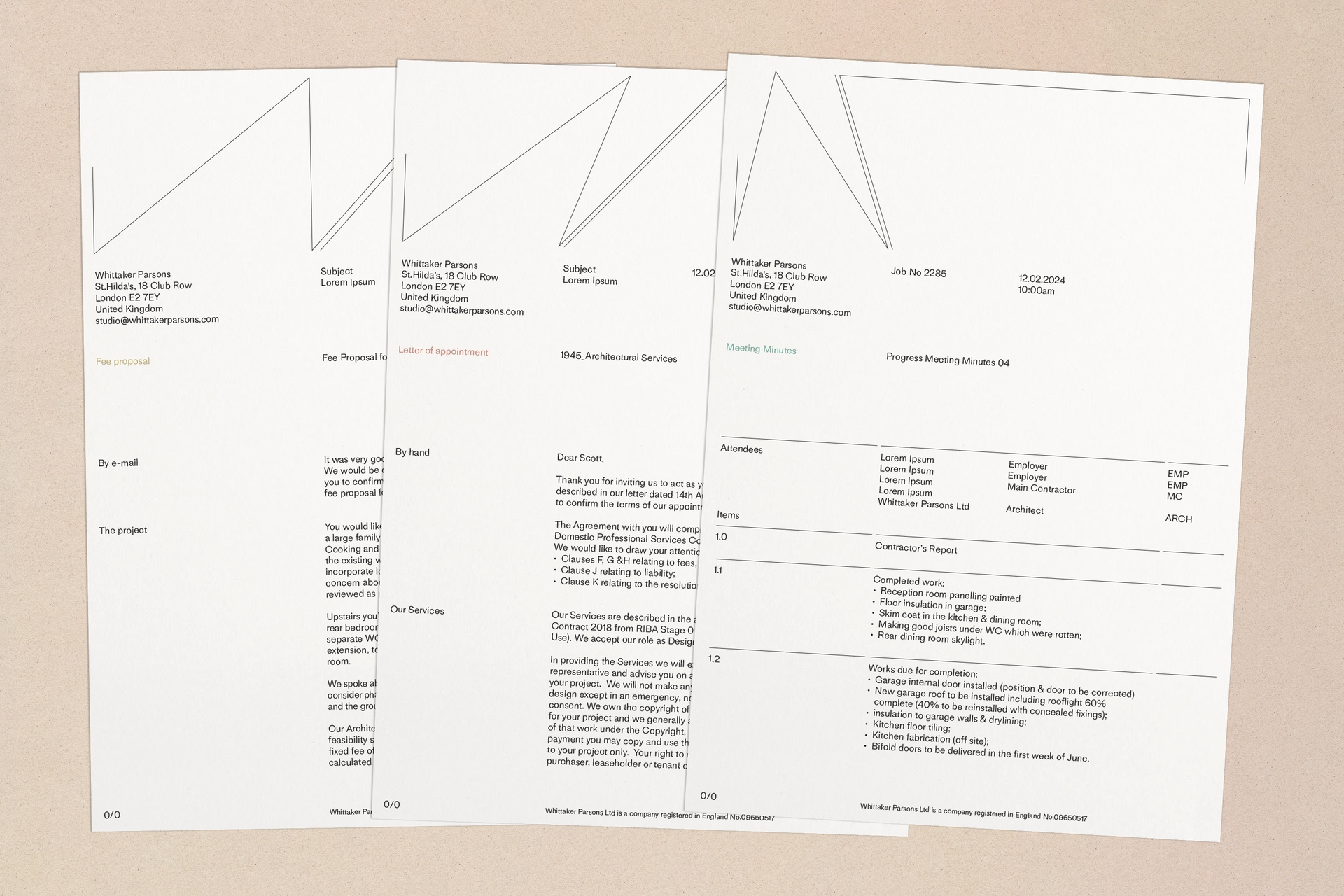
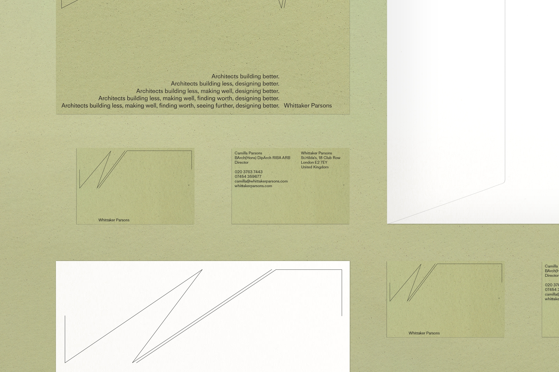
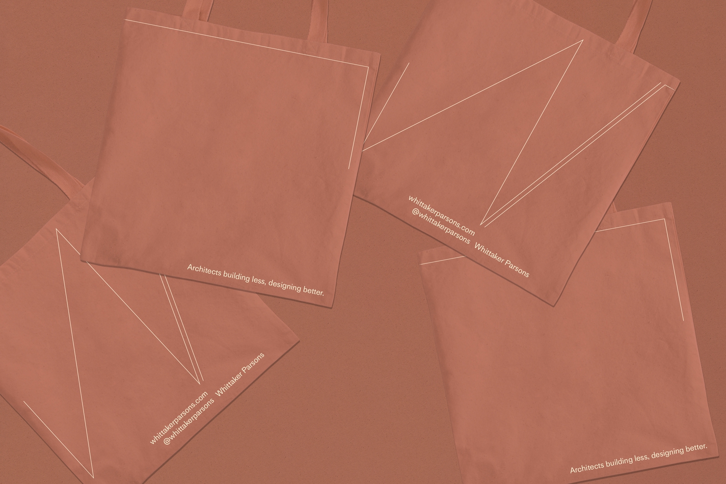
We created a new visual identity inspired by tectonics, the way WP seek balances across built forms, material choices and human relationships. This is led by signature W and P forms, continually shifting in position as a partnership and in relation to surrounding spaces and changing content. The concertina-like folds echo signature lines in their works while earthy tones and recycled materials across printed applications emphasise a commitment to healthy and progressive materials. The typeface Medium LL blends angularity (especially in its terminals) and a very human tone of voice.
Words by Emma Keyte
Website build by M/M
Medium LL Typeface by Lineto