Bubu — Binding together more than books.
Bubu is a Swiss bindery founded in 1941 by Albert Burkhardt and subsequently governed by both his son Hans and, as of 2013, his grandson Christian Burkhardt.
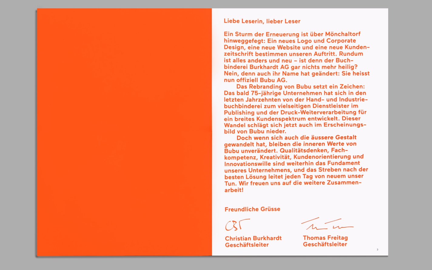
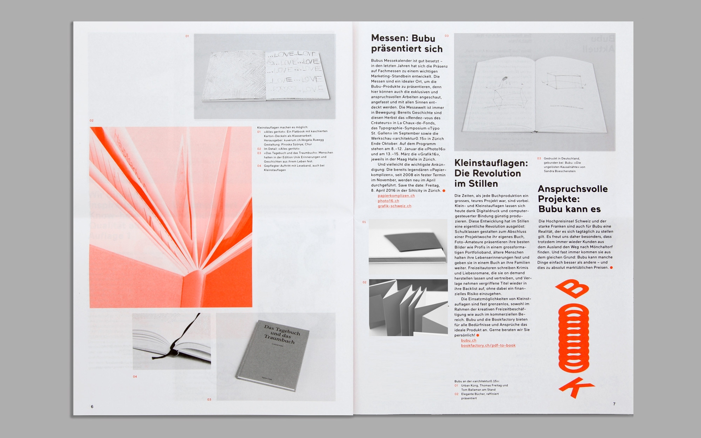
We created a new visual identity to coincide with this latest chapter for Bubu and to support its widening business strategy for the years ahead — to remain rooted in a strong sense of traditional craft while opening up further areas of service and expertise.
We created a new visual identity to coincide with this latest chapter for Bubu and to support its widening business strategy for the years ahead — to remain rooted in a strong sense of traditional craft while opening up further areas of service and expertise.
Read more
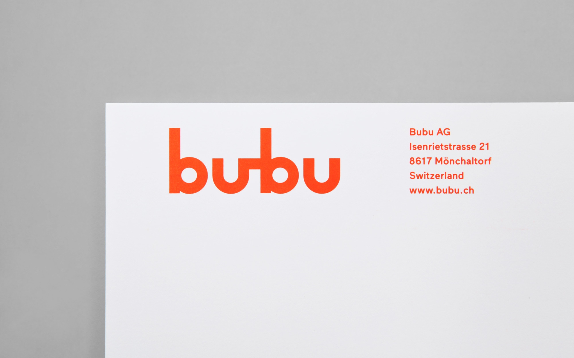
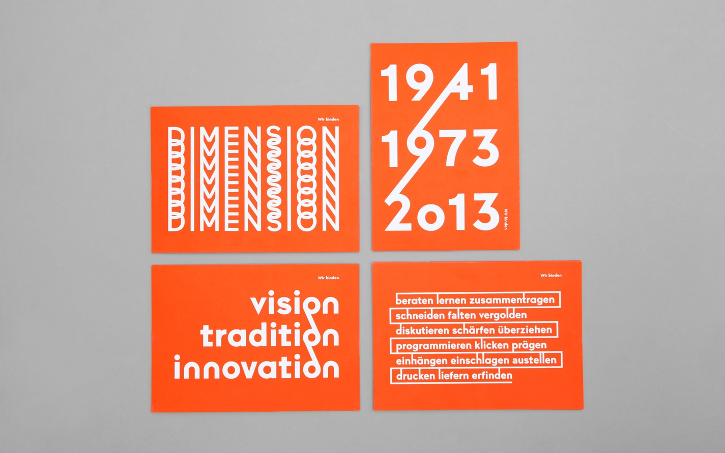
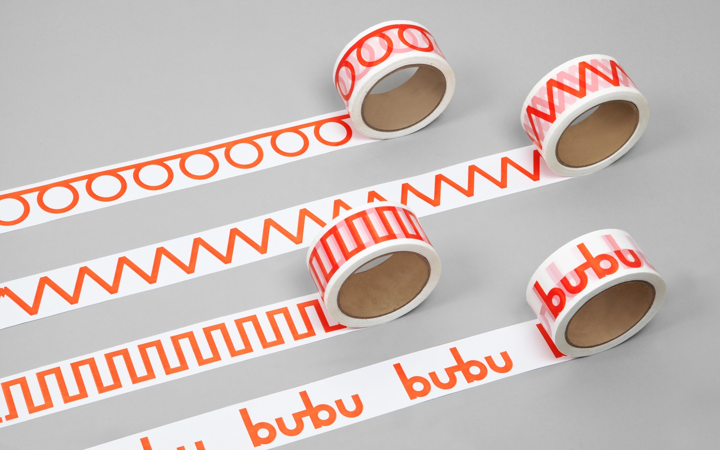
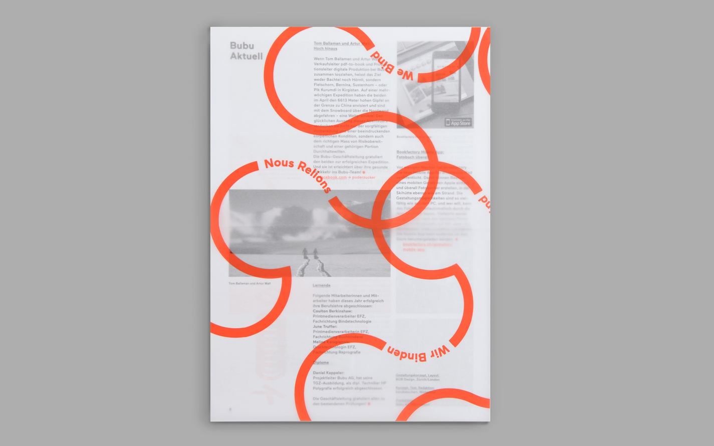
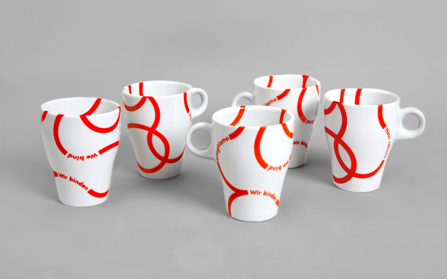
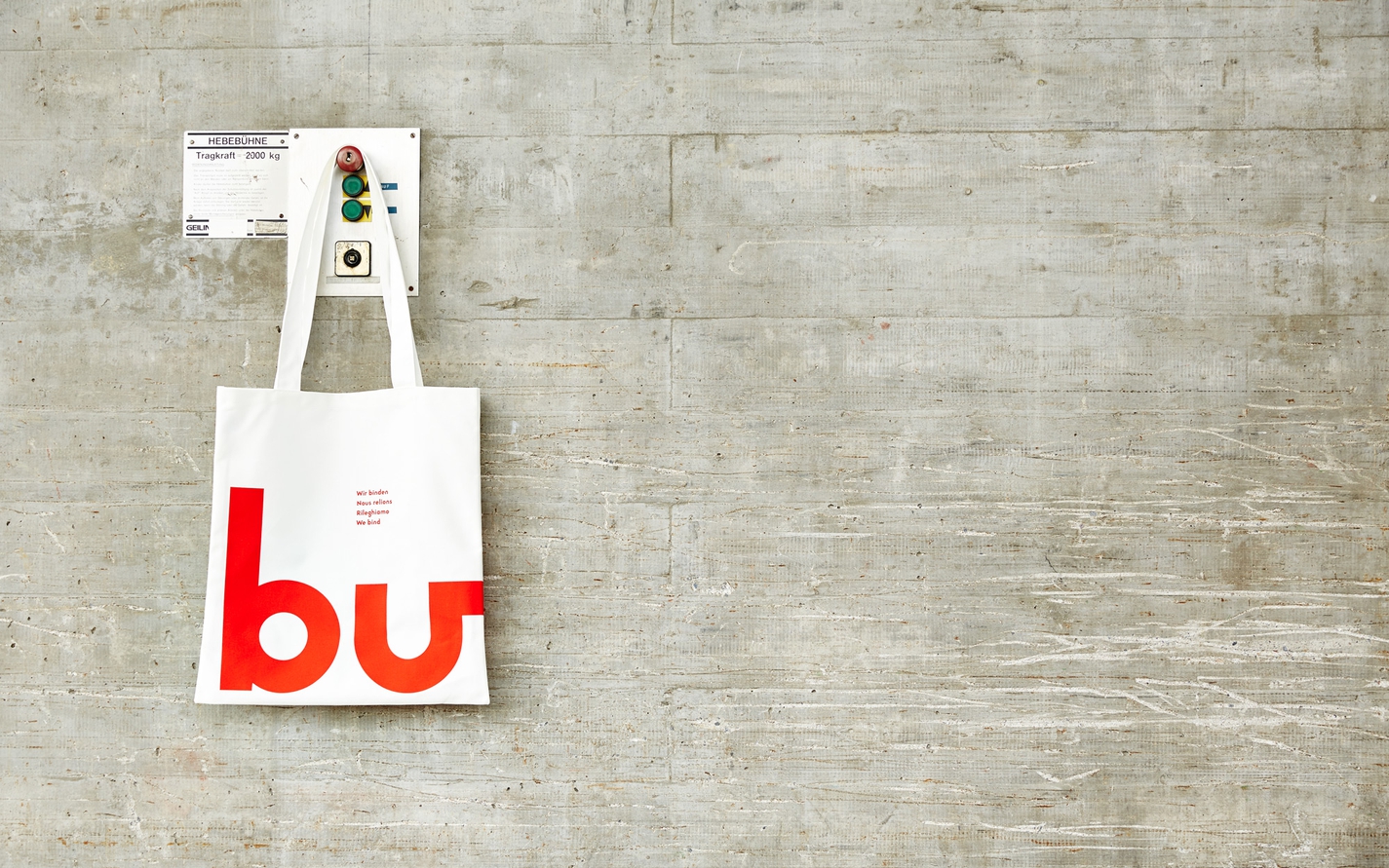
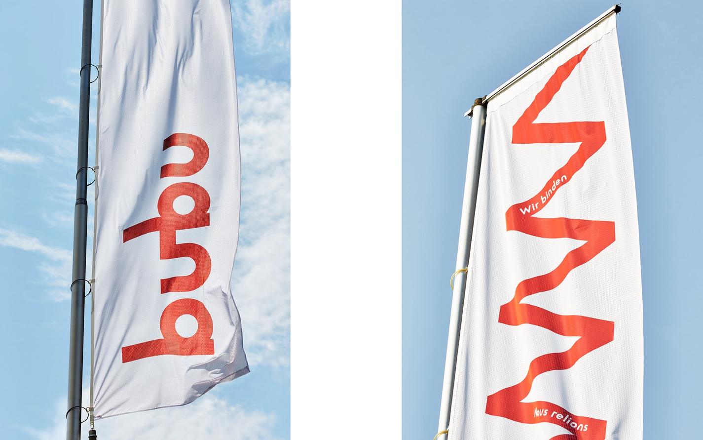
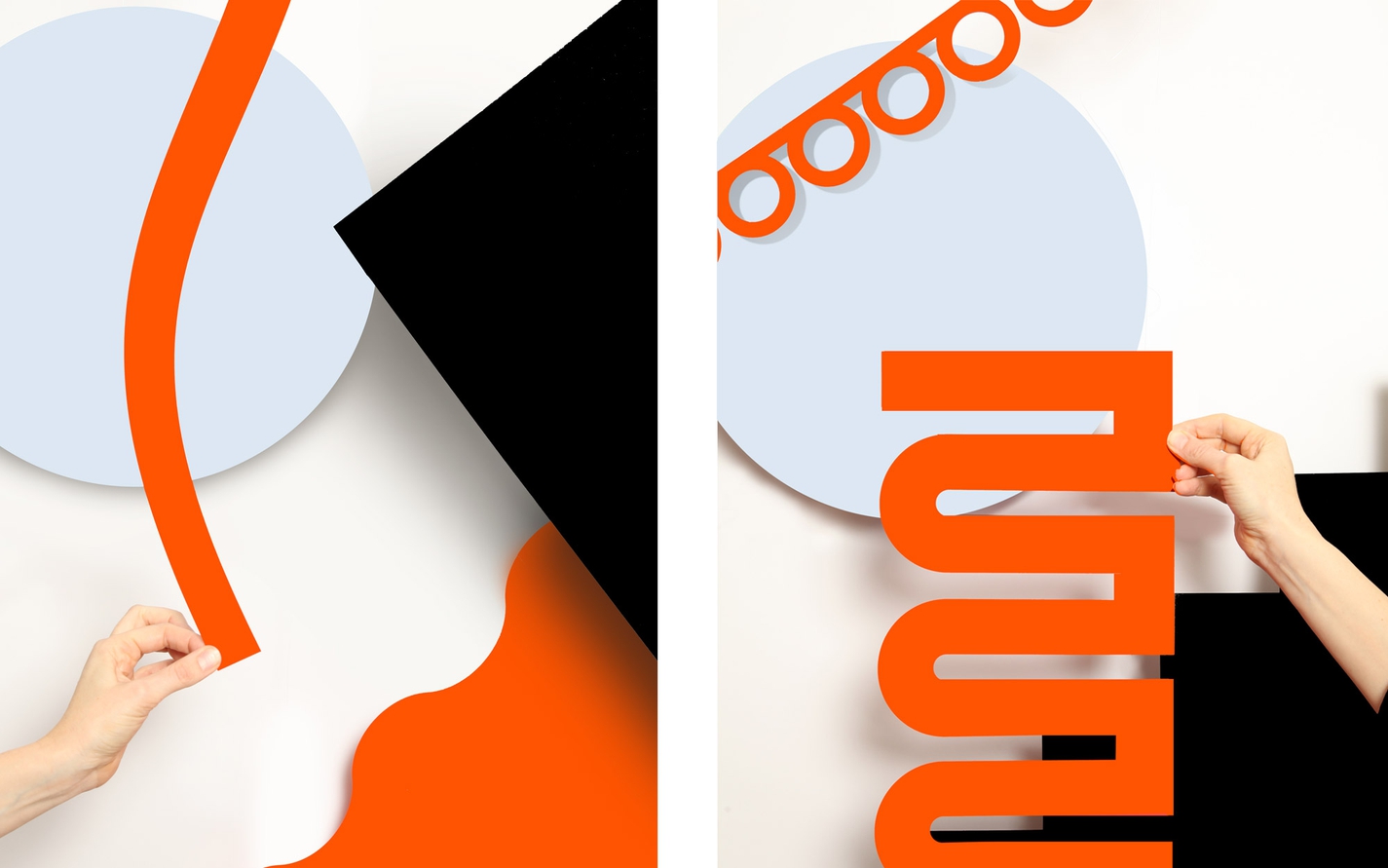
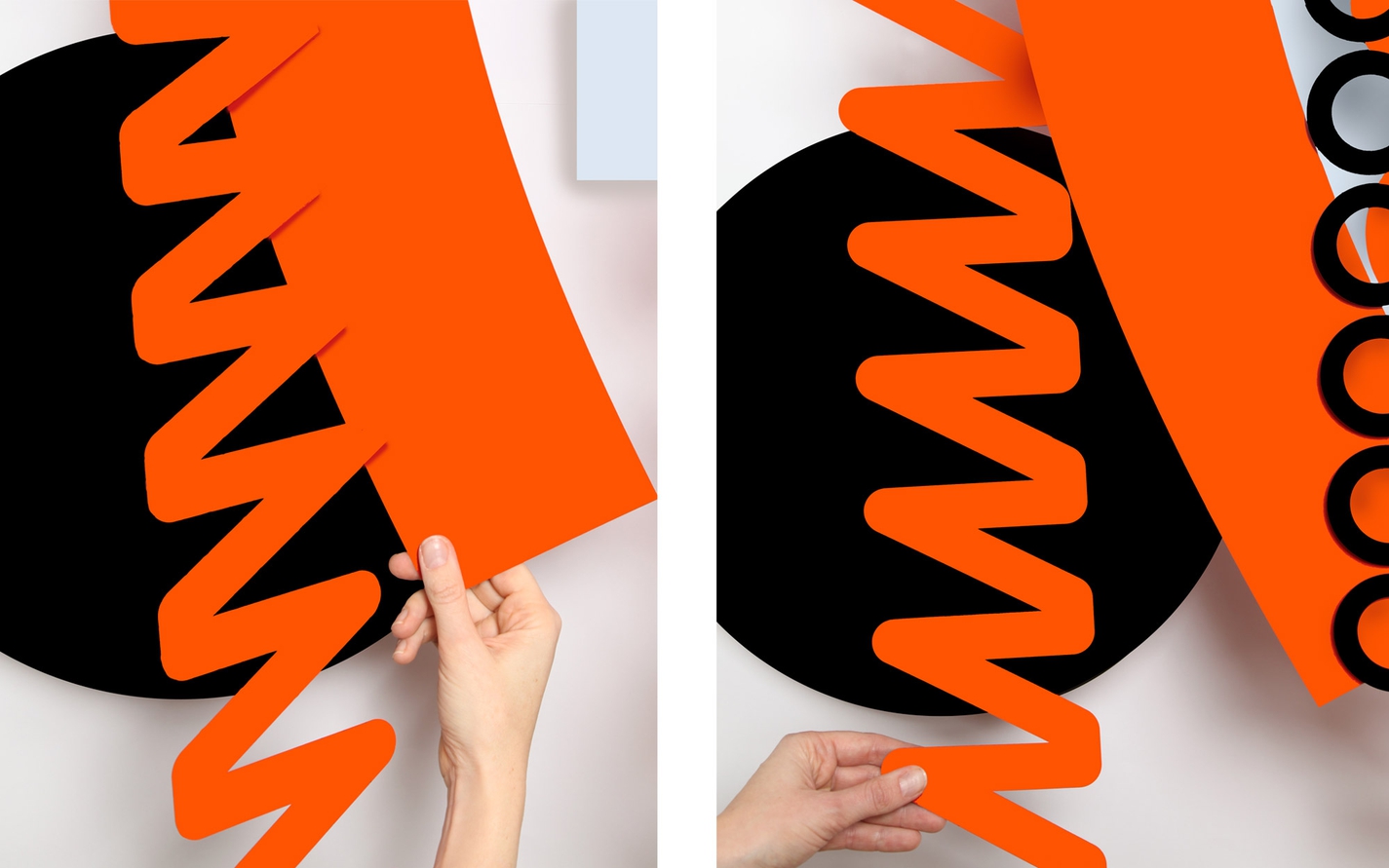
used over three generations of binding and itself a compound word or joining of parts; ‘bu’ and ‘bu’. By using a typographic ligature we place the emphasis on this binding action — a red linking stroke that extends playfully throughout the visual identity.
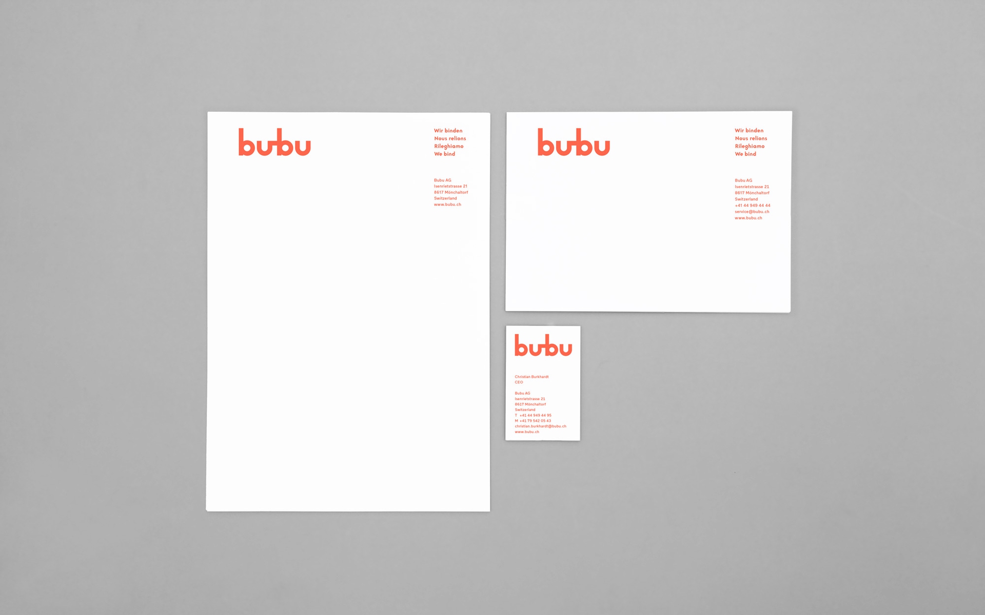
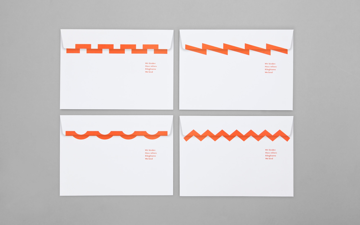
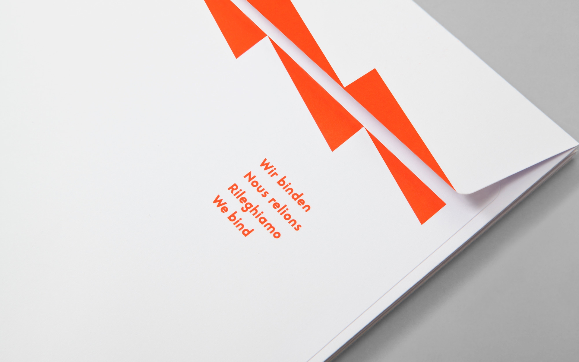
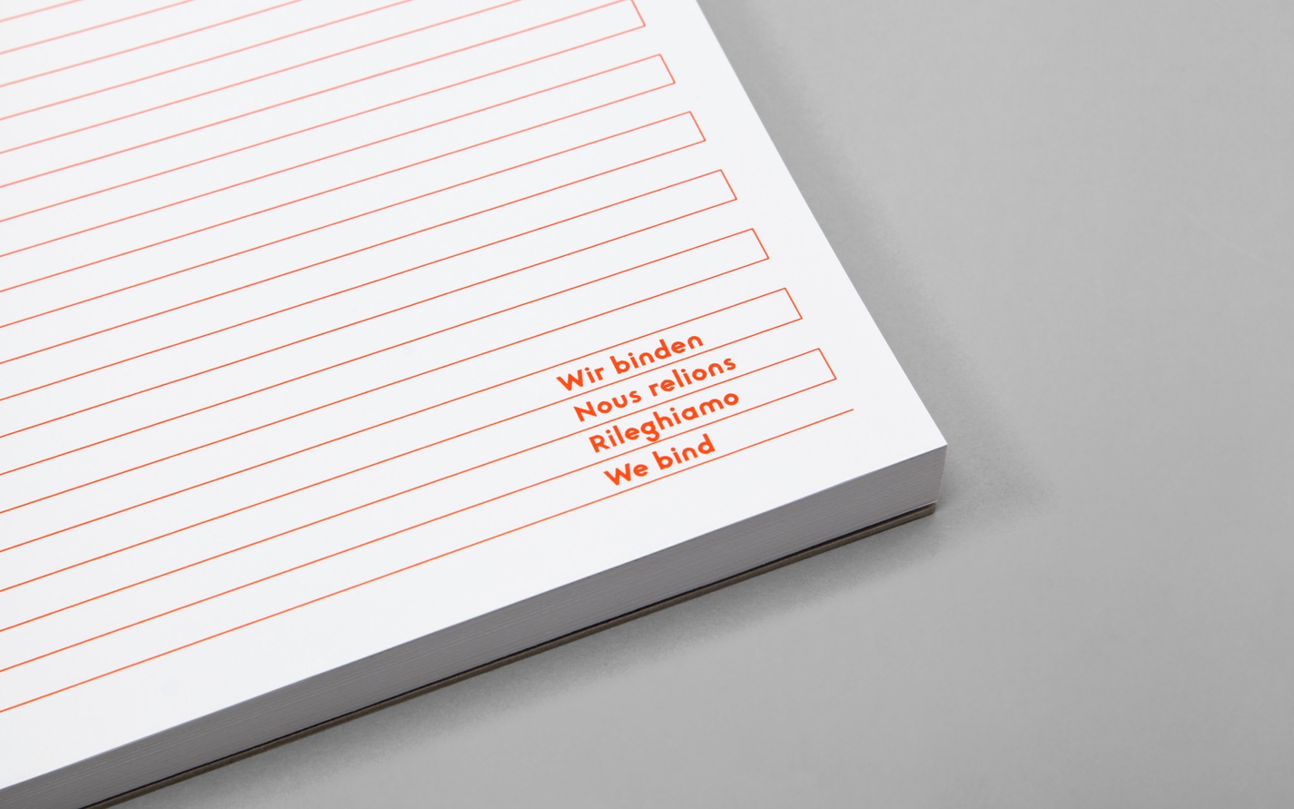
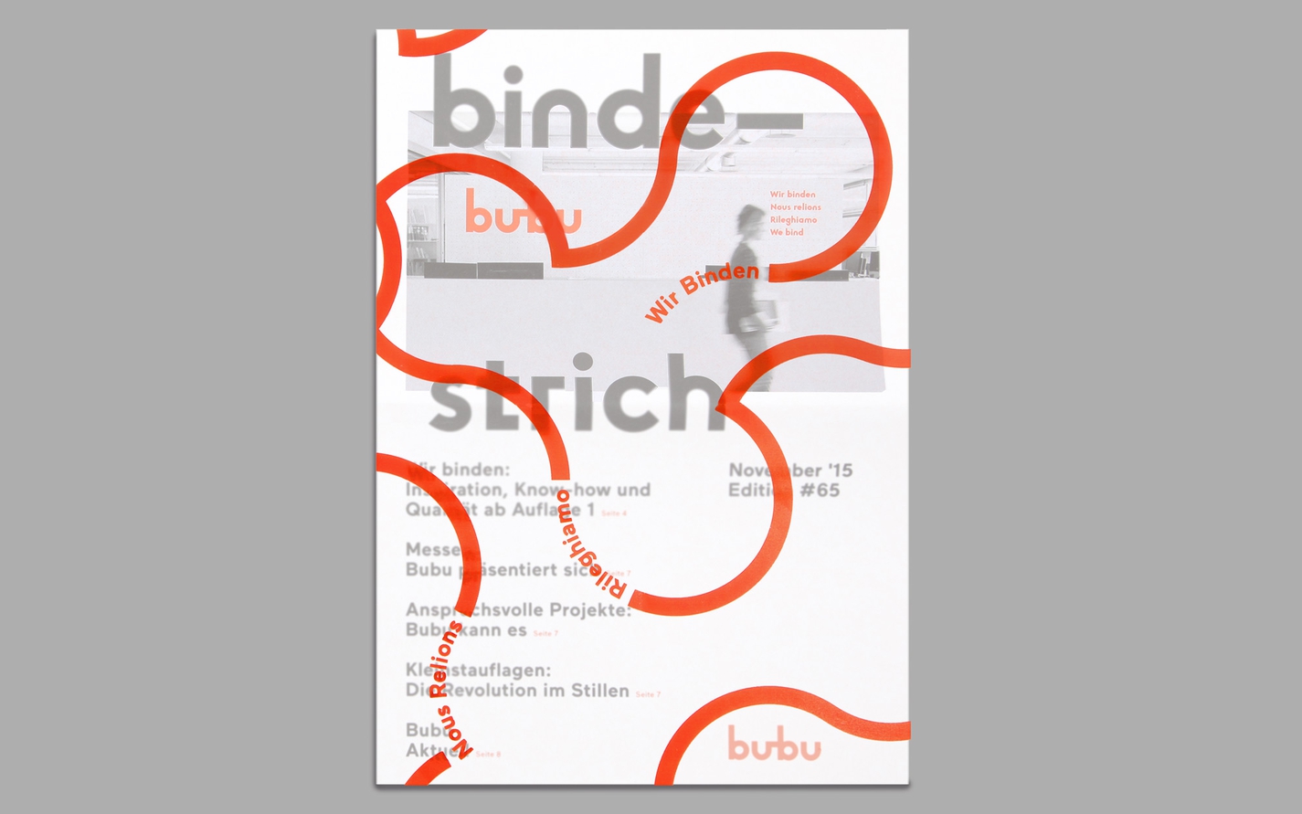
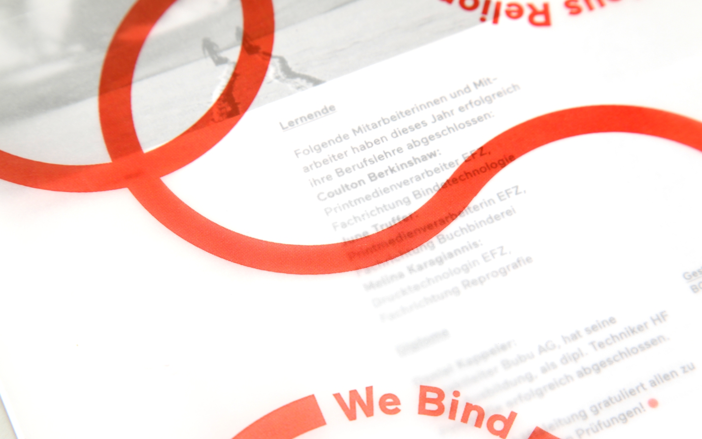
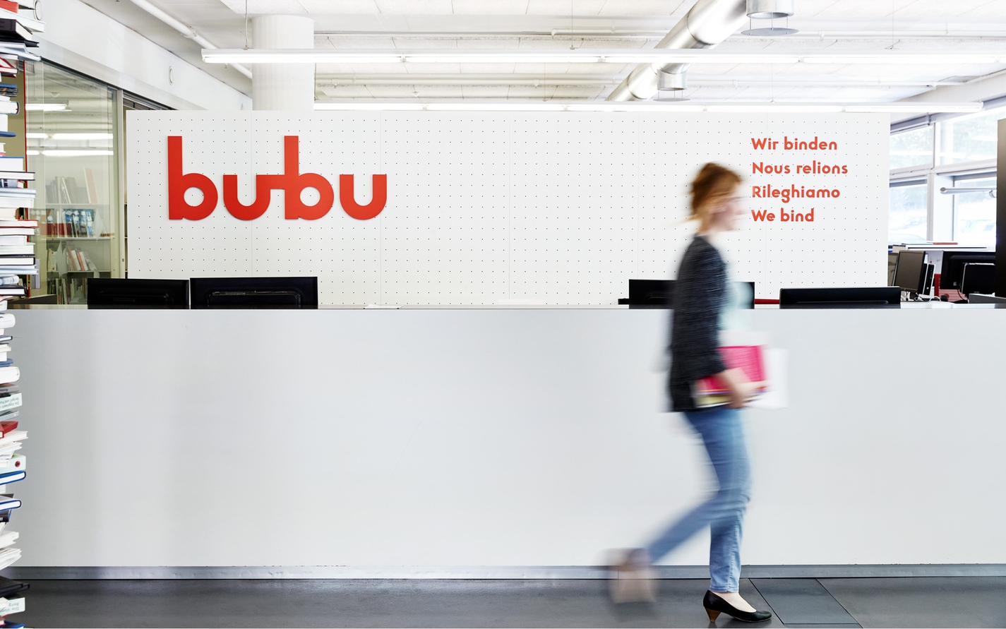
The claim “Wir Binden” also articulates this concept through language. “We Bind” can be interpreted as both specific to books and expansively to Bubu’s approach to strategies, techniques, sectors, people and design going forward.
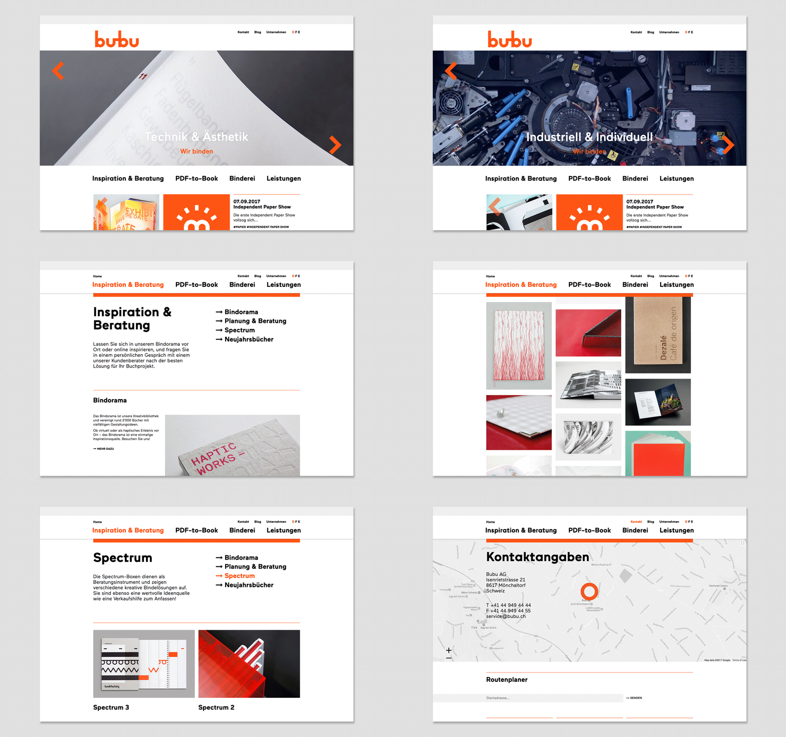
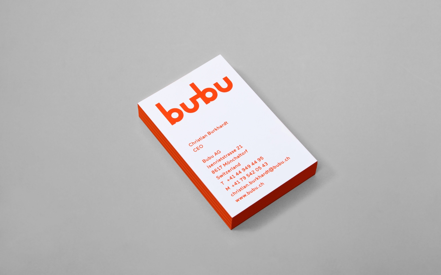
Scope for this project included copywriting, strategy and the redesign of all Bubu’s printed and communication materials: logo and brand language; stationery; packaging; signage; vehicular graphics; website.
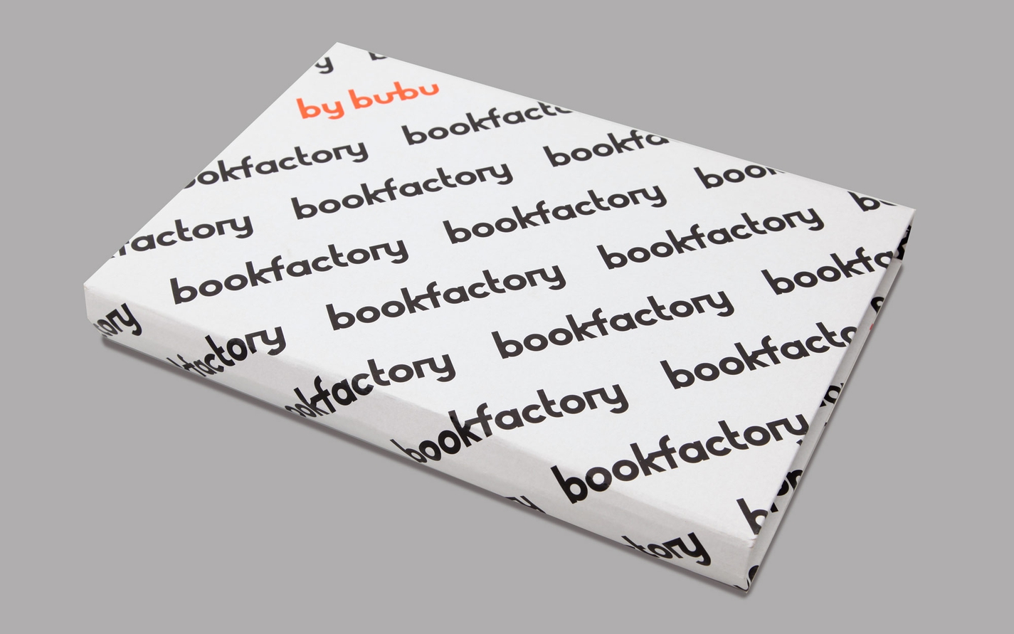
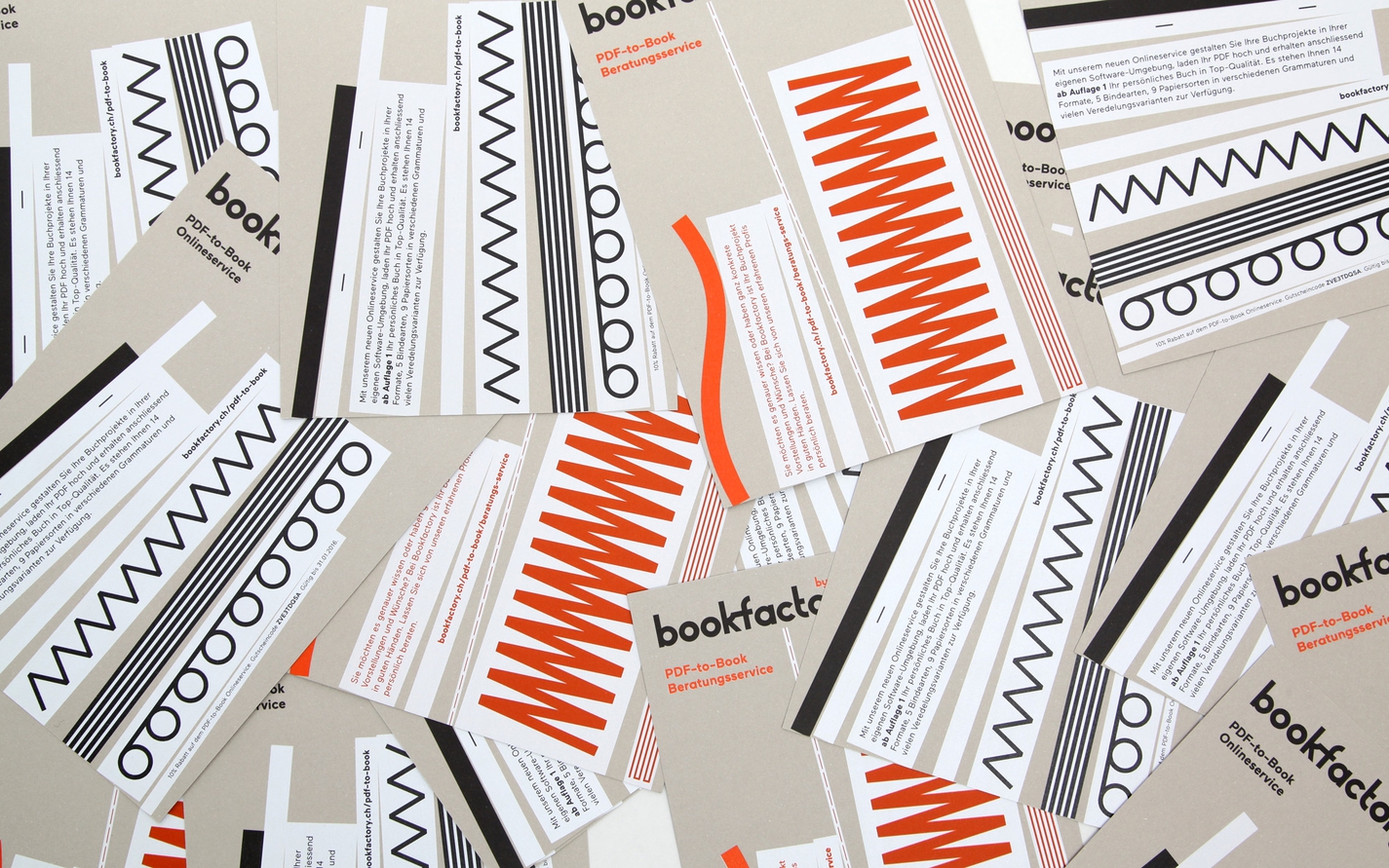
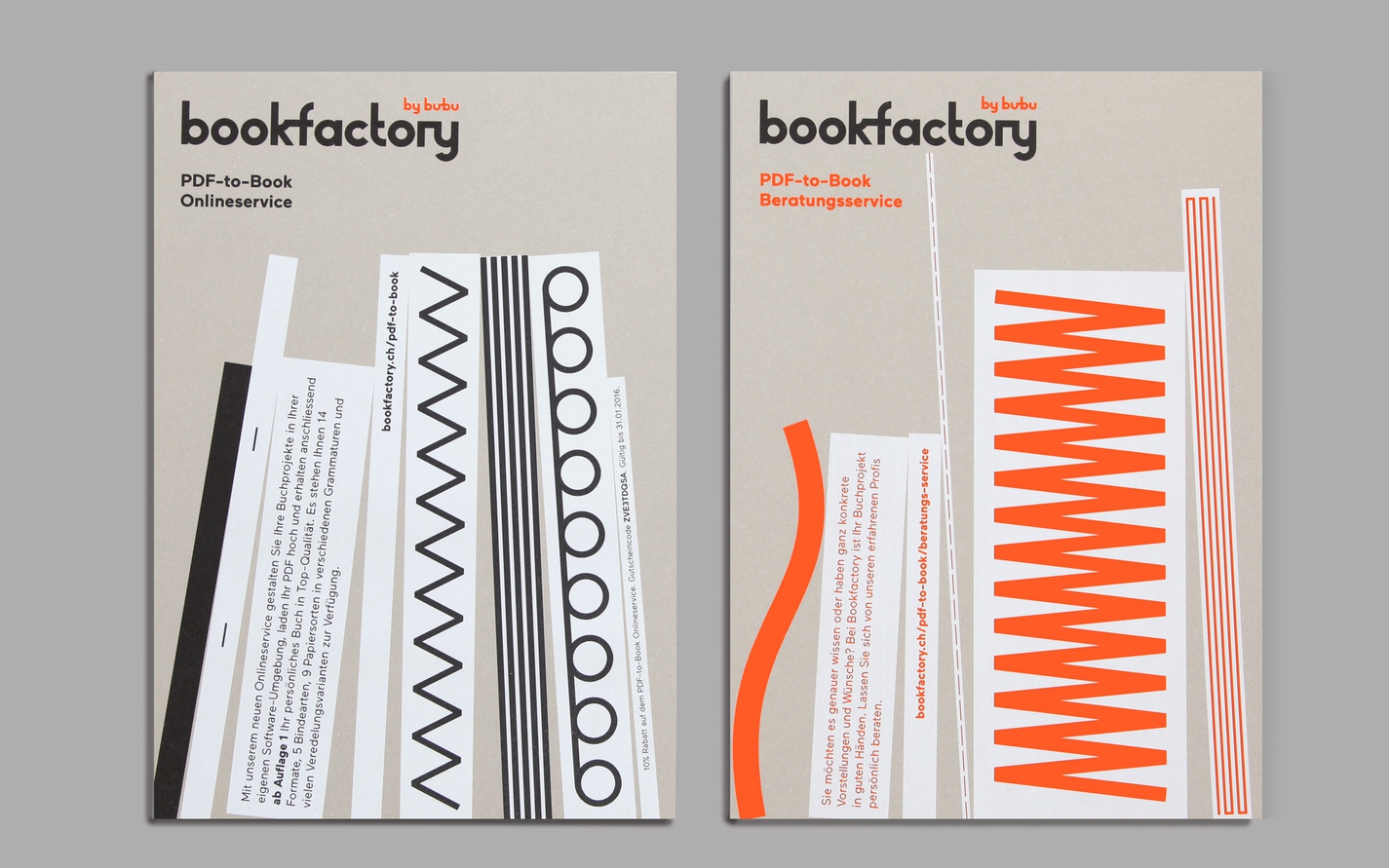
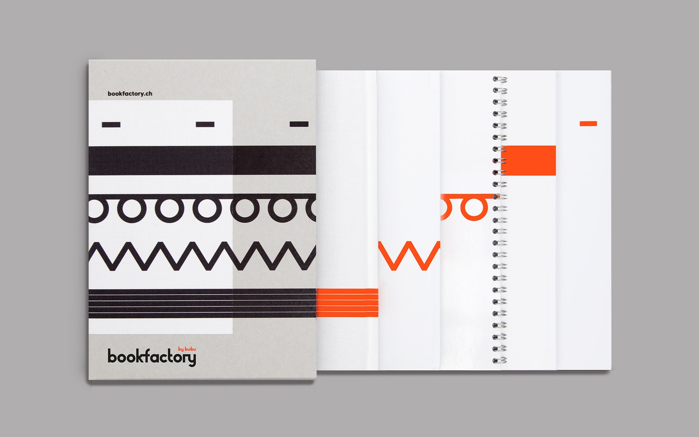
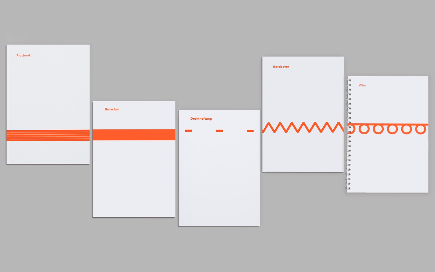
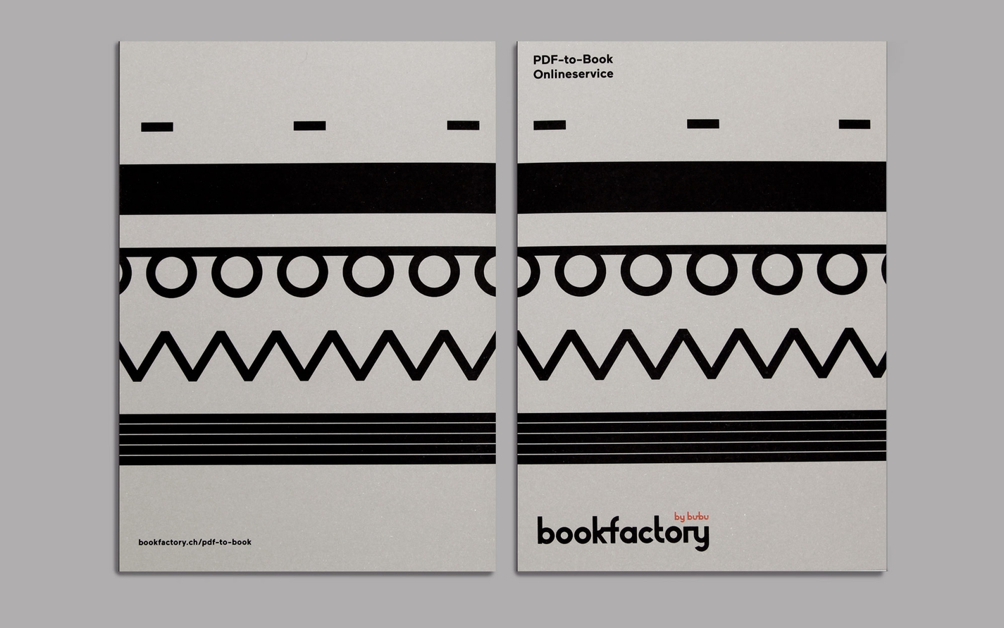
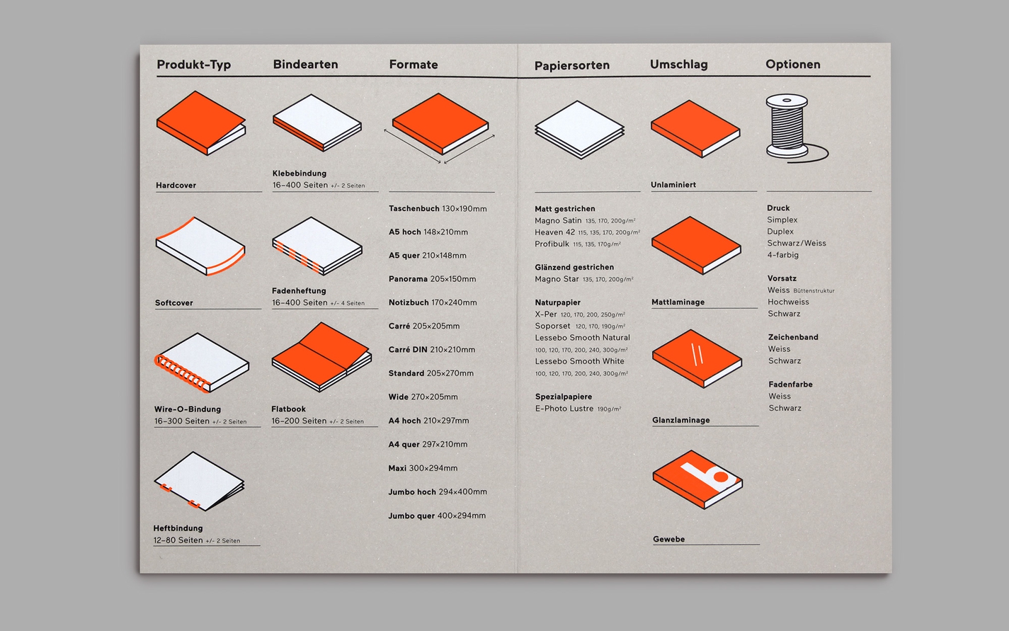
It also included the redesign and positioning of Bubu’s online sister brand Bookfactory.
Identity

Environmental


Digital
