Frida Kahlo: Making Her Self Up
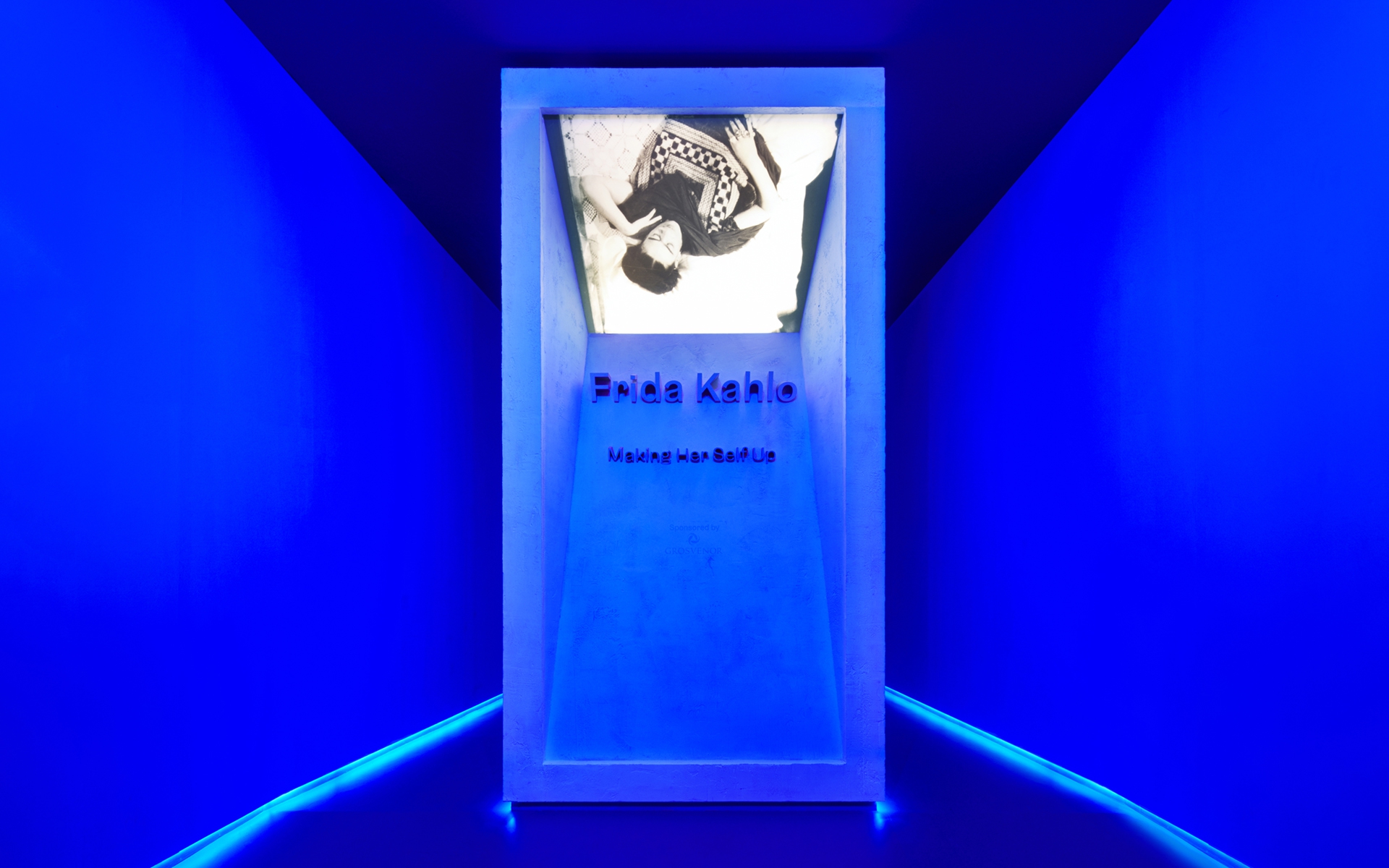
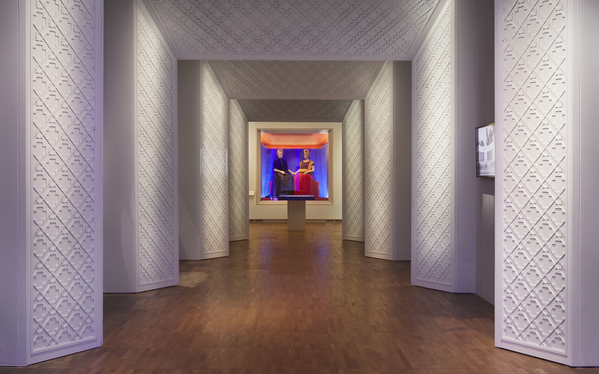
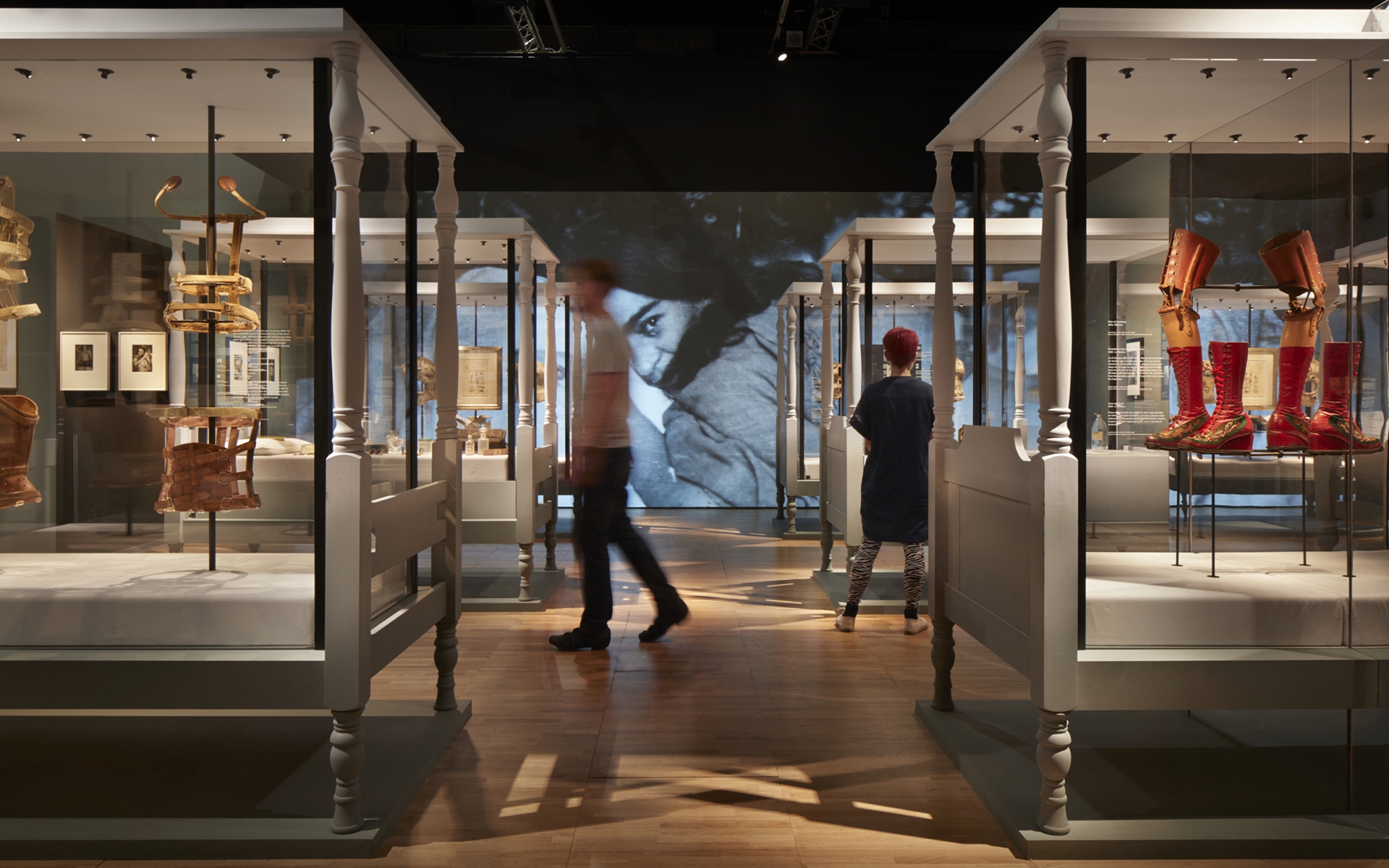
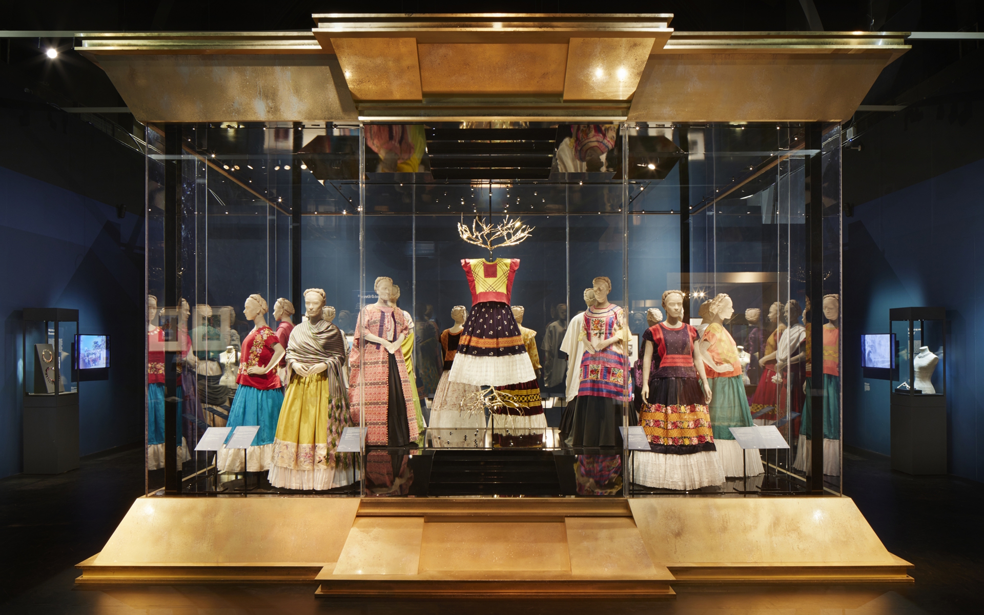
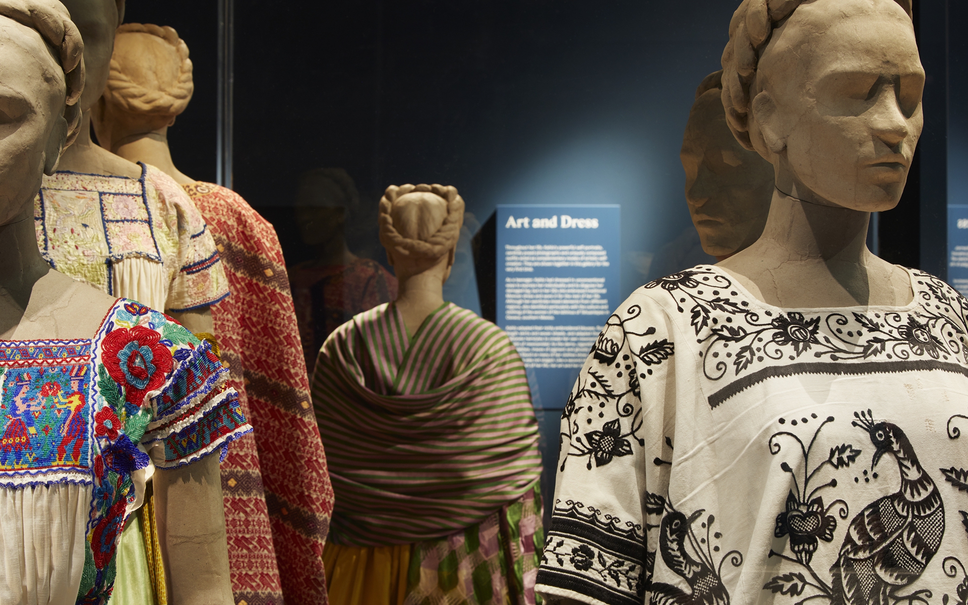
Making Her Self Up: an exhibition at the V&A presenting an extensive collection of personal artefacts and clothing belonging to Frida Kahlo.
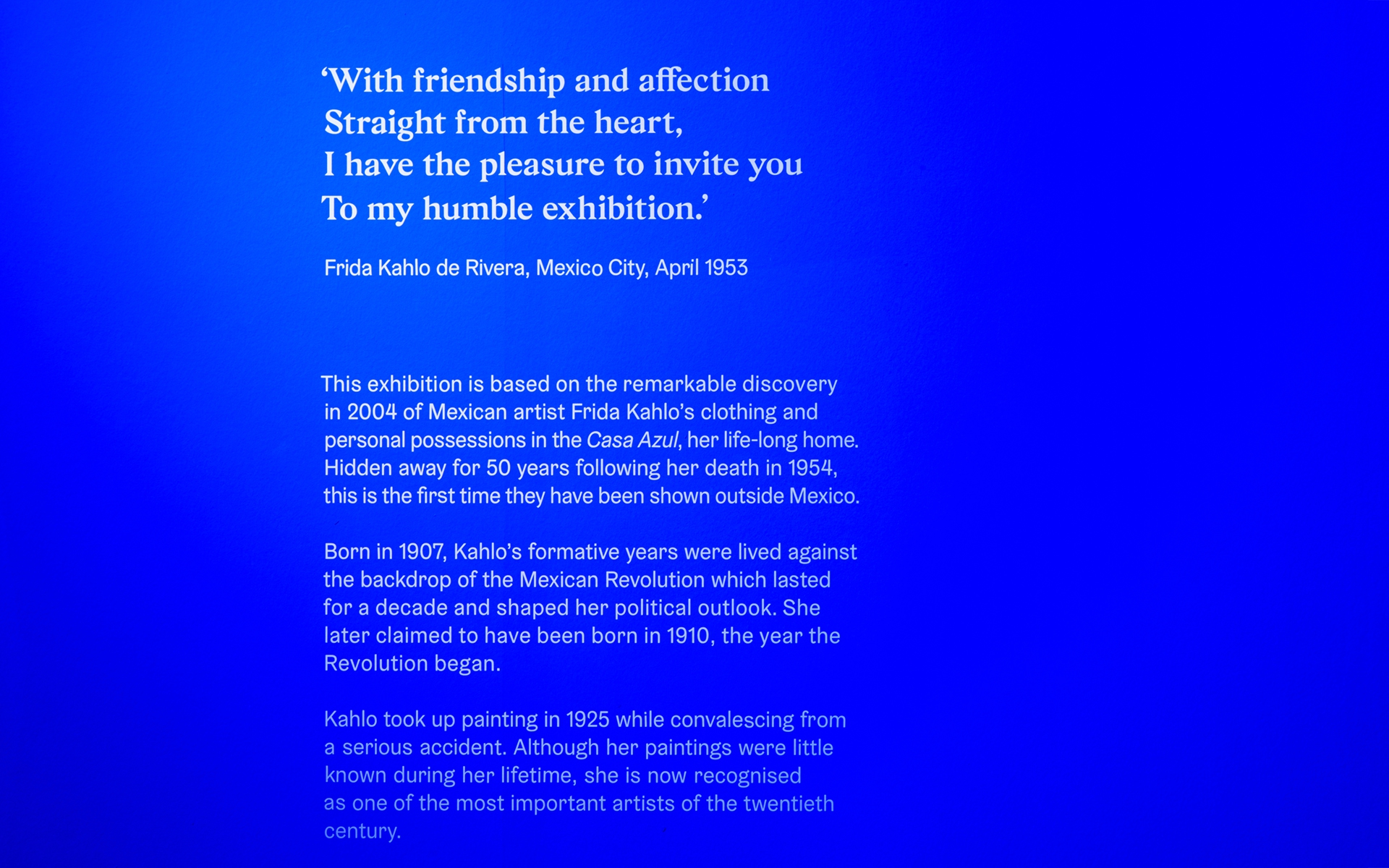
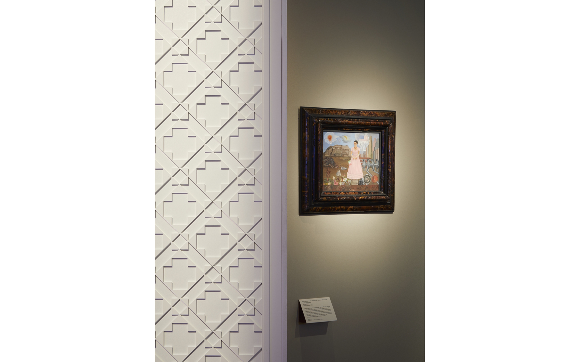
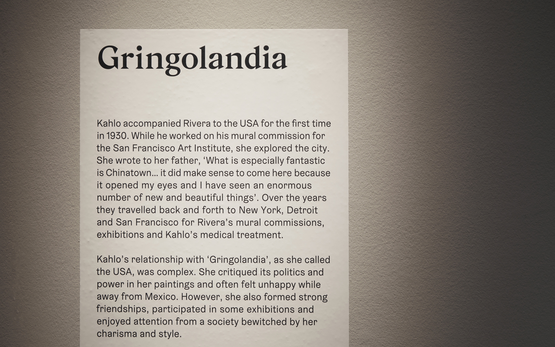
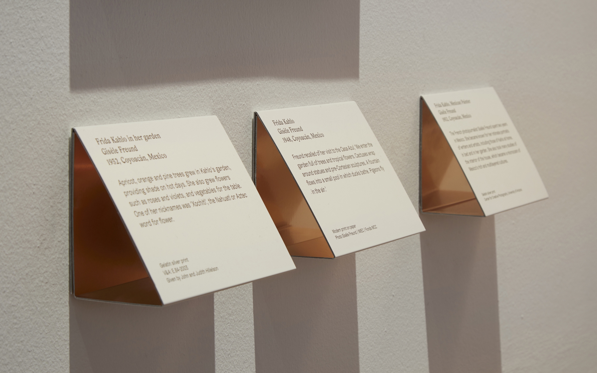
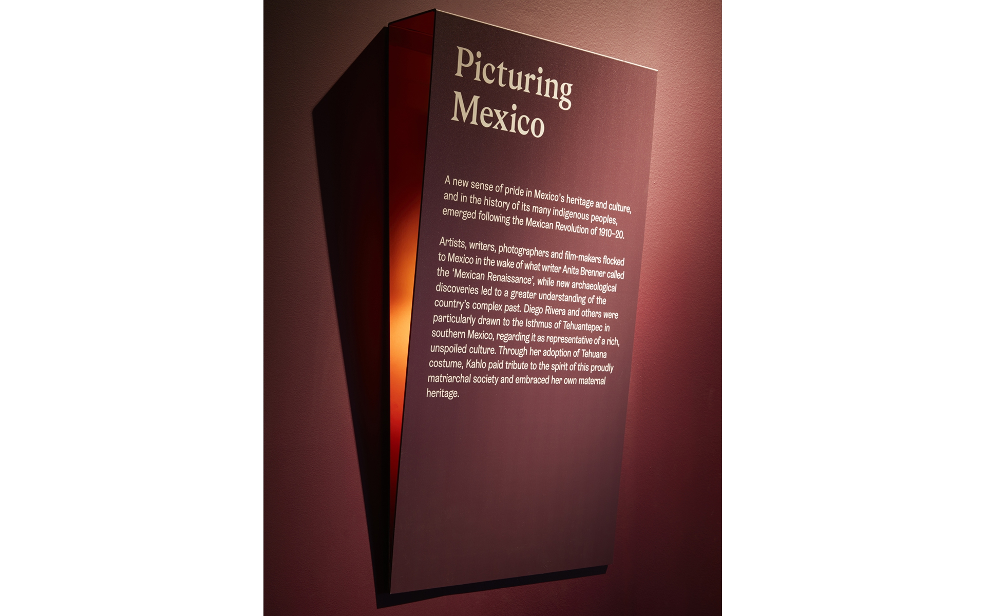
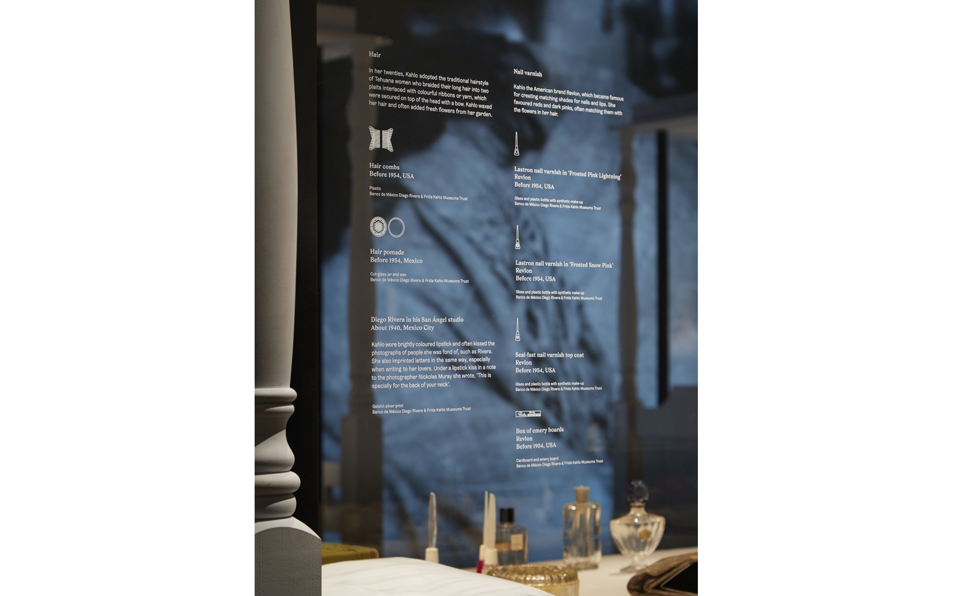
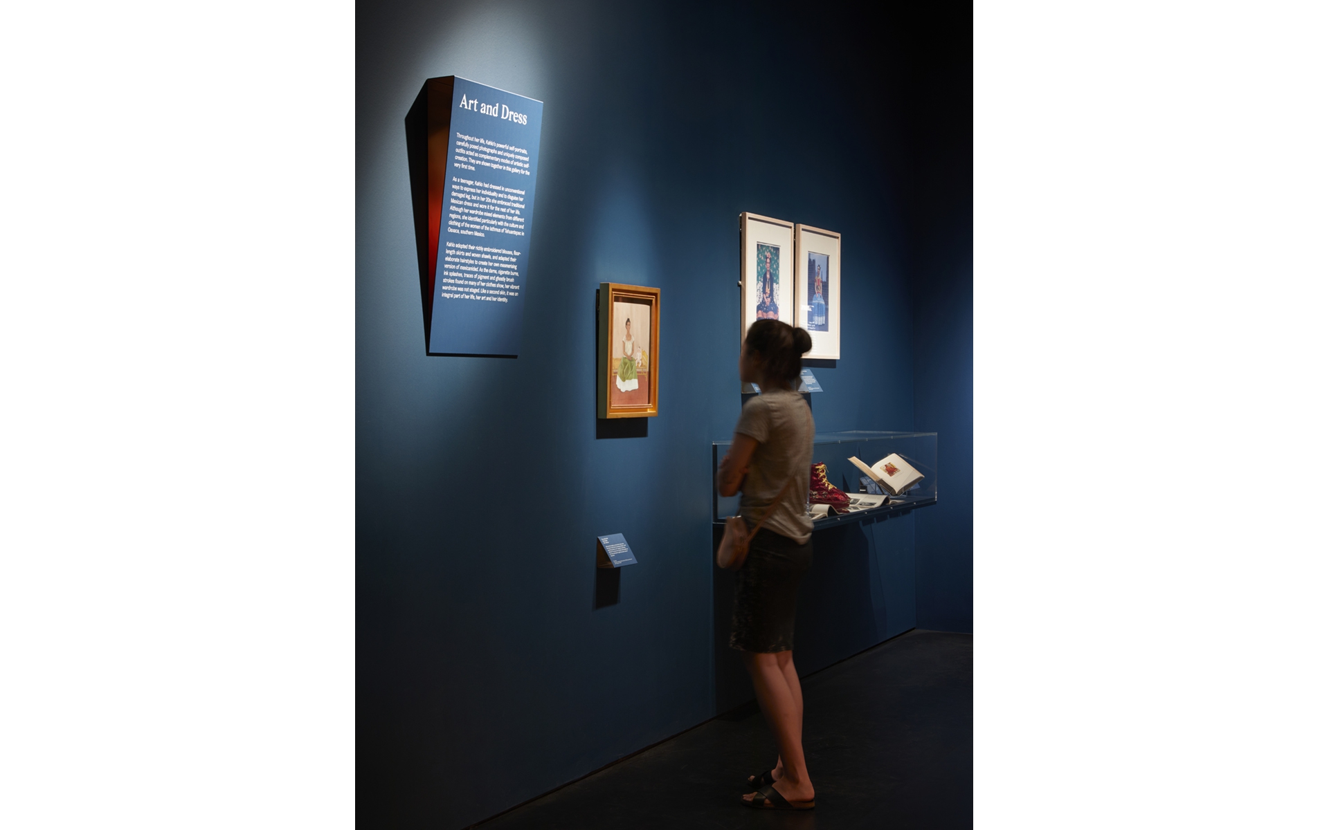
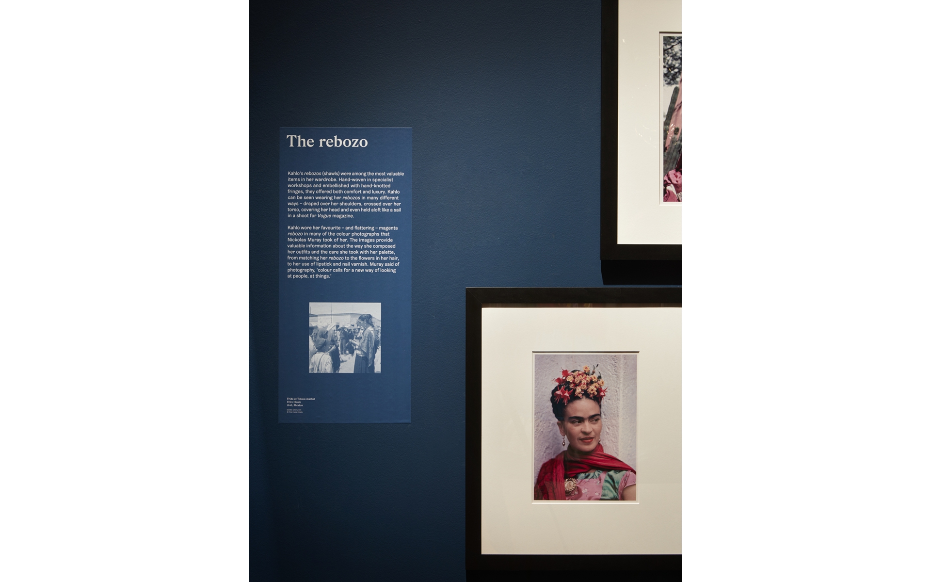
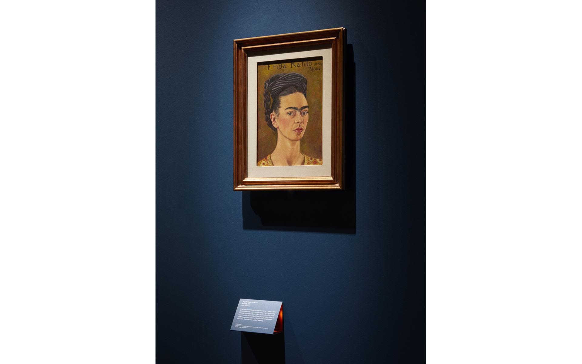
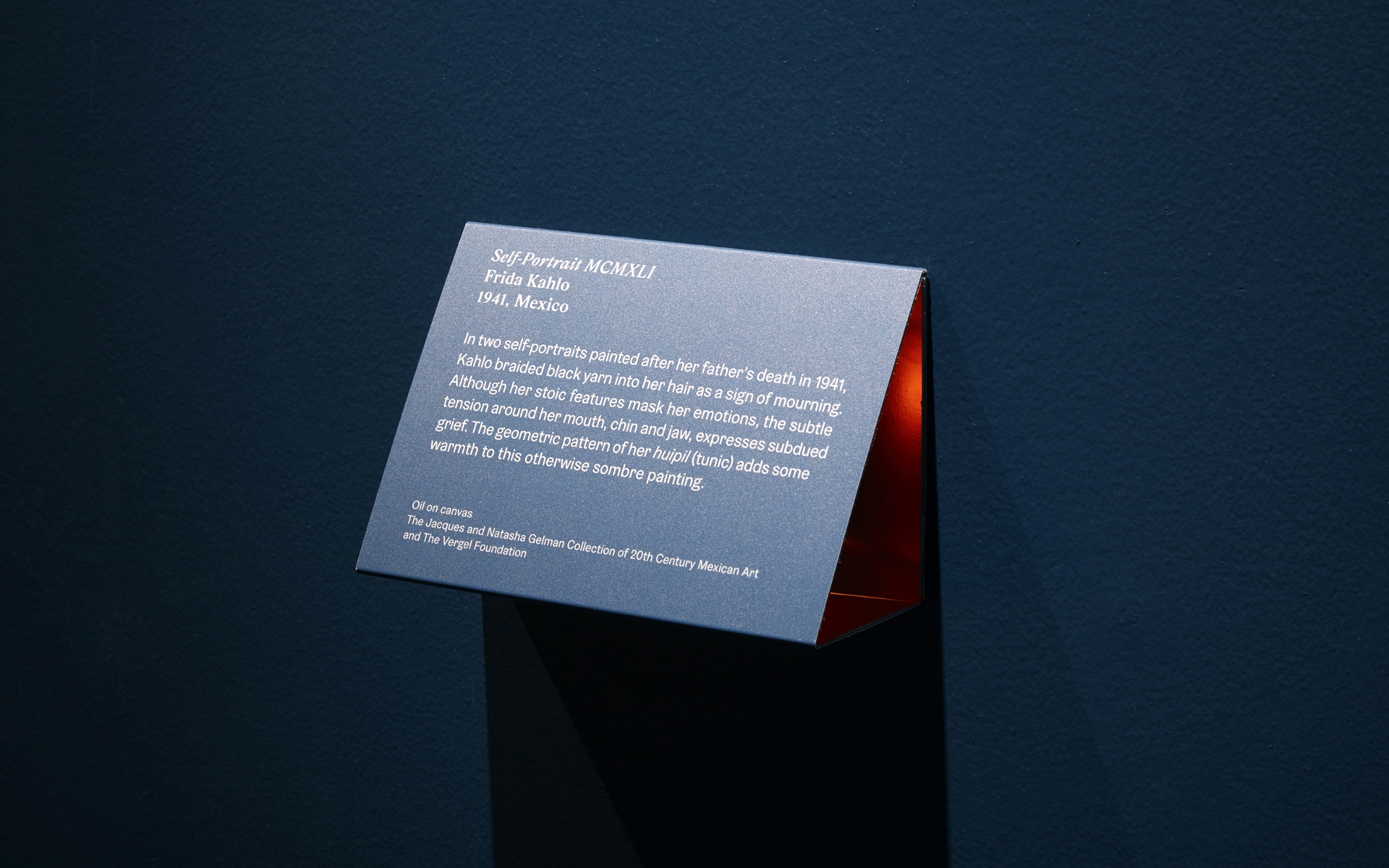
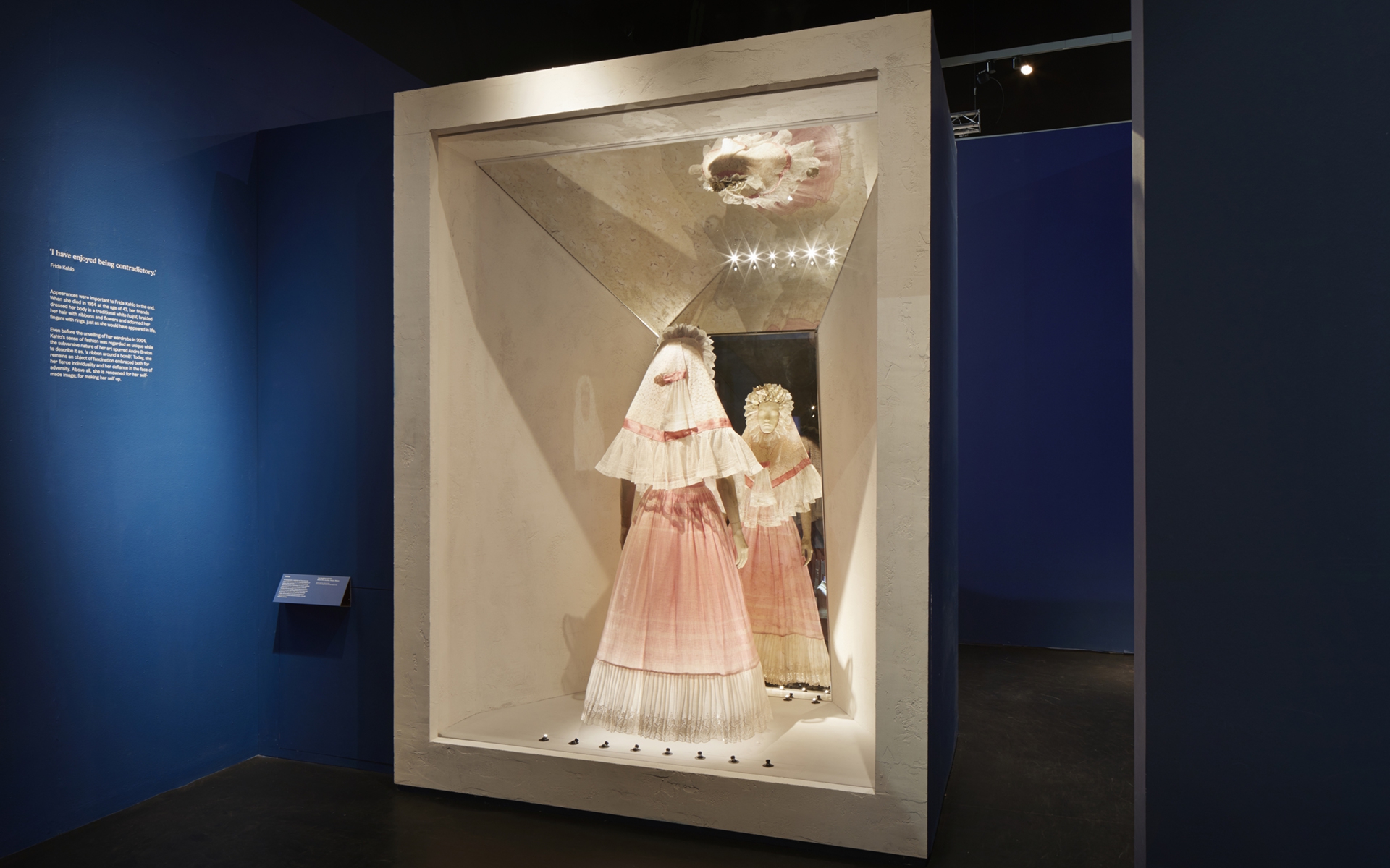
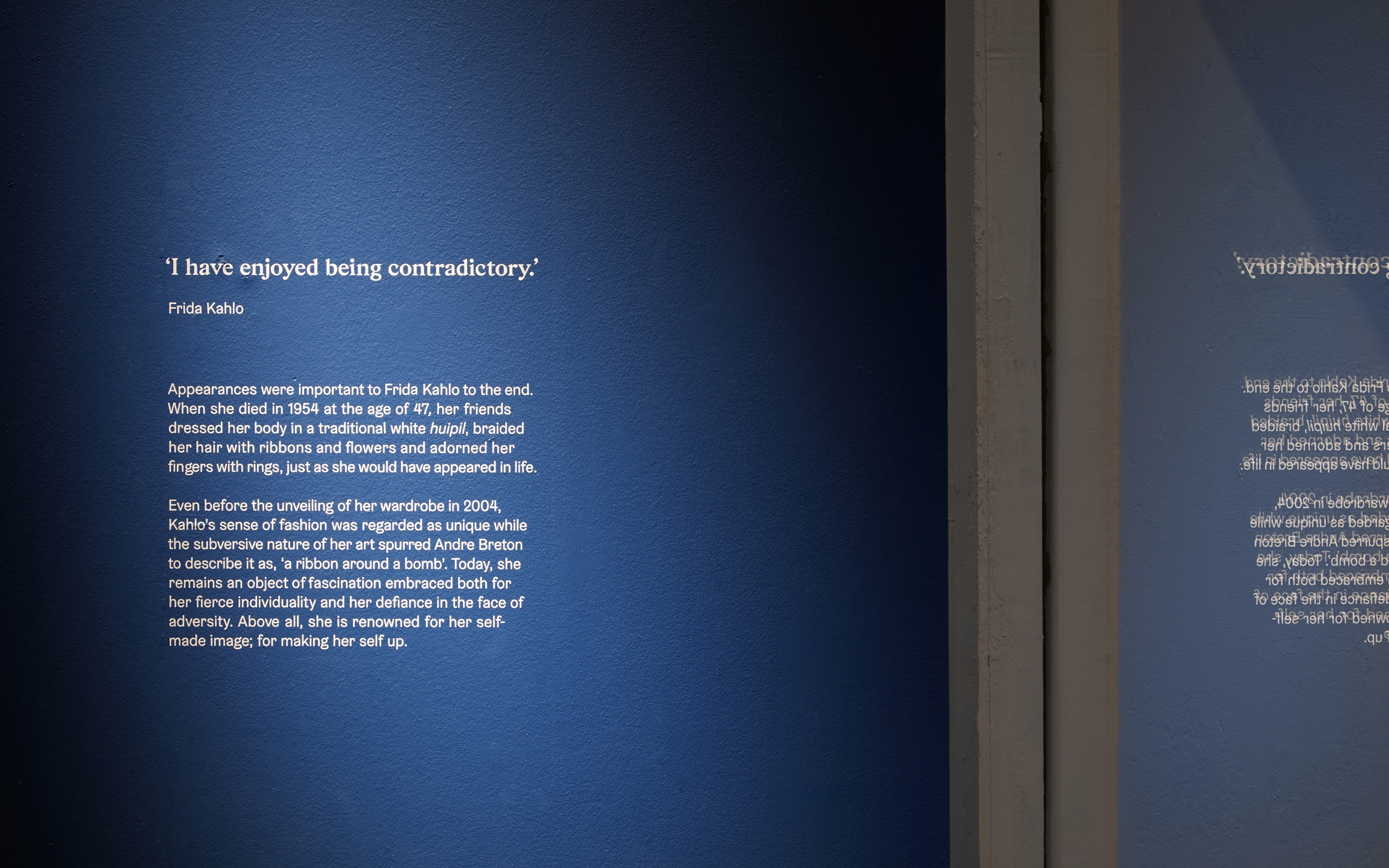
We created the exhibition graphics, working closely with stage designer Tom Scutt and architects Gibson Thornley. Our design encompassed large-scale titles, captions and object labels, wall panels, and a family of exhibit-specific icons.
We created the exhibition graphics, working closely with stage designer Tom Scutt and architects Gibson Thornley. Our design encompassed large-scale titles, captions and object labels, wall panels, and a family of exhibit-specific icons.
Read more
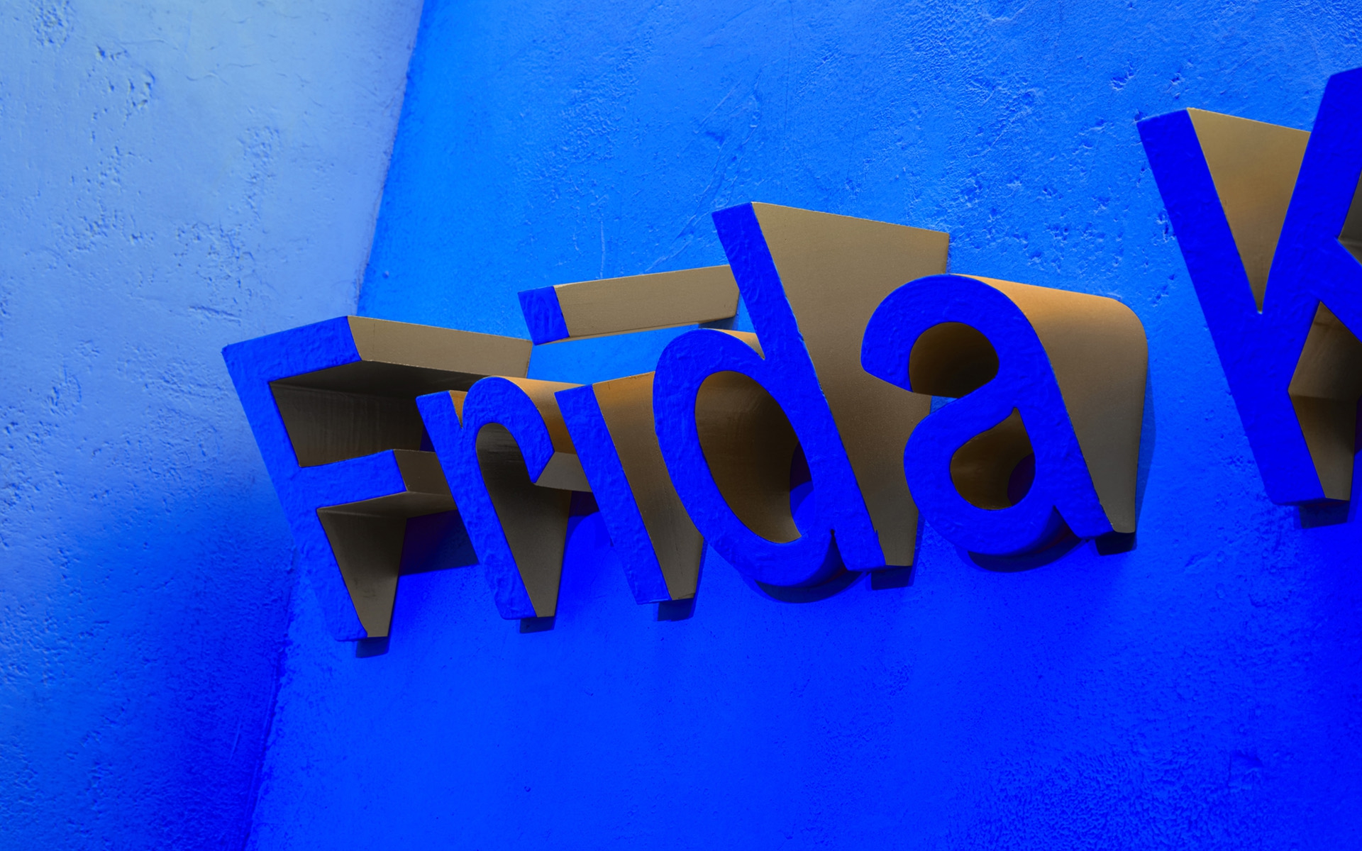
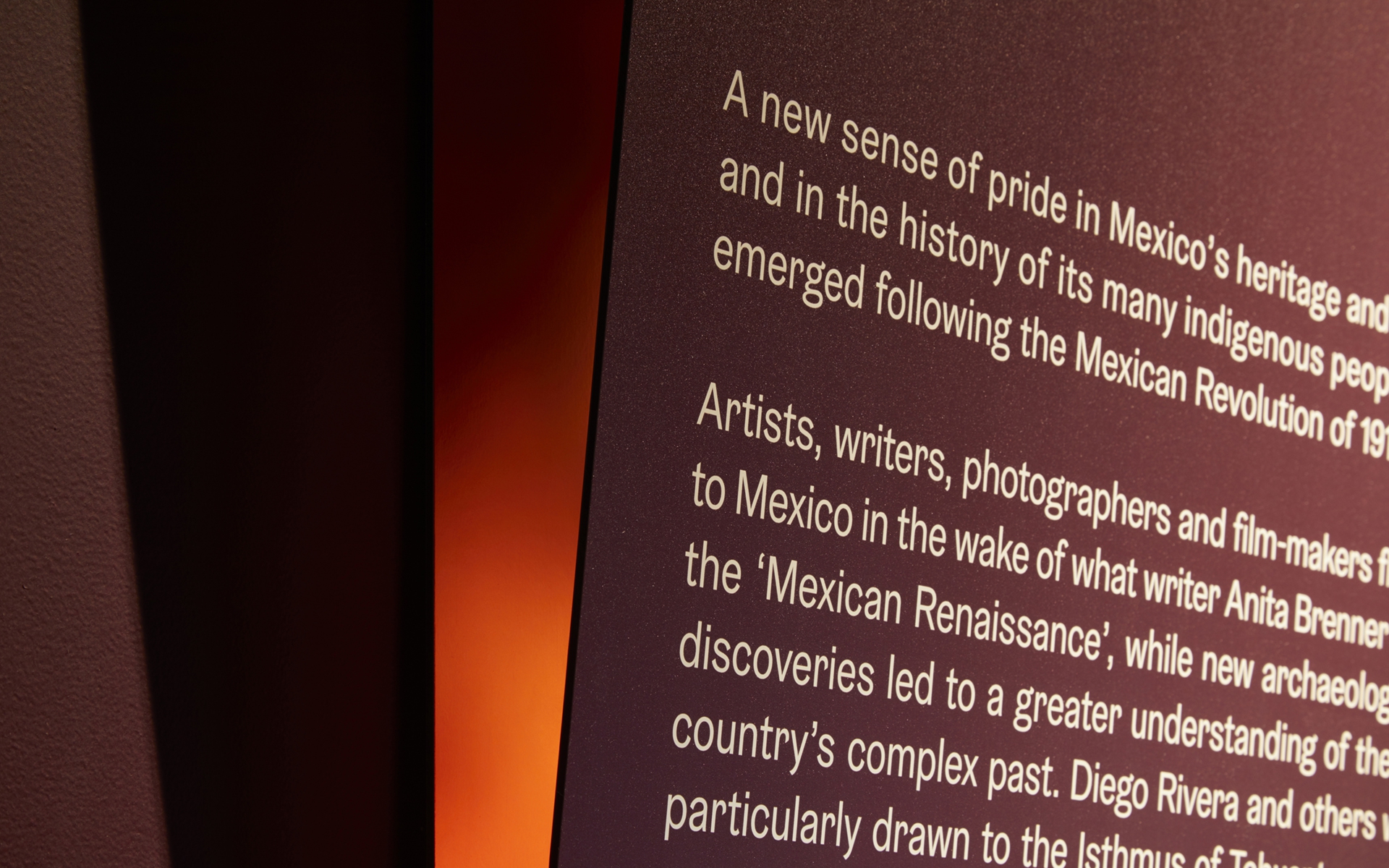
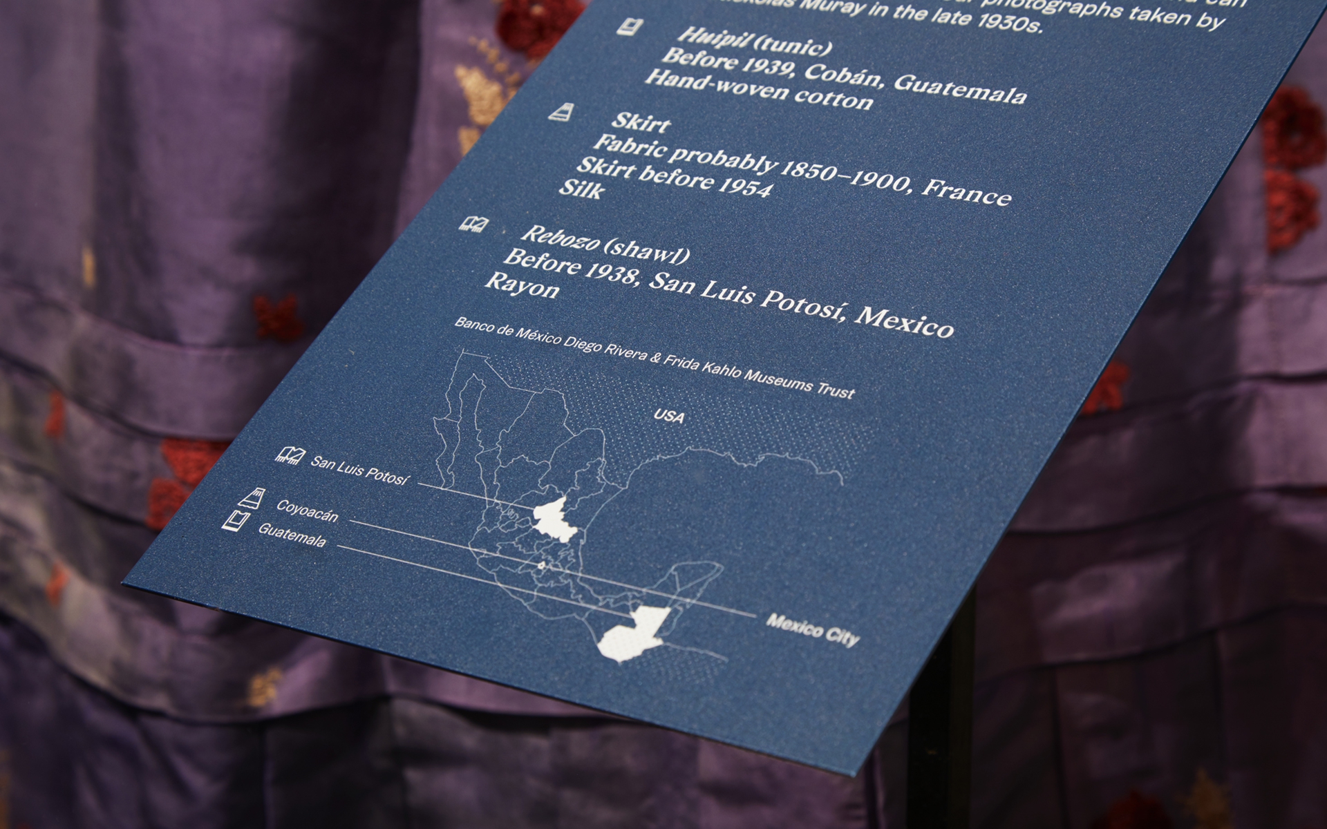
We chose the typefaces GZA and Gräbenbach for their strong angular forms, which when combined bring duality to the typography. We then worked in 3D, creating tilted panels and large-scale angled typeforms which play with perspective. We also made these forms’ sides reflective—to add qualities of colour, radiance and the mirror-like. Most importantly this 3D approach helped us make information more accessible. The V&A aimed to be as inclusive as possible, using focus groups and interviews to gauge how best to make information viewable to those in both sitting and standing positions.
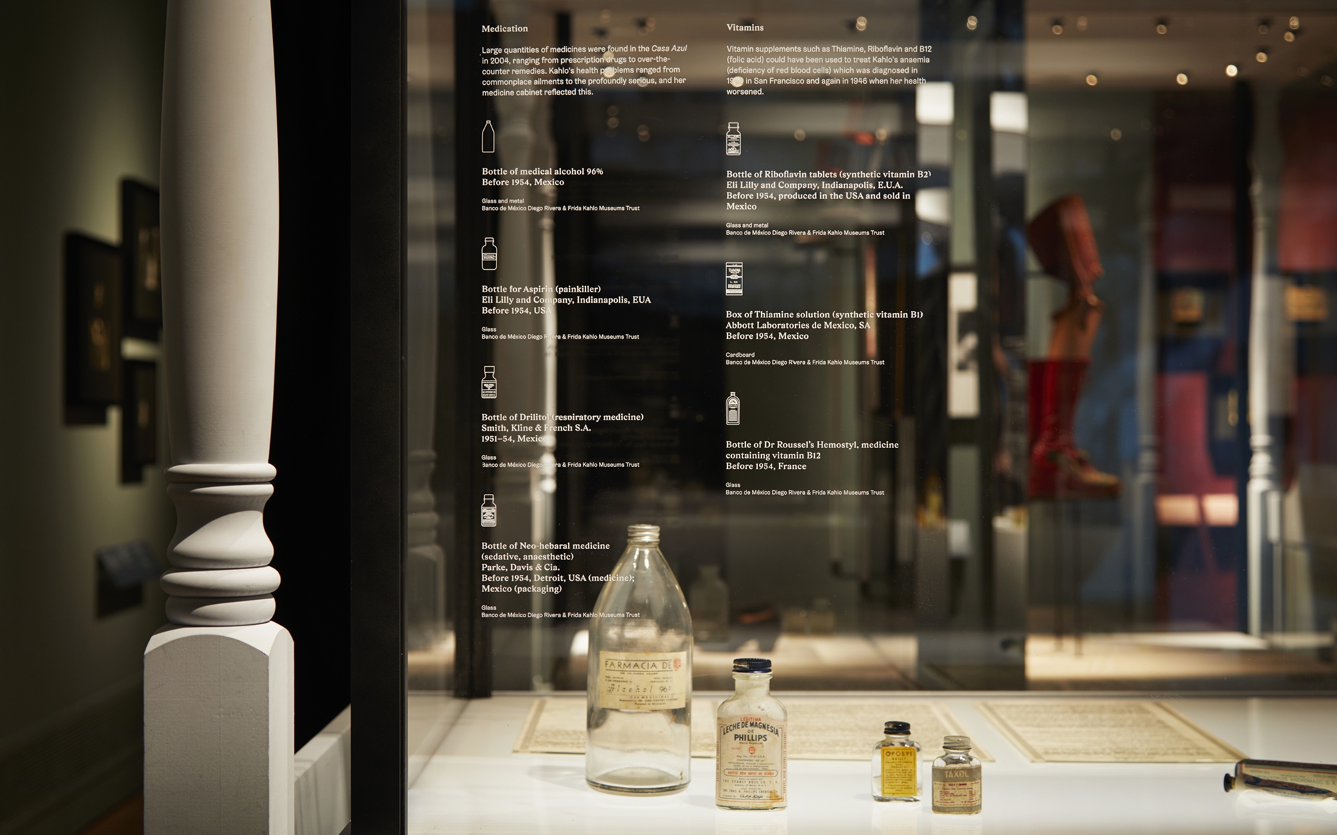
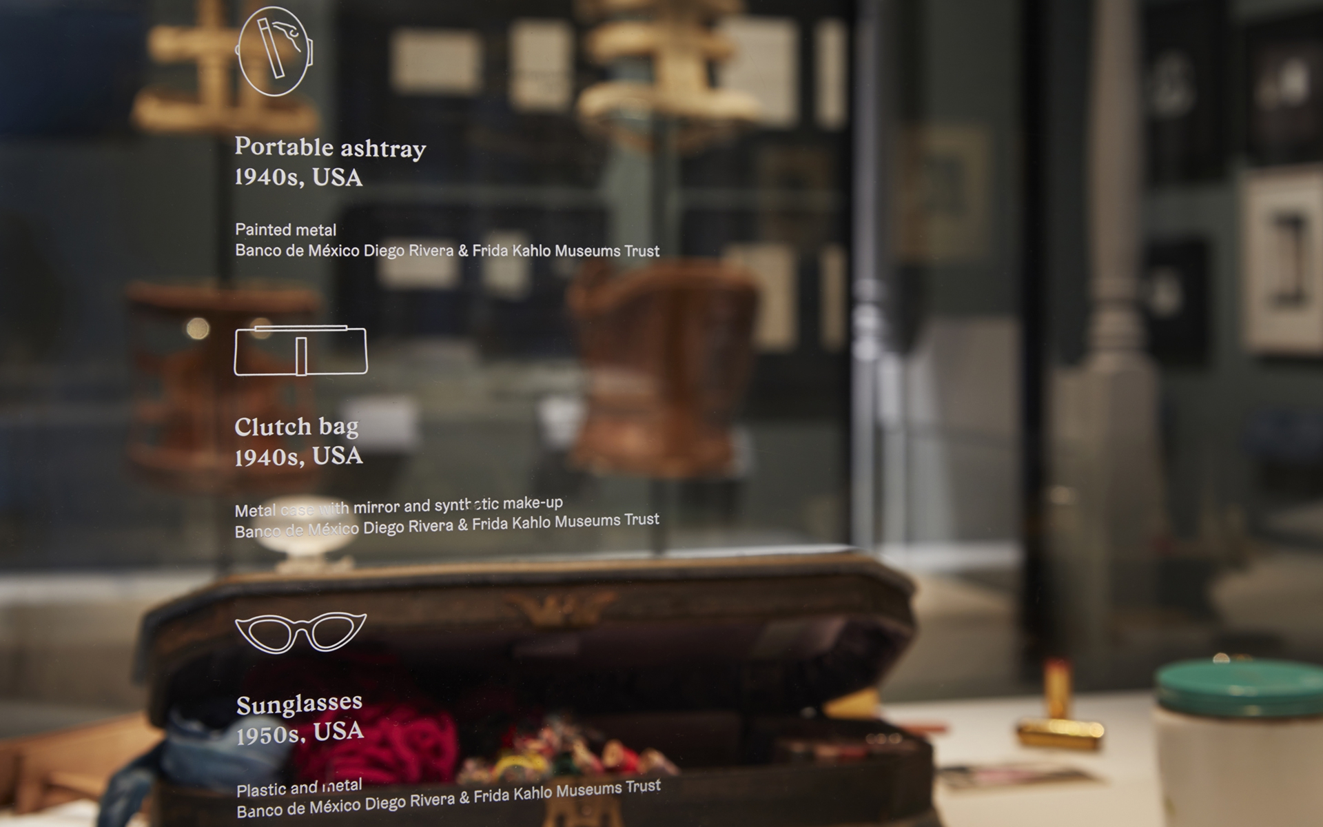
Finally, we drew icons of objects on display as a key alongside captions—a subtler way of helping visitors access information with ease.
Exhibition Design by Tom Scutt and Gibson Thornley
Exhibition Curators by Claire Wilcox, Circe Henestrosa
Lightning Design by DHA
Video Design by Luke Halls Studio
Gza typeface by Out Of The Dark, Gräbenbach typeface by Camelot
Photography by Jack Hobhouse
