AFK
AFKs are a London based architectural practice with Australian roots.
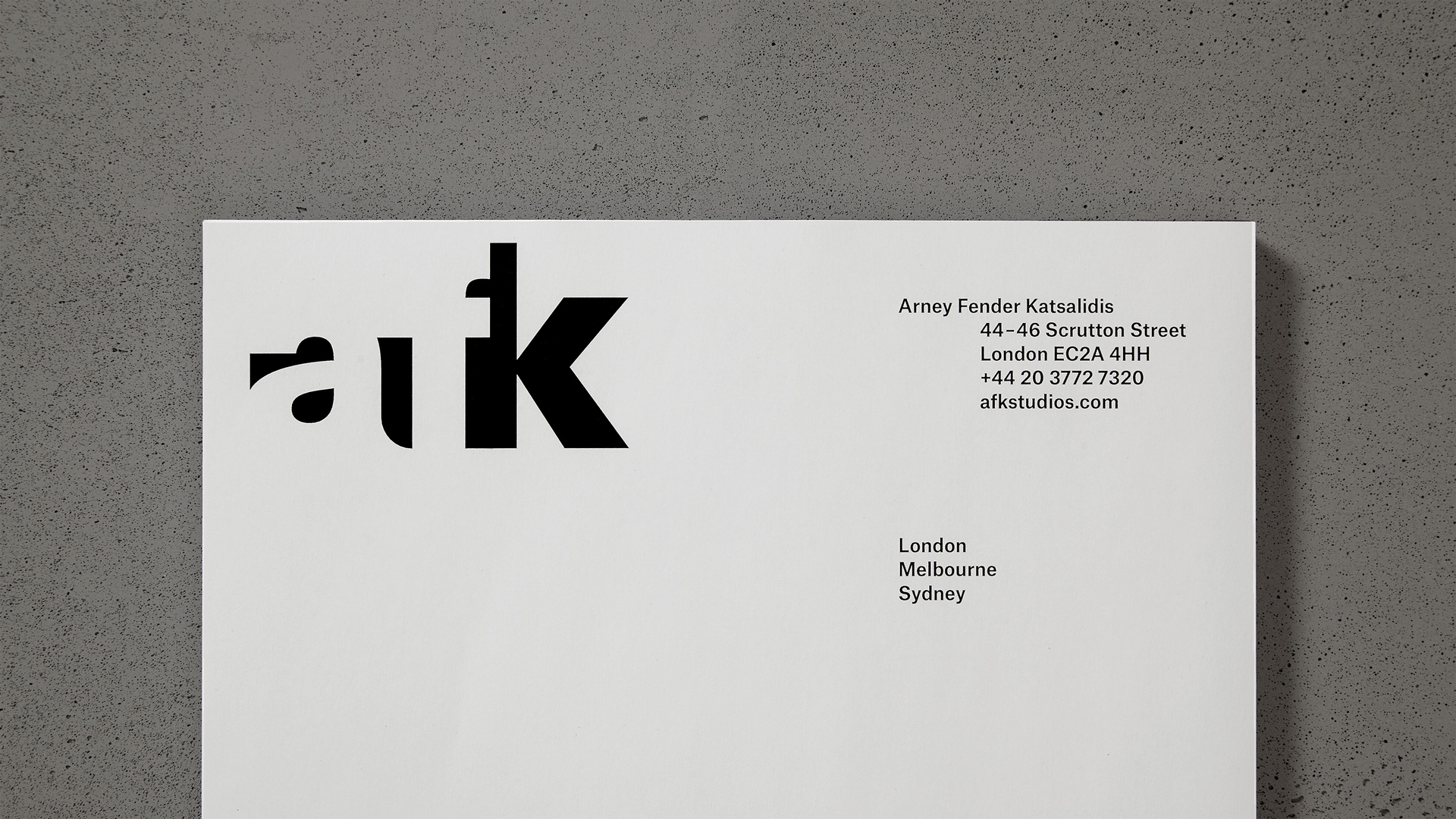
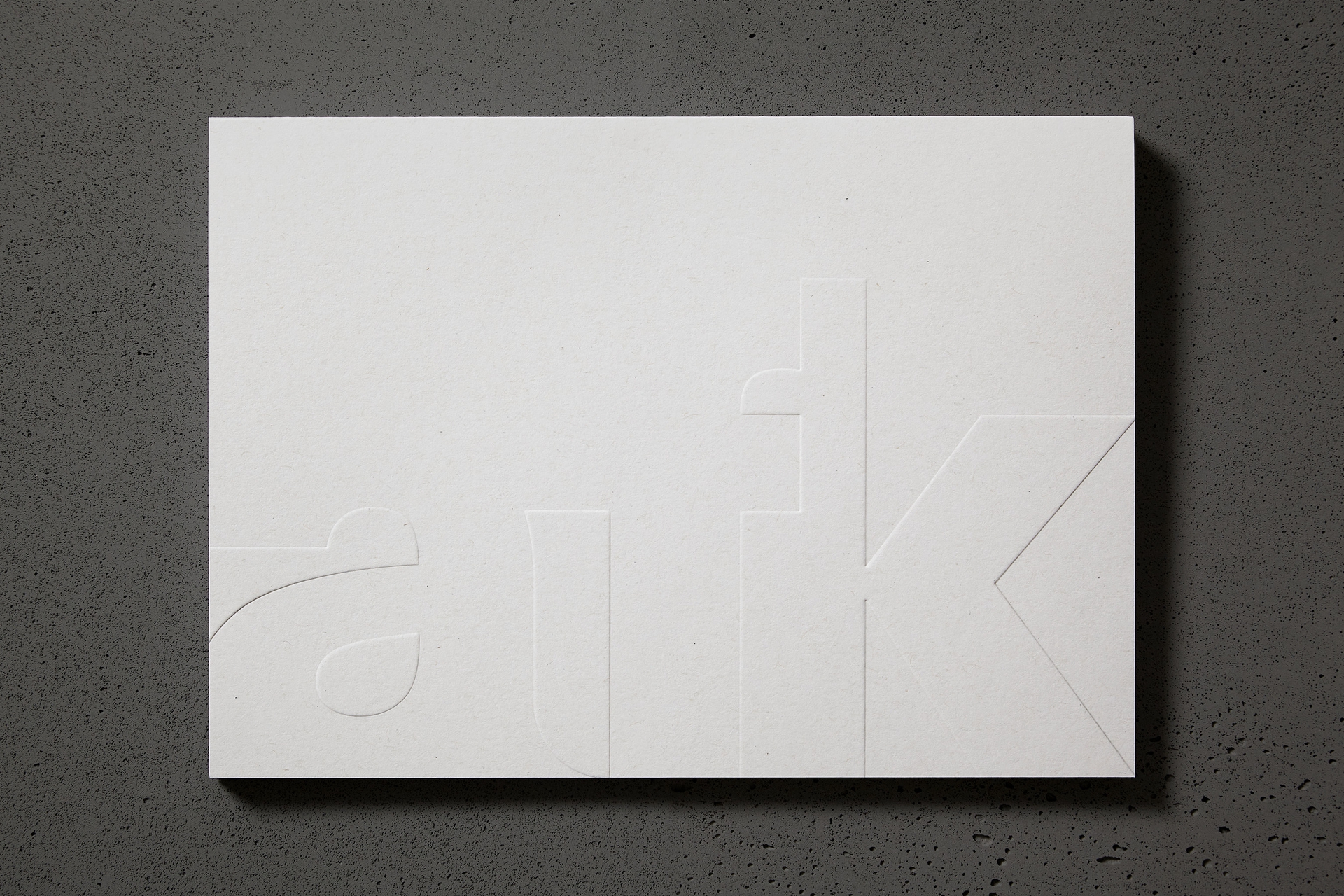
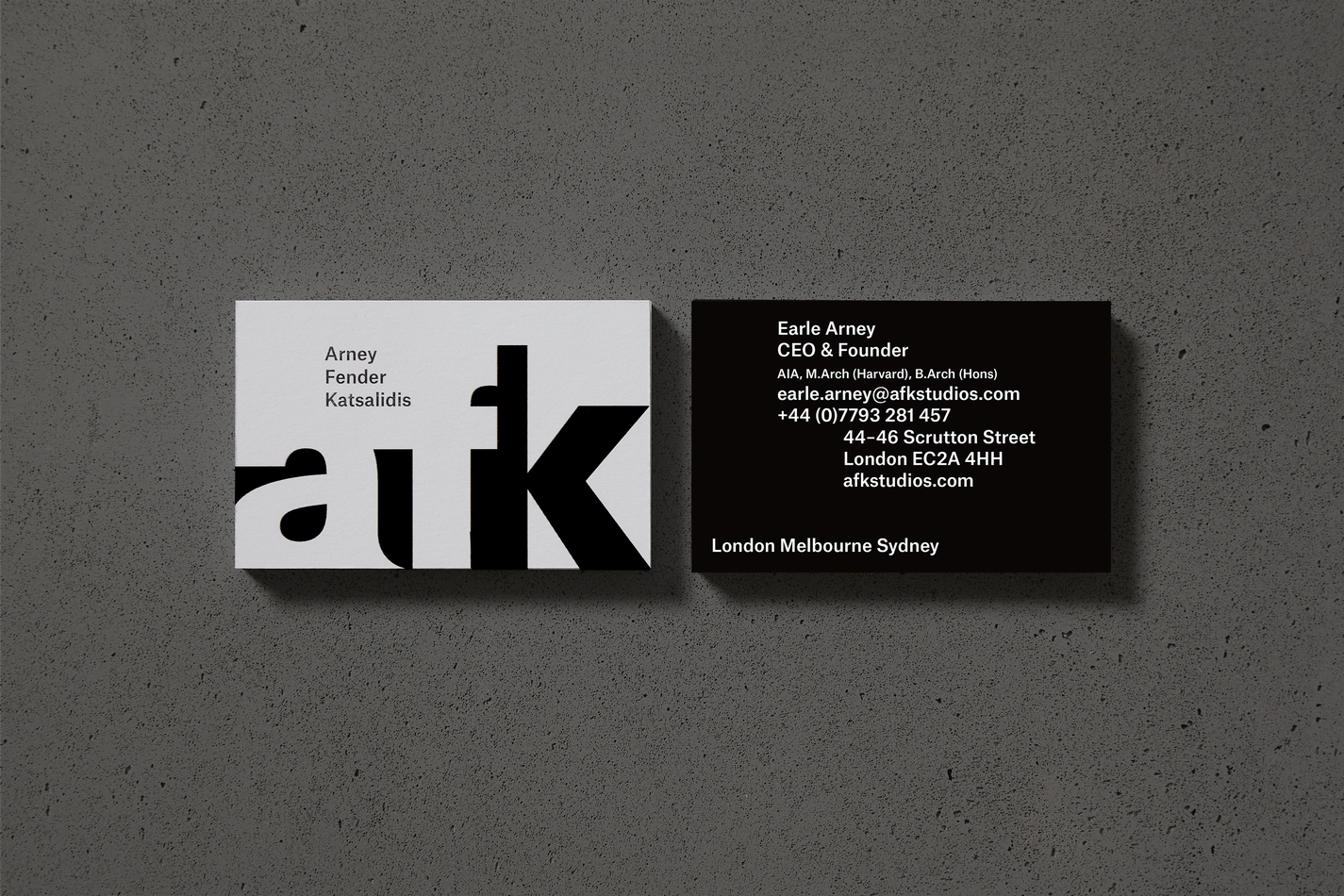
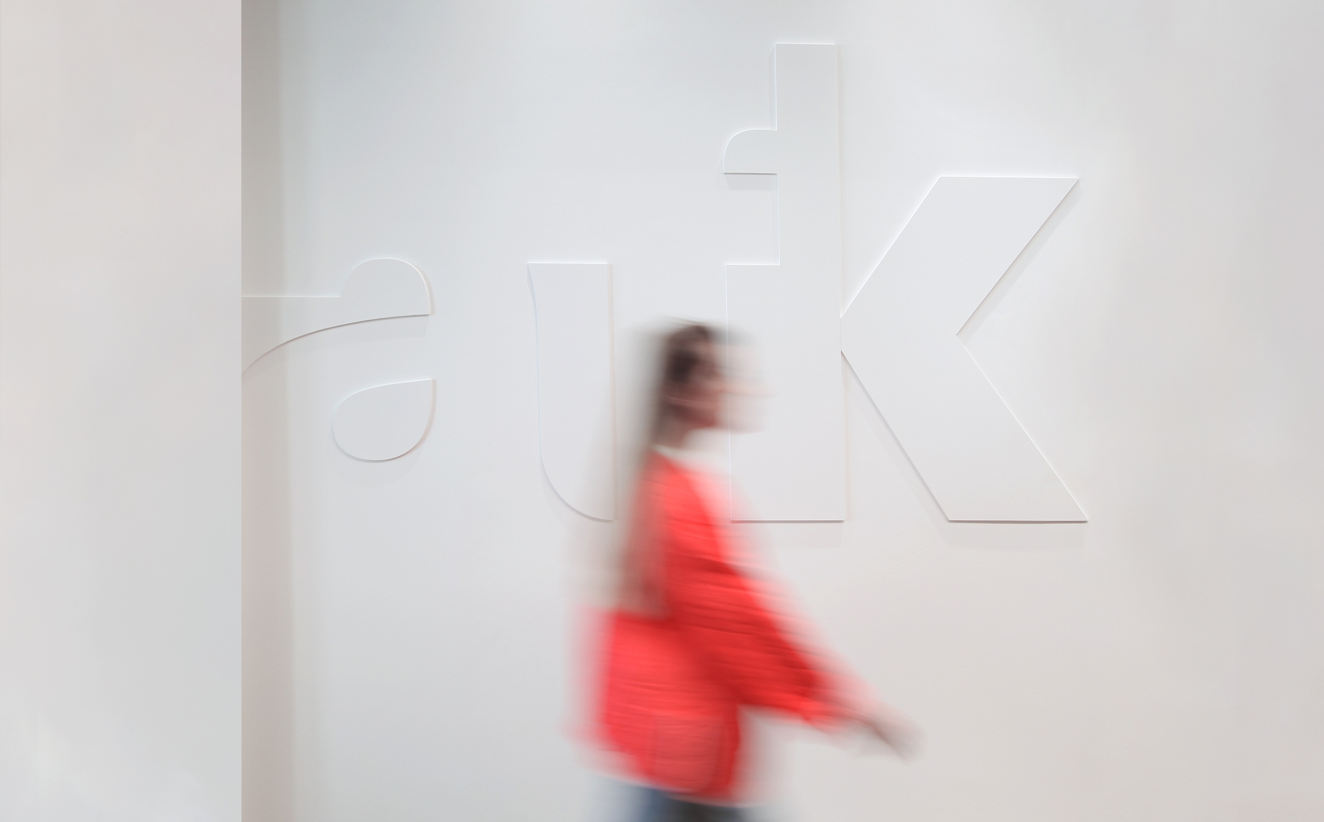
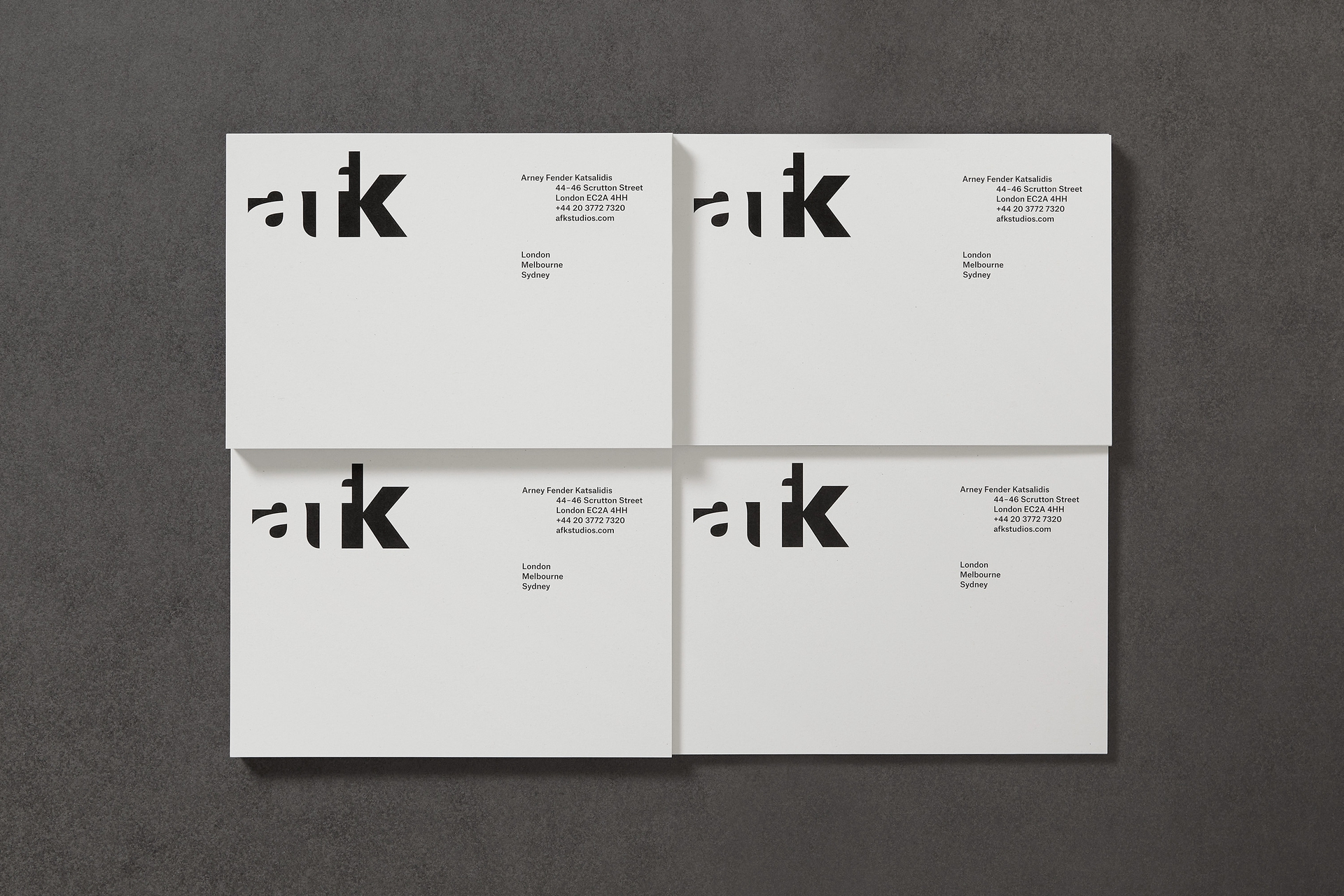
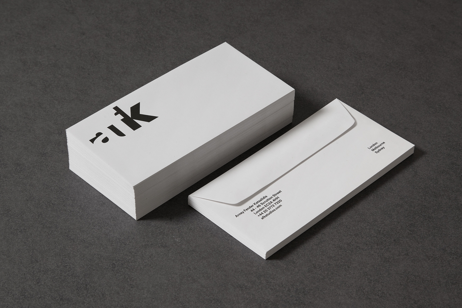
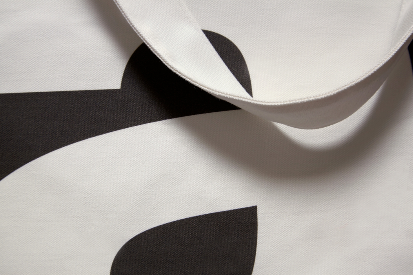
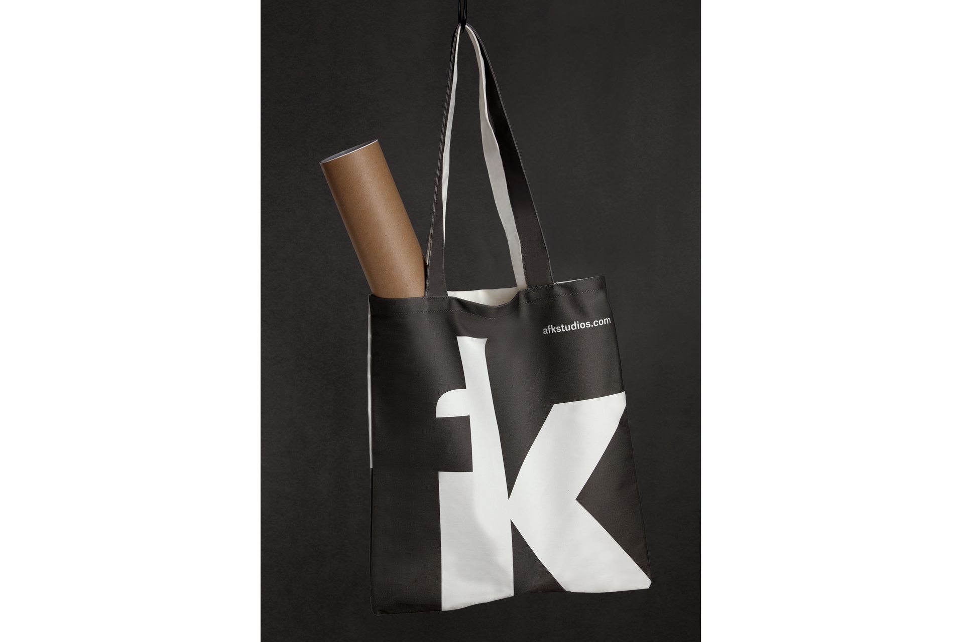
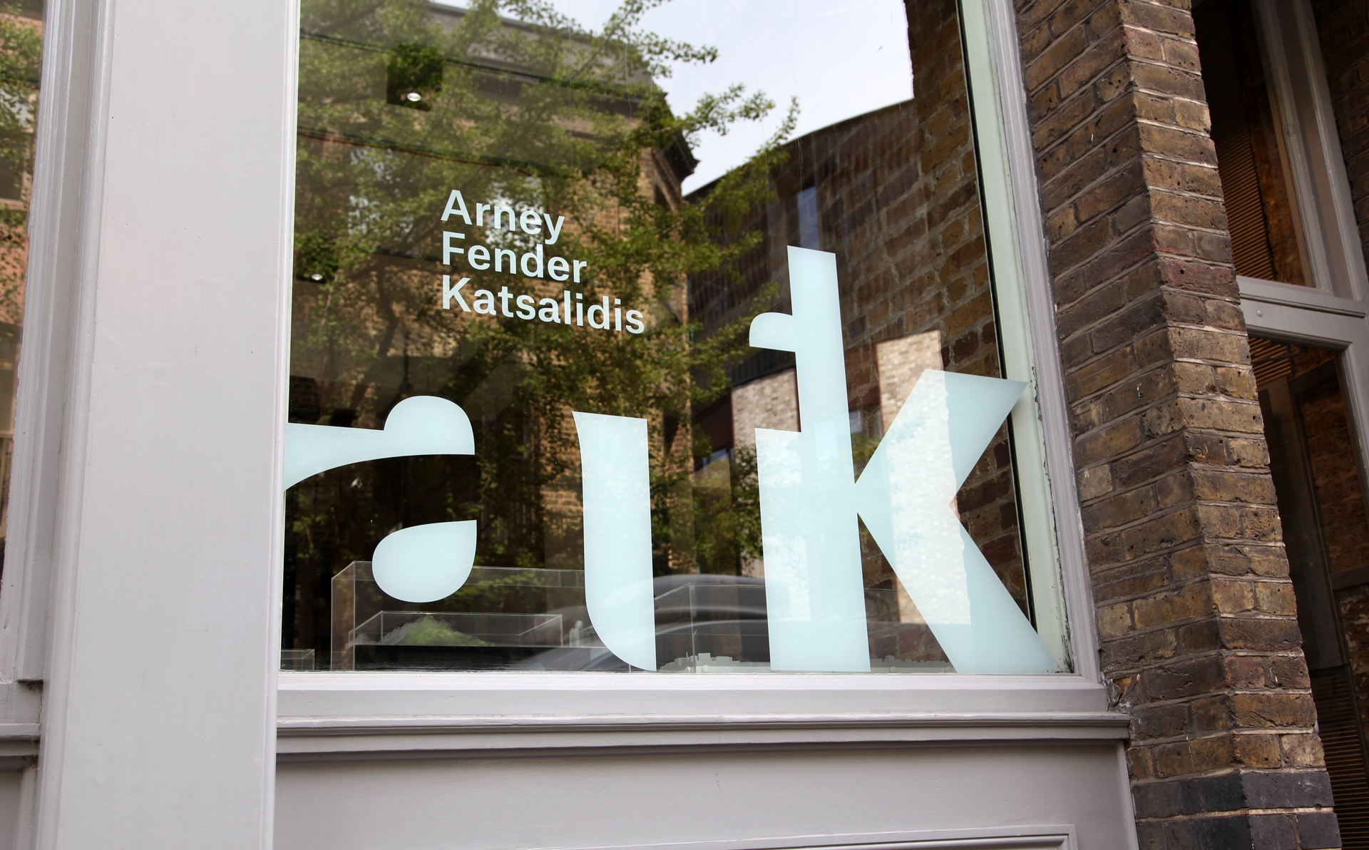
We created their new visual identity based on the concept of duality. This reflects working ‘inside out and outside in’ as architects and interior designers, southern and northern hemisphere influences and deeper interplays in their practice: creativity and pragmatism, complexity and simplicity, efficiency and elegance, thinking and making, tall and short, spaces and places.
We created their new visual identity based on the concept of duality. This reflects working ‘inside out and outside in’ as architects and interior designers, southern and northern hemisphere influences and deeper interplays in their practice: creativity and pragmatism, complexity and simplicity, efficiency and elegance, thinking and making, tall and short, spaces and places.
Read more
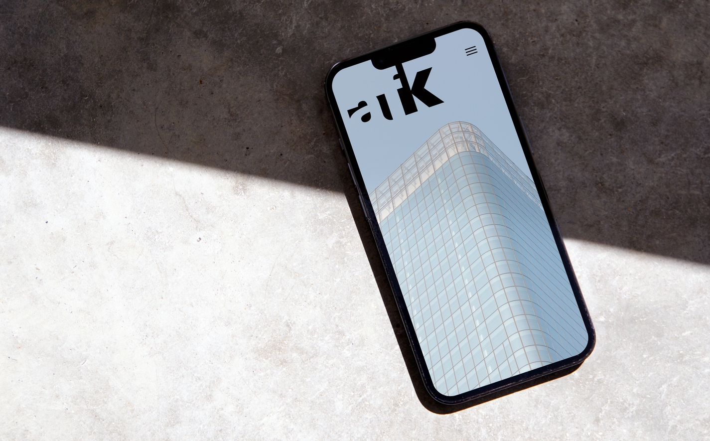
The website expands the colour palette to categorise content by Projects, Practice, People and Journal and unpacks the complexity of each project story through a balance of diagram and dramatic imagery.
Website built by Official Business
Words by Diane Hutchinson
Atlas Grotesk by Commercial Type
Identity
Digital
